Disciplines
User research, UI / UX case study, Prototyping, Interaction Design, Design System, Illustration
Timeline
Apr 2020 - July 2021
Updated Sep 2024
Project Type
Personal design project
Tools
Figma, Procreate


Disciplines
Disciplines
User research, UI / UX case study, Prototyping, Interaction Design, Design System, Illustration
User research, UI / UX case study, Prototyping, Interaction Design, Design System, Illustration
Timeline
Timeline
Apr 2020 - July 2021
Updated Sep 2024
Apr 2020 - July 2021
Updated Sep 2024
Project Type
Project Type
Personal design project
Personal design project
Tools
Tools
Figma, Procreate
Figma, Procreate

The Adventurer’s Scroll
The Adventurer’s Scroll
Gamified task management for middle school students


Adventurer
Summary
Problem
Prototype
Overview (V5)
Design
System
Iterations 1-5
Middle school students are particularly vulnerable to academic anxiety. They face pressure to overachieve under unrealistic expectations, are subjected to standardized systems that often overlook individual circumstances, and, as adolescents, are naturally more prone to stress and a sense of cognitive overwhelm. This external pressure, combined with feedback systems that downgrade “mediocrity” to anonymity, often stifles genuine passion for learning—the very intrinsic motivation that could drive long-term success.
Traditional productivity tools tend to be too rigid, failing to capture the attention and imagination of students in this age group. These methods also lack personalized incentives and creative freedom—key motivators for younger audiences. What students need is a dynamic, engaging way to visualize progress and stay invested in their tasks.
Hypothetically, The Adventurer’s Scroll aims to address these challenges by offering a gamified productivity experience that transforms routine tasks into a personal, evolving story. By mapping users’ self-defined goals into a branching narrative, the app not only structures focus sessions but also provides creative incentives that appeal to students’ desire for adventure and autonomy. This approach fosters intrinsic motivation and healthy long-term study habits, promoting both engagement and resilience in learning.
Alike its tab bar, the app can be broken down into 4 main sections:
Adventure
Store
Clan
Profile
Project Type
Personal design project
Disciplines
User research, UI / UX case study, Prototyping, Interaction Design, Design System, Illustration
Timeline
Apr 2020 - July 2021
Updated Sep 2024
Tools
Figma
Procreate
Students struggle to develop intrinsic motivation for learning due to the overwhelming pressure to meet
academic expectations, leading to disengagement and reduced productivity.


Academic Anxiety
Worry
Emotions that inhibit
concentration
Peer pressure
& survivor bias:
underepresentation
Study skill deficit
Flawed methods
Task-related
interference
Extrinsic motivation
Intrinsic motivation

Competence
Skill / challenge
Connection
Social

Autonomy
Self-motivated
Self-determination
theory
The Adventurer’s Scroll is a gamified productivity app designed specifically for middle school students. It motivates learning and task completion by transforming users' personal goals into an AI-powered, interactive litRPG (literary role-playing game) adventure. Through pomodoro-style focus sessions, users embark on a unique journey where they shape their own epic—or humorously absurd—tale.
The app's development began in April 2020, with the first high-fidelity prototype completed by September of that year. Since then, the app has undergone 5 major iterations, significantly enhancing its UI design, usability, and overall functionality (detailed development timeline available). The integration of AI, which automates the generation of multi-branched storylines, has been a crucial advancement. The next phase of development focuses on product deployment and recruiting mobile app developers to bring this project to life.
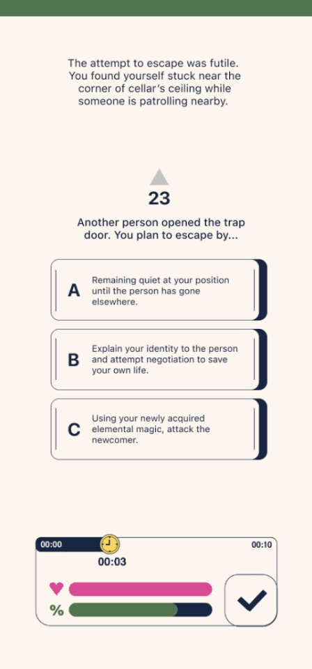
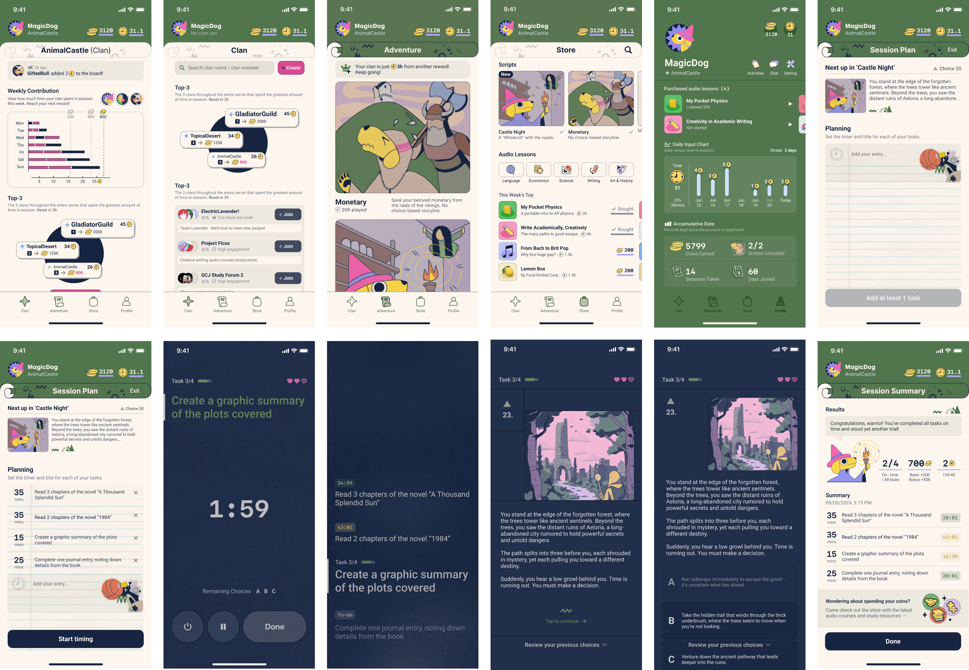
Users begin a timed focus session, and during the breaks between completed tasks, they are presented with a new segment of their ongoing story. They then make a multiple-choice decision on how the adventure should continue.
Over time, by making more plot decisions, users craft their own dynamic, branching narrative—becoming composers of their own adventure, much like the bards of Medieval times.
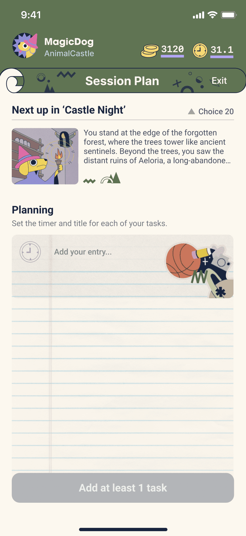
Planning stage

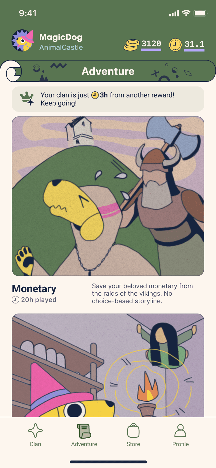
Choose script from homepage
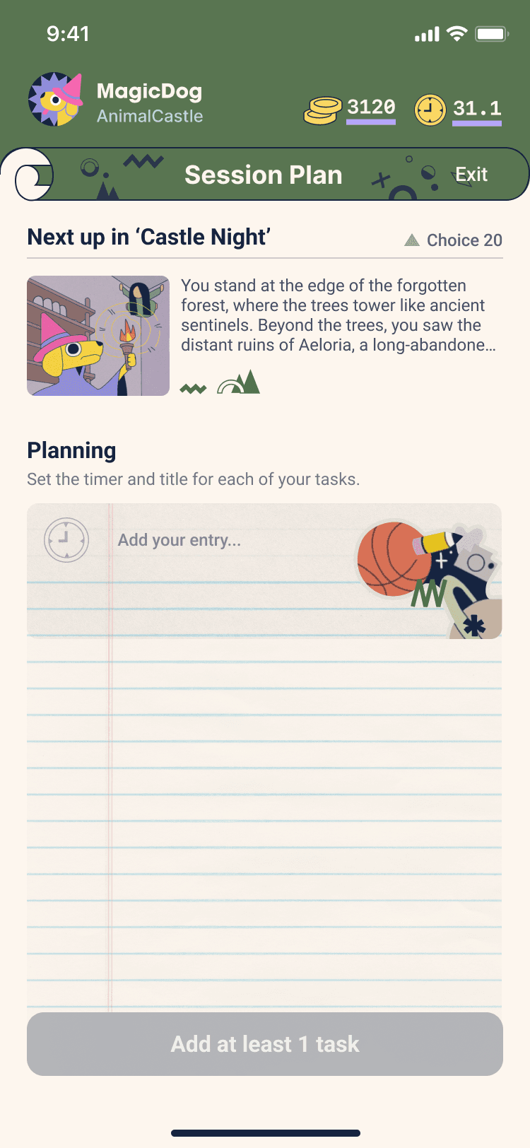
Add task entry
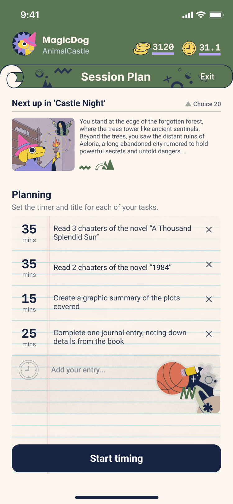
Edit tasks
In-session: focus mode

Task dashboard
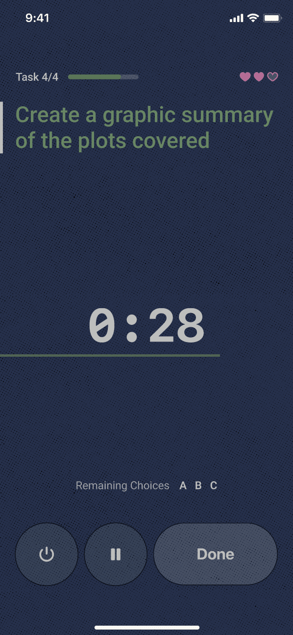
Agenda summary
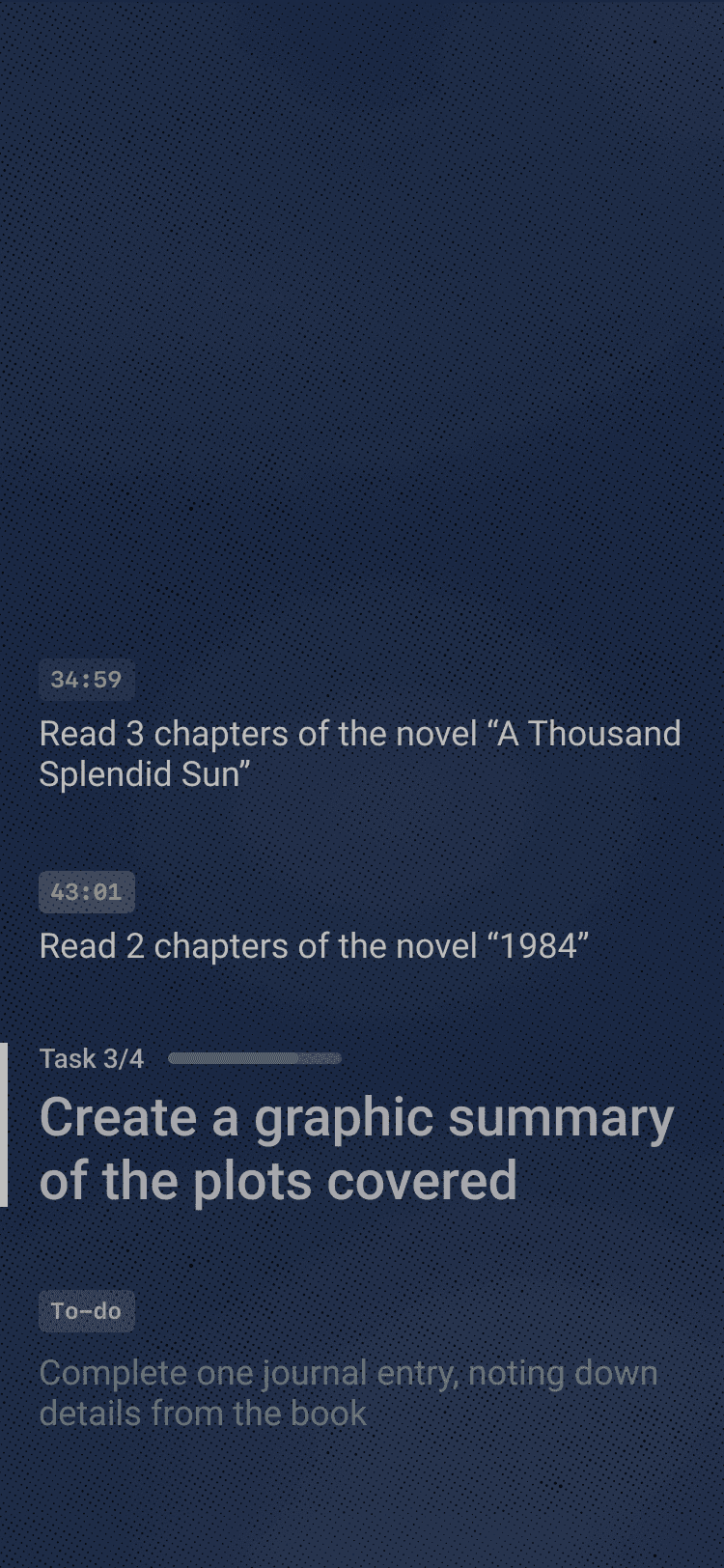
Story choices & summary

Selecting story option
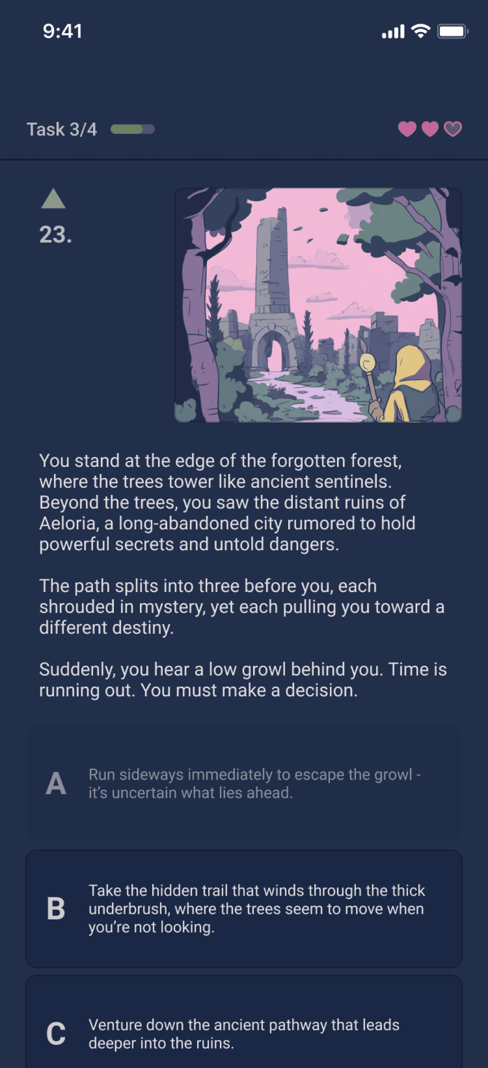
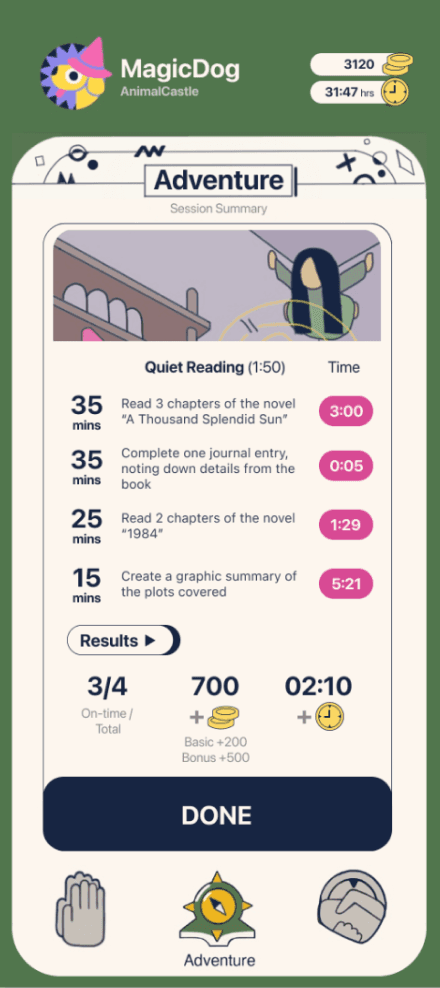
Session summary
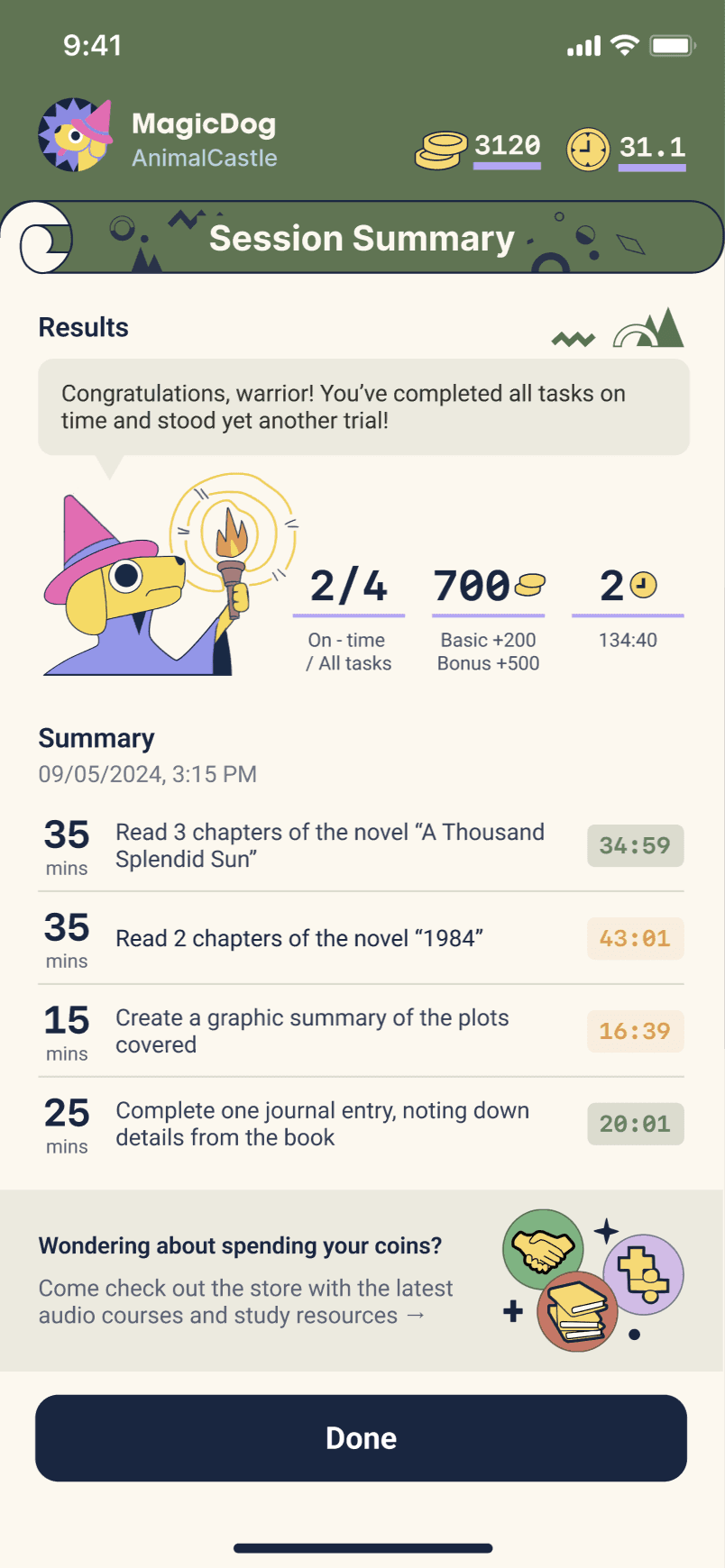
Congratulations page
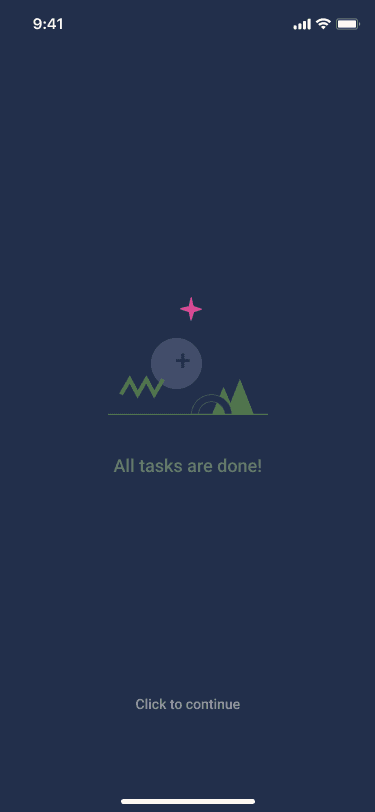
↓ Click to visit the full interactive prototype in Figma
1. Adventure
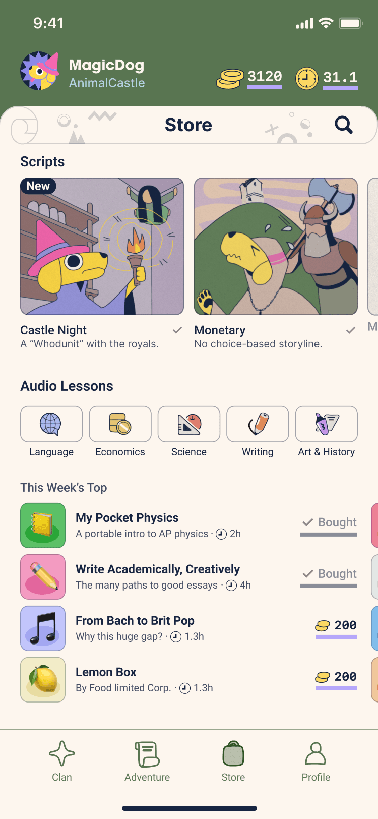
2. Store
The coins earned from focus sessions could be exchanged for new script slots and online learning resources such as audio classes.

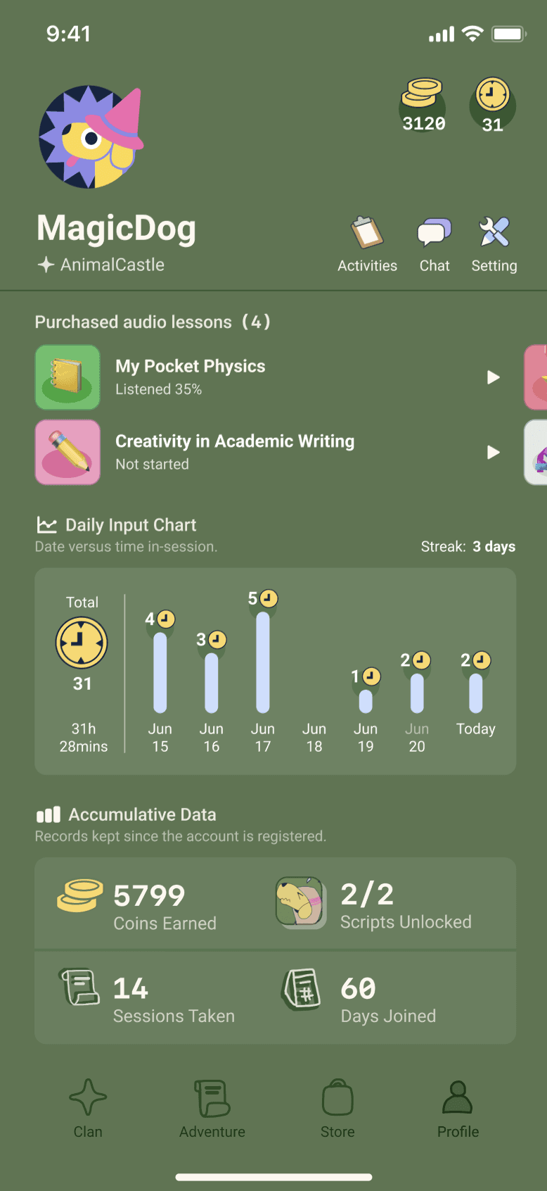
3. Profile
Access purchased resources and personal statistics.
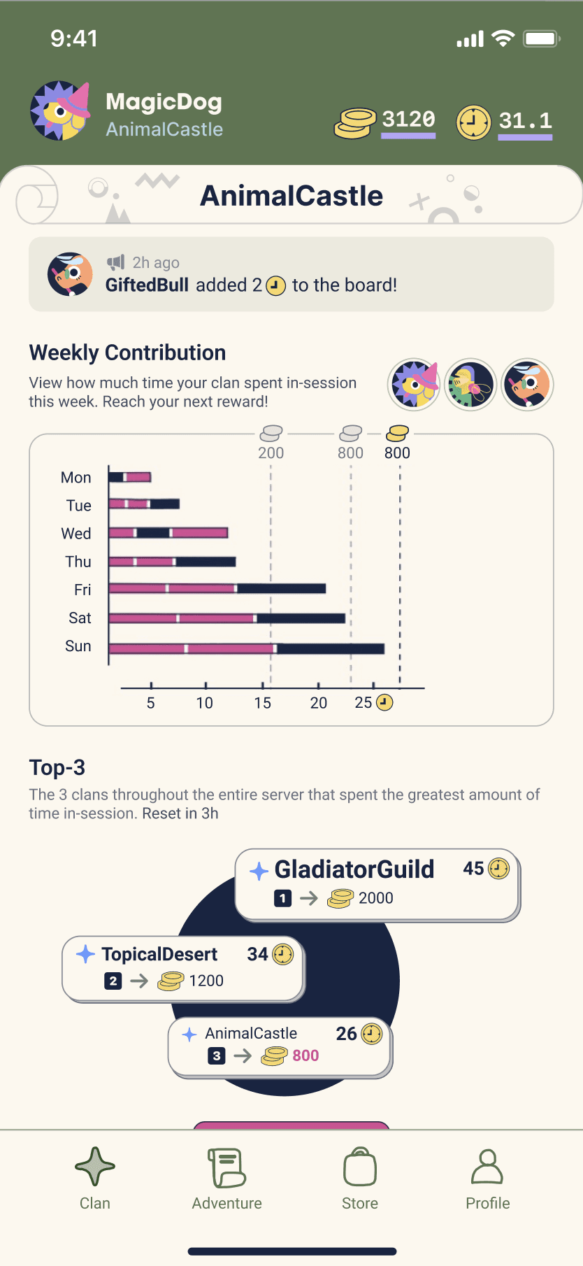
4/ Clan
Users can form or join 4-people groups to compete for weekly achievements and rewards.

Full length
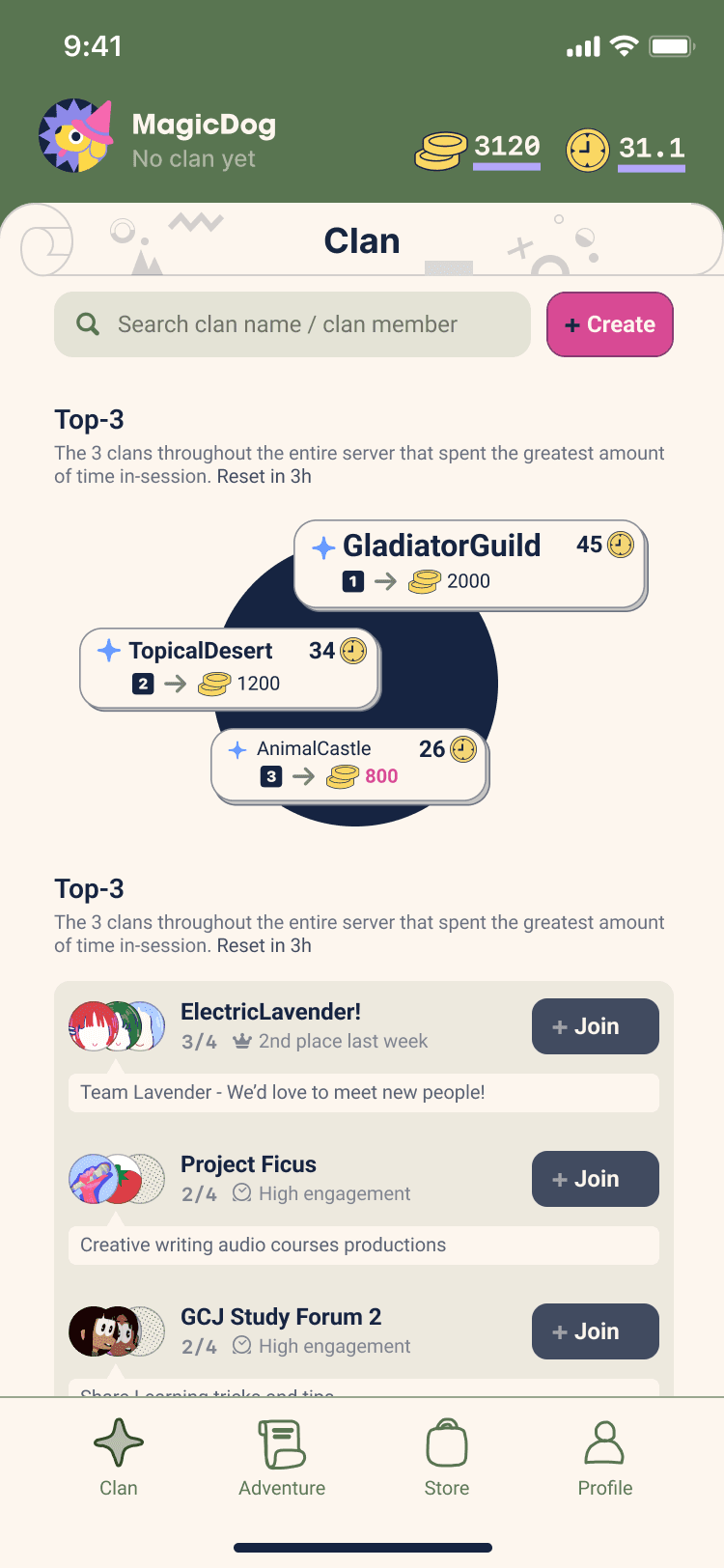
Clan (joined)
Clan (not joined)
Iteration 1
September 13th, 2020
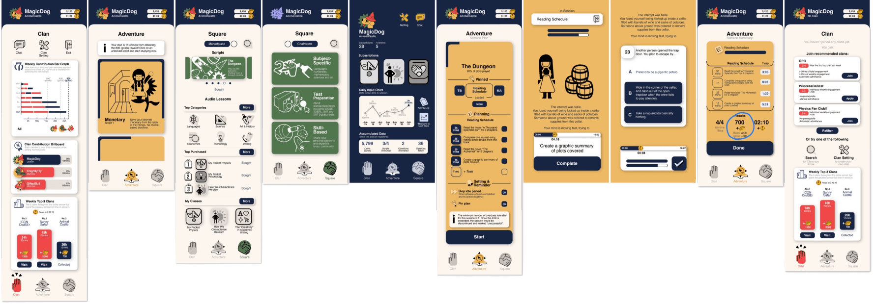
In my first iteration, I experimented with various color palettes, eventually settling on one featuring vibrant primary colors to suggest interactivity among design components.
Iteration 2
November 7th, 2020
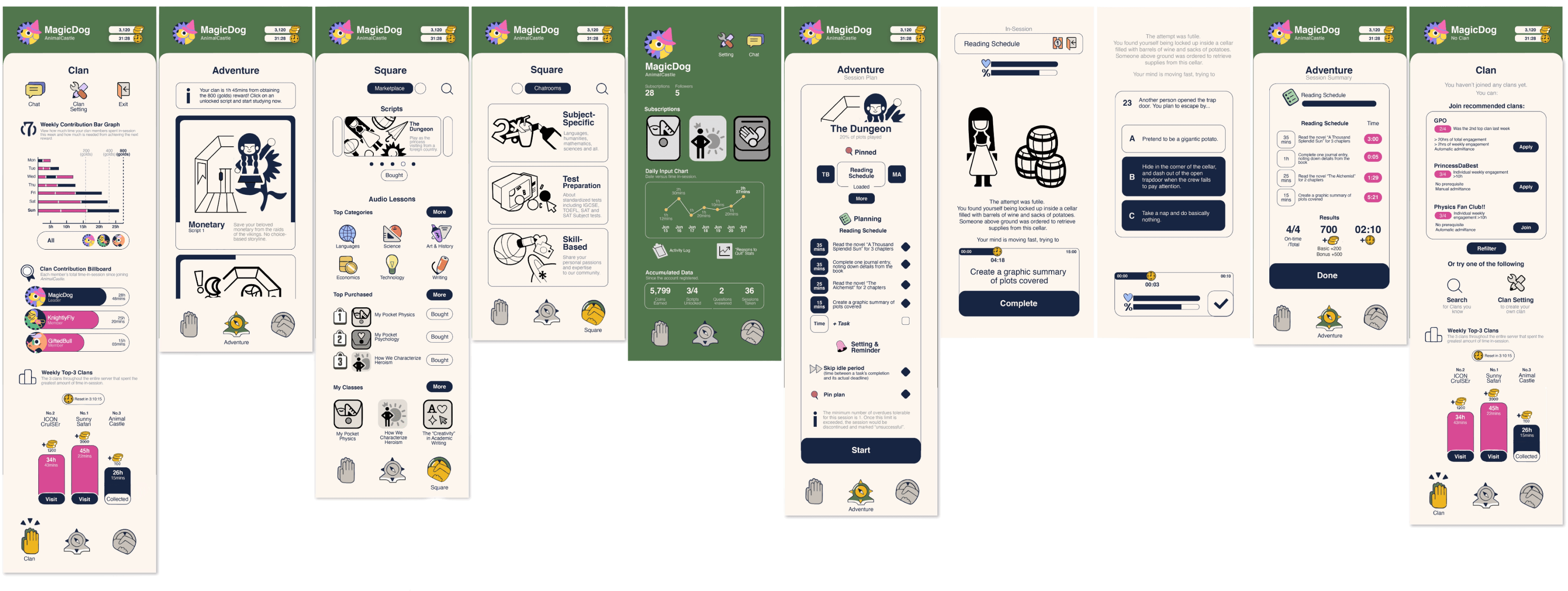
Lack of color hierarchy
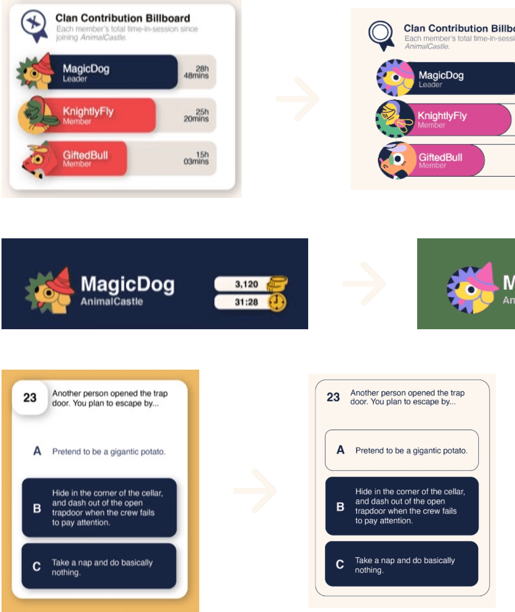
Upon reflection, I realized that the initial design's overuse of strong, vibrant colors and switch-up between light and dark texts reduced the app’s clarity and undermined longer texts’ readability. I transitioned to a more subdued, ivory-white-based palette to create a cleaner, more user-friendly interface.
In the first version, the same blue was used for both buttons and the background, blurring the distinction between interactive and non-interactive elements. In this iteration, I reserved blue strictly for interactive components.
Removed unnecessary spatial depth
Previously, I applied shadows to all panels and cards to differentiate them from the background, but this created an unnatural separation. In this iteration, I relied on the updated color scheme and added subtle strokes as borders to define these elements more naturally.
Iteration 3
July 9th, 2021

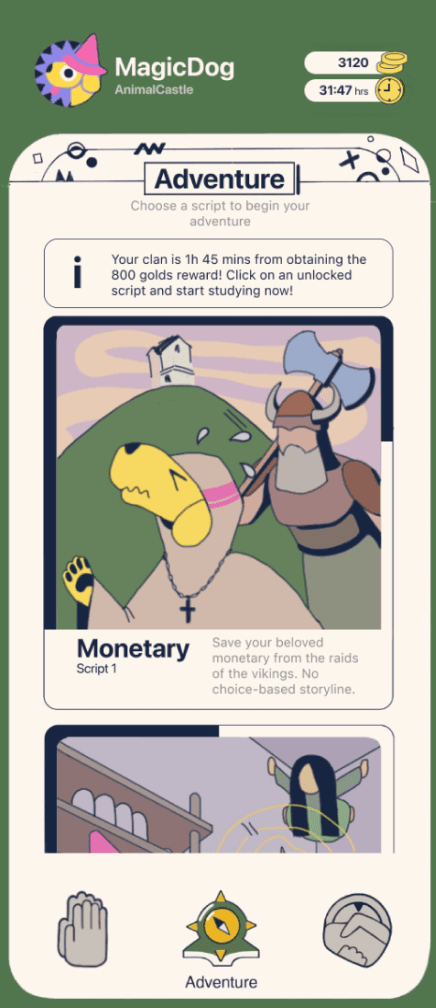

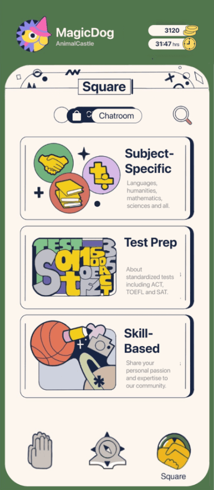
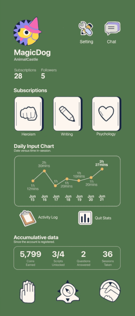

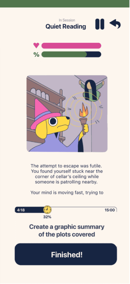


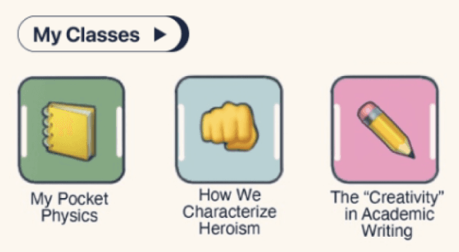
New colors + incorporated emoji
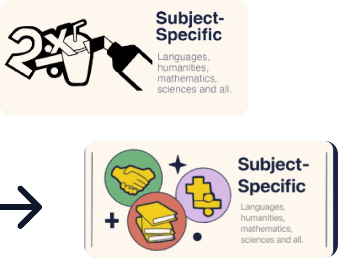
Enhancing visual appeal and personality
I added decorative patterns to the top of design frames to fill empty space and bring more personality to the interface.
To better align with the playful, polished nature of the app, I reduced stroke weight and introduced fill colors to previously monochromatic graphics and illustrations. I initially avoided using too many hues, but seeing how adding colors of the same value and saturation to the color scheme could improve the diversity
Iteration 4
Oct 30th, 2021
Adapting for mobile compatibility
Upon previewing the design in Figma, I realized the original version wasn’t phone-friendly. Icon clickable areas were too large, and I had to replace some icons with SF symbols due to their complexity when resized. Using the mobile version of Figma to test usability on the go was a helpful practice.
I also adjusted the layout to better fit the iPhone screen by integrating a status bar and home indicator for more seamless navigation.

Improving visual hierarchy and space efficiency
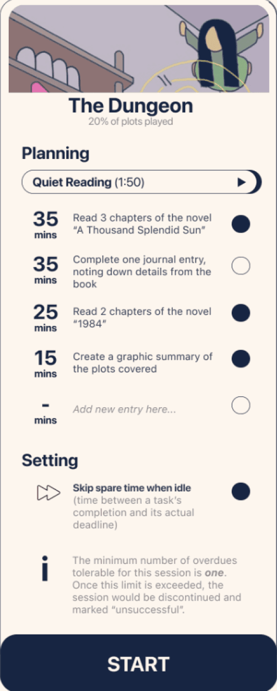
1) Upon realizing that adjusting opacity through my experimentations would strengthen structural hierarchy without compromising visual coherency, I applied reduced opacity to background panels, allowing them to blend in and not compete for attention.
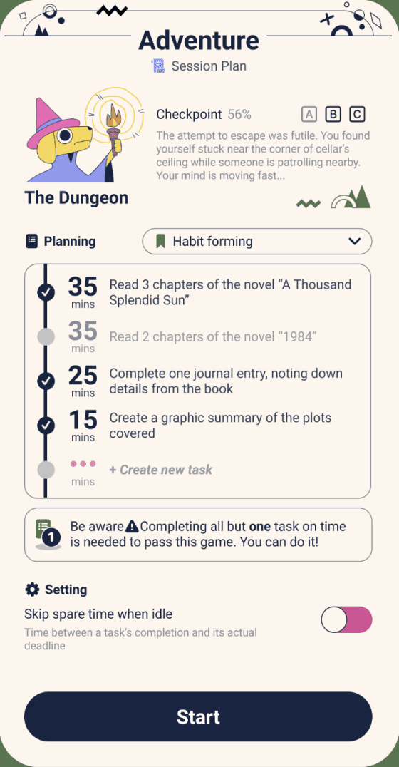
2) Panels such as "Session Plan" is evidence of how I significantly improved space efficiency throughout my current prototype. Despite adding more information, the panel now occupies less space than previous versions.

4)Integrating AI-generated story scripts
With the inclusion of AI-generated story scripts, I removed the progress bar from the story card, as the story can now be continuously updated without a finite structure. Instead, the app now highlights the time invested and the choices made by the user.
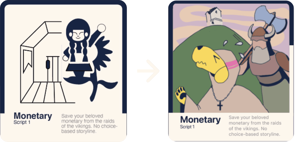
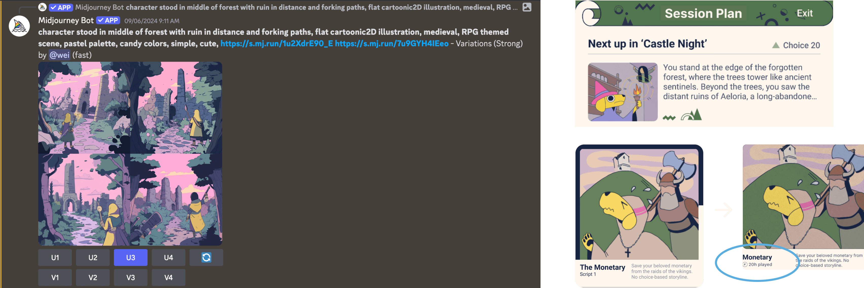
Additionally, I integrated AI tools like Midjourney to generate thumbnail images for each story segment. I trained the AI using two existing illustrations I drew myself to maintain visual coherence as the story evolves.
5)Adding creative touches to graphic design
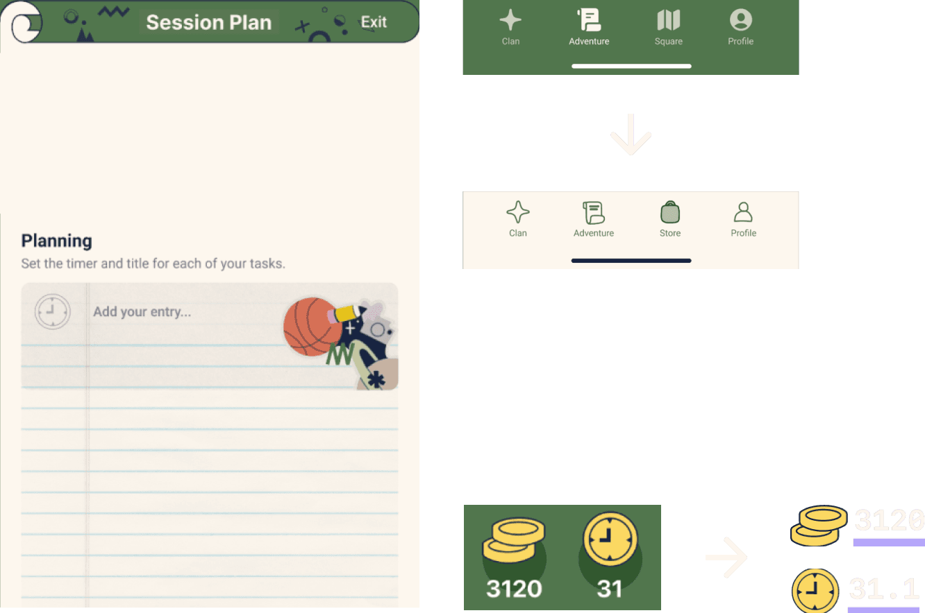
I added a notepaper texture overlay where users add task entries, giving the interface a more personal and homely feel.
The rigid SF symbols were replaced with hand-drawn, traced icons using the pencil tool in Figma, creating a softer, more organic aesthetic to align with the app’s creative and personalized vibe.
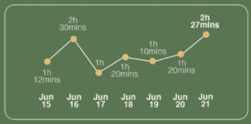
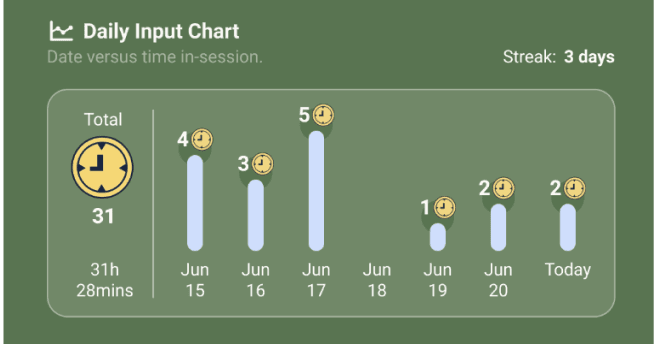
Statistical displays for time and coins were updated to prioritize the actual numbers over icons, ensuring users focus on key information.
3)Reducing on-screen distractions in focus mode
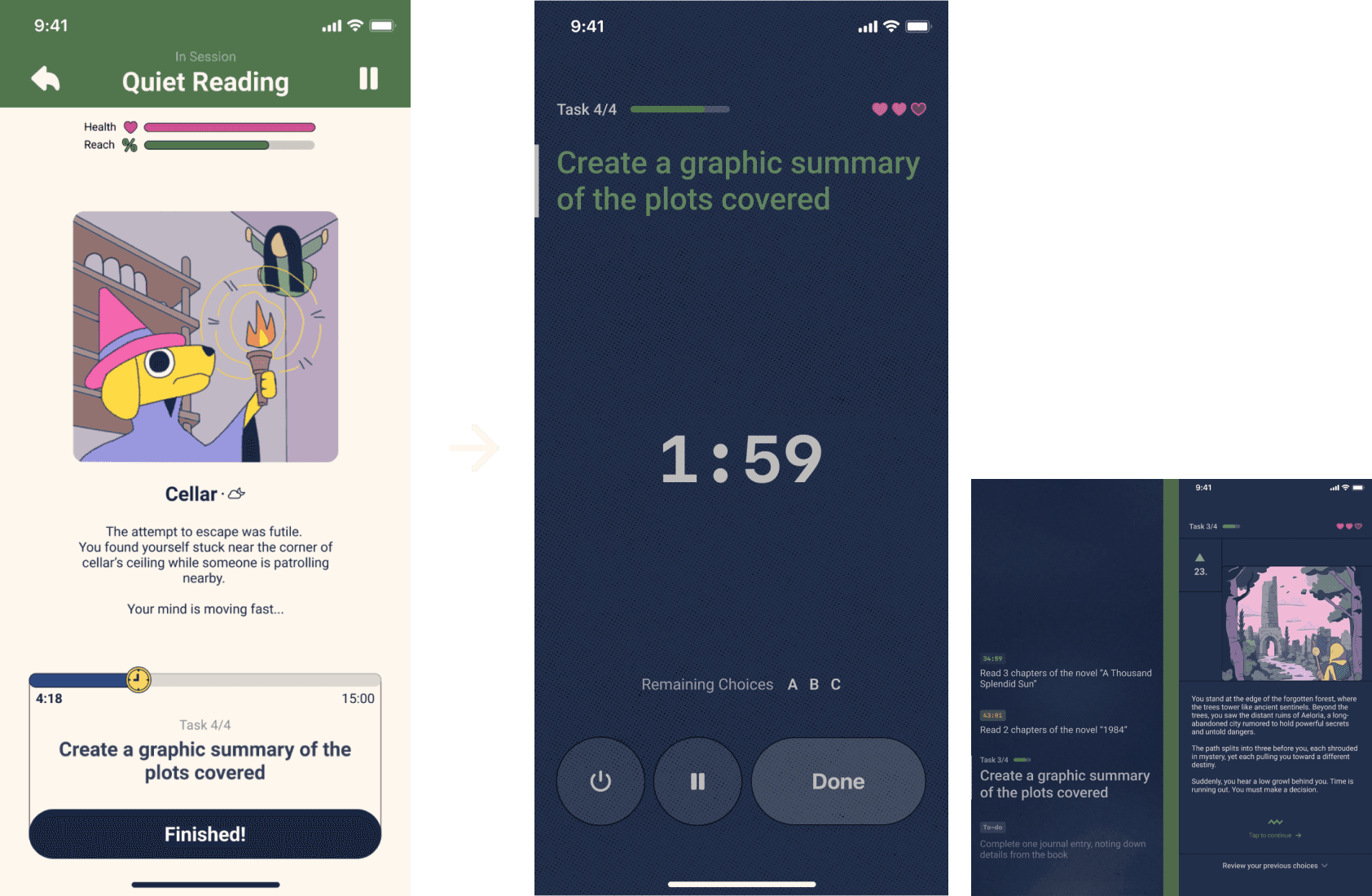
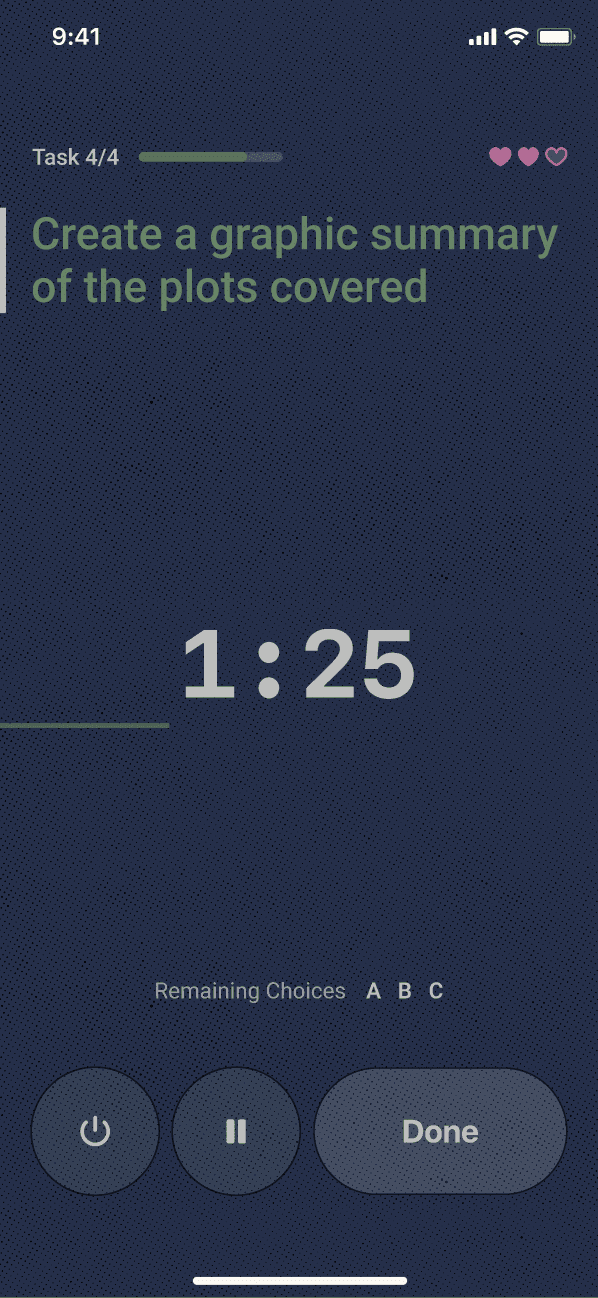
To reduce distraction, I redesigned the focus mode screen into a dashboard. I prioritized interactive elements like buttons by arranging them in a single row instead of scattering them across the screen.
The animated timer was also given priority, and I moved content related to the ongoing story to a separate interface, preserving the story’s role as a relaxing intermission between tasks.
Iteration 5
Sep 5th, 2024
New
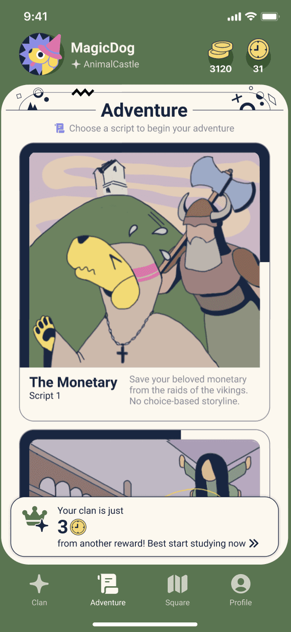
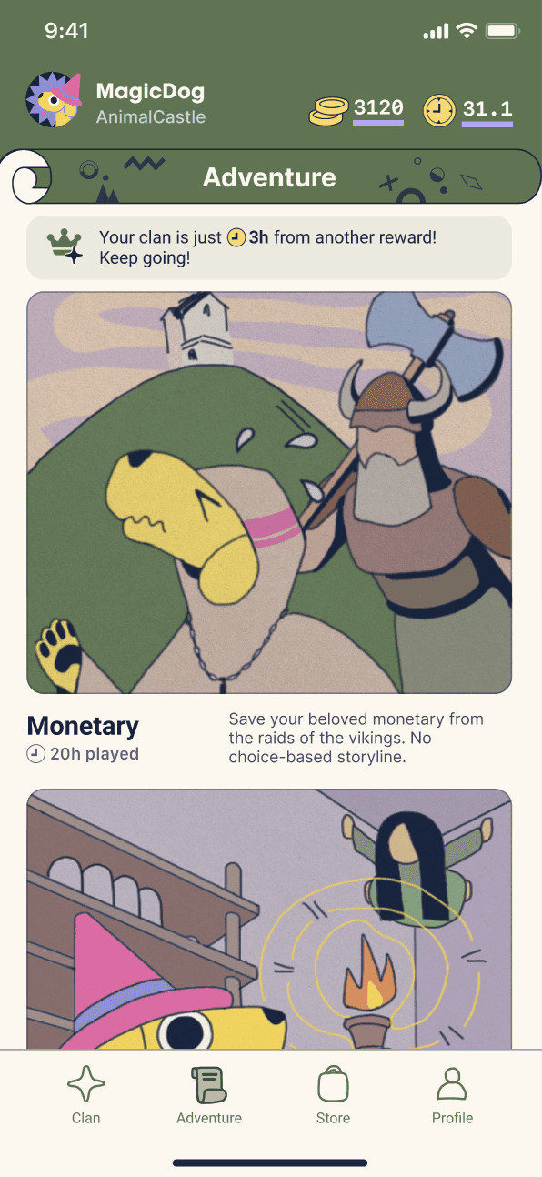
1)In this iteration, I focused on balancing modernity and airiness with bold, expressive design elements.
Expanding viewport and enhancing storytelling
To accommodate more scrollable content, I reduced the size of the page header. I replaced the poker card motif with a parchment scroll design, which echoes the app’s story-writing mechanism during focus sessions. I also removed the rounded corners at the bottom of the page to alleviate a sense of confinement, giving the design a more open feel.
Simplifying usability
I replaced the bottom toaster notification on the homepage. As users only need to see the message once, the floating property becomes redundant.
Optimizing visual emphasis
I decreased the horizontal padding between the thumbnail posters and the screen margin, putting more emphasis on the graphics and creating a more immersive visual experience.
x 3
2)Light & dark mode switch-up
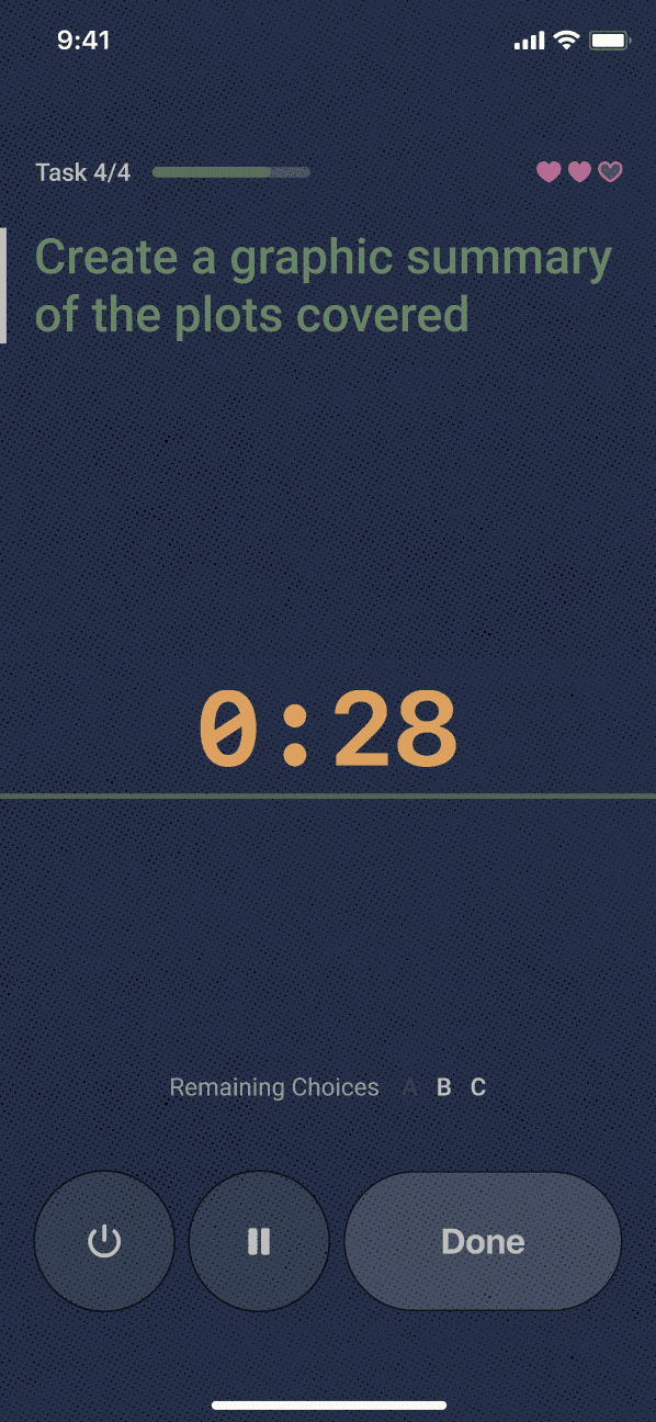
Instead of sticking solely to a light mode (ivory color palette), I realized that users may keep their devices open during study sessions to monitor tasks and time. In darker environments, the light mode could become a distraction. To resolve this, I redesigned all focus session screens with a dark blue background and ivory-colored text, minimizing visual distractions and improving usability in low-light settings.

V5: Scroll header design
V4: Header
V4: Bottom toaster


+

Reduced horizontal padding
Benefits of prototyping
I regret not creating an animated prototype or play-testing UI screenshots on my phone earlier in the process. Doing so would have helped me catch usability issues like button placement and responsiveness much sooner. By waiting until the final iteration to test, I missed chances for earlier refinements that could have led to a smoother user experience from the start.
In addition, the “variable” function from Figma really helped me with prototyping animated features such as the stretching progress bar and the changing timer digits. They perfectly illustrated the visualization I would like to achieve with the final product.
Adapting text-generation to comic generation
After discussing with my friend Jane, I realized that the text-generating feature could be adapted into comic generation. Middle school students, especially those looking to improve their learning skills, might find it difficult to engage with long paragraphs of text after focusing on their tasks. While reading serves as a form of relaxation between task intermissions, a comic format could be more visually engaging and memorable. By allowing users to choose character appearances, dialogs, and movements, the narrative experience could become more interactive and appealing.
Expanding story customization beyond the protagonist
Jane also inspired me to rethink how plot decisions are presented. Up until now, I assumed the focus would always be on what the protagonist does next. But what if users could become the designers of the story itself, choosing which parts of the comic they want to change? For example, by clicking on a specific area of the comic strip, they could select from a list of options for different plot elements. This approach would offer users greater creative freedom, letting them influence various aspects of the story beyond just the protagonist’s actions. These are options worth exploring in future product development stages.
Wishes
↓ Scroll down for more


The Adventurer’s Scroll
Gamified task management for middle school students

Nicole Wei
Best
UI / UX
Graphic
Fine arts
Summary
The Adventurer’s Scroll is a gamified productivity app designed specifically for middle school students. It motivates learning and task completion by transforming users' personal goals into an AI-powered, interactive litRPG (literary role-playing game) adventure. Through pomodoro-style focus sessions, users embark on a unique journey where they shape their own epic—or humorously absurd—tale.
The app's development began in April 2020, with the first high-fidelity prototype completed by September of that year. Since then, the app has undergone 5 major iterations, significantly enhancing its UI design, usability, and overall functionality (detailed development timeline available). The integration of AI, which automates the generation of multi-branched storylines, has been a crucial advancement. The next phase of development focuses on product deployment and recruiting mobile app developers to bring this project to life.
Problem
Students struggle to develop intrinsic motivation for learning due to the overwhelming pressure to meet academic expectations, leading to disengagement and reduced productivity.
Middle school students are particularly vulnerable to academic anxiety. They face pressure to overachieve under unrealistic expectations, are subjected to standardized systems that often overlook individual circumstances, and, as adolescents, are naturally more prone to stress and a sense of cognitive overwhelm. This external pressure, combined with feedback systems that downgrade “mediocrity” to anonymity, often stifles genuine passion for learning—the very intrinsic motivation that could drive long-term success.
Traditional productivity tools tend to be too rigid, failing to capture the attention and imagination of students in this age group. These methods also lack personalized incentives and creative freedom—key motivators for younger audiences. What students need is a dynamic, engaging way to visualize progress and stay invested in their tasks.
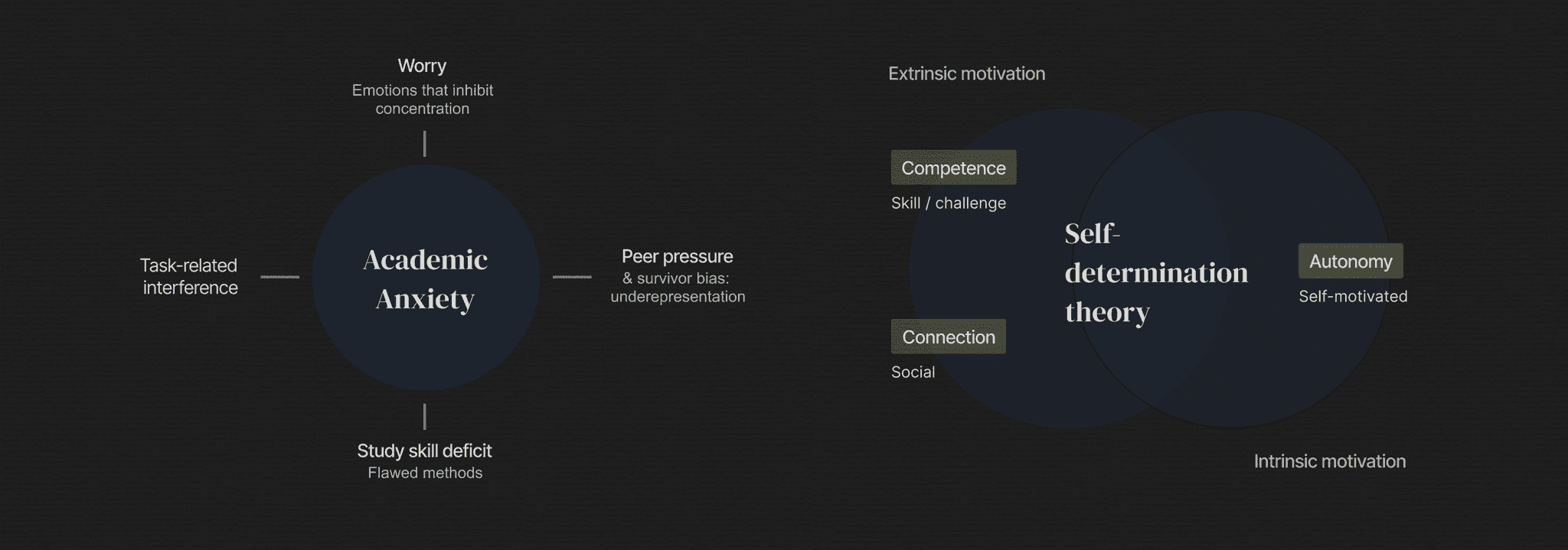

Hypothetically, The Adventurer’s Scroll aims to address these challenges by offering a gamified productivity experience that transforms routine tasks into a personal, evolving story. By mapping users’ self-defined goals into a branching narrative, the app not only structures focus sessions but also provides creative incentives that appeal to students’ desire for adventure and autonomy. This approach fosters intrinsic motivation and healthy long-term study habits, promoting both engagement and resilience in learning.


Prototype Overview (V5)
Prototype Overview (V5)
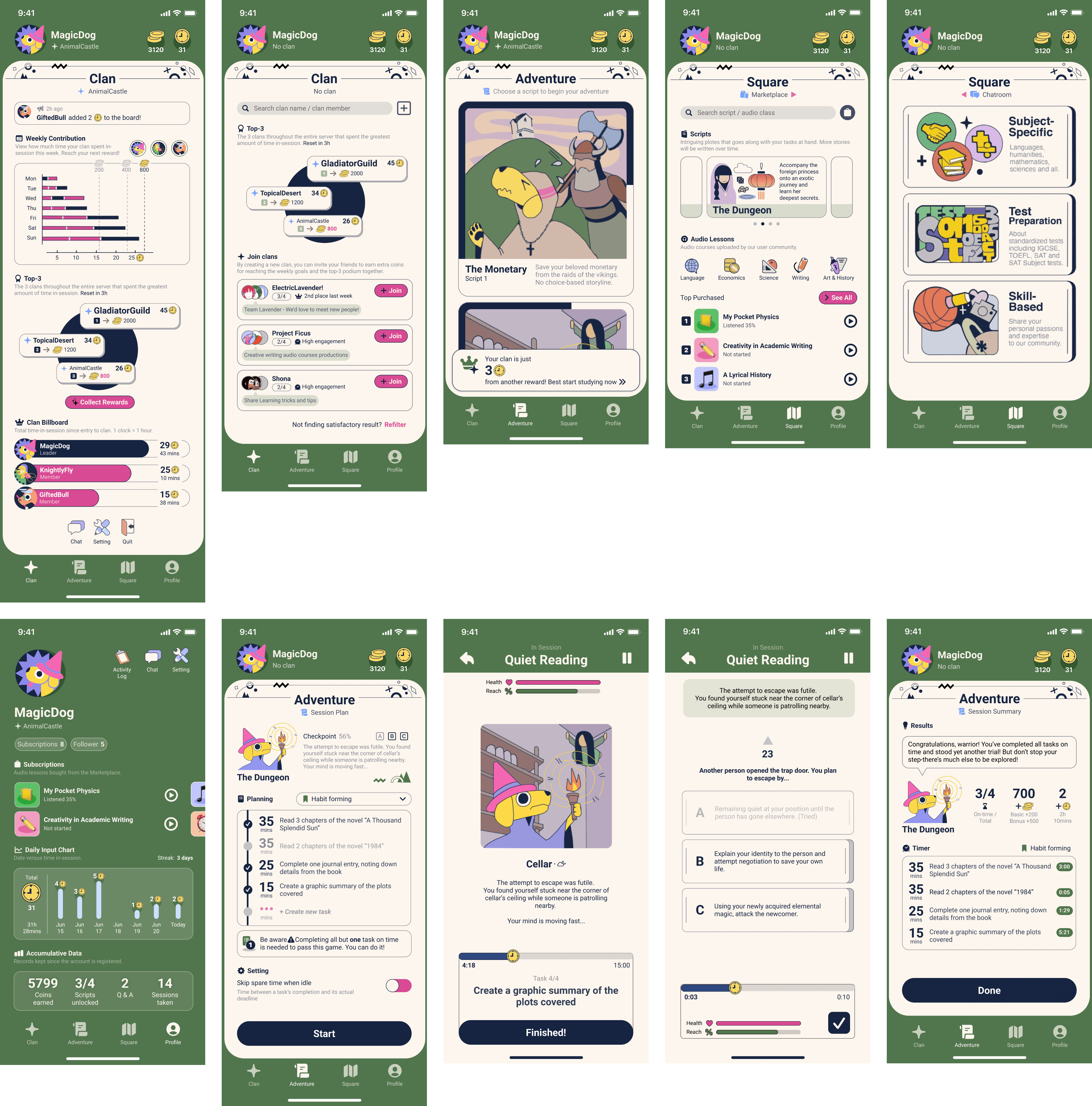
Alike its tab bar, the app can be broken down into 4 main sections:
Adventure
Store
Clan
Profile
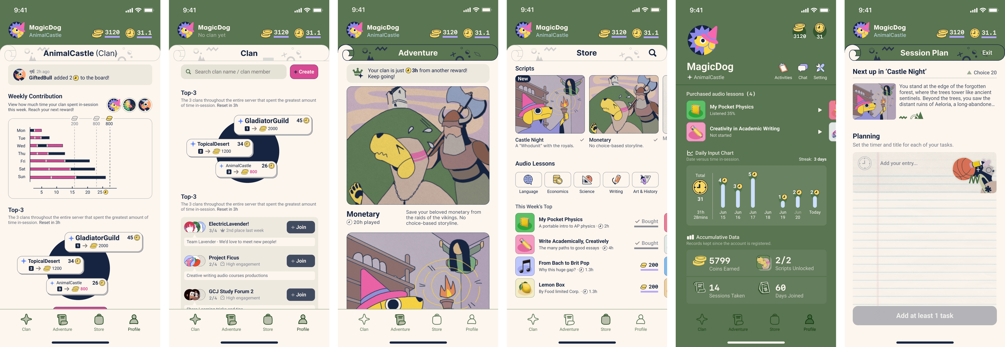


Alike its tab bar, the app can be broken down into 4 main sections:
Adventure
Store
Clan
Profile
1. Adventure
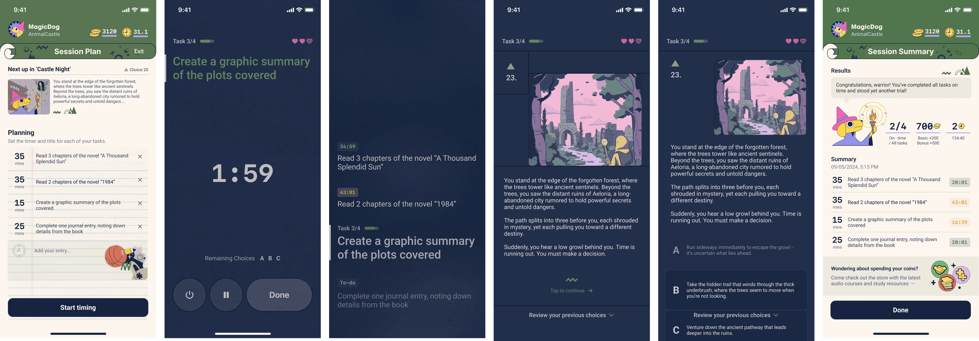
Users begin a timed focus session, and during the breaks between completed tasks, they are presented with a new segment of their ongoing story. They then make a multiple-choice decision on how the adventure should continue.
Over time, by making more plot decisions, users craft their own dynamic, branching narrative—becoming composers of their own adventure, much like the bards of Medieval times.
①
Planning stage
Choose script from homepage

Add task entry

Edit tasks

②
In-session: focus mode
Task dashboard

Agenda summary

③
Story choices & summary
Selecting story option

Session summary

Congratulations page

2. Store
The coins earned from focus sessions could be exchanged for new script slots and online learning resources such as audio classes.
3. Clan
Users can form or join 4-people groups to compete for weekly achievements and rewards.

Clan (not joined)

Clan (joined)

Profile
Full Prototype
↓ Click to visit the full interactive prototype in Figma
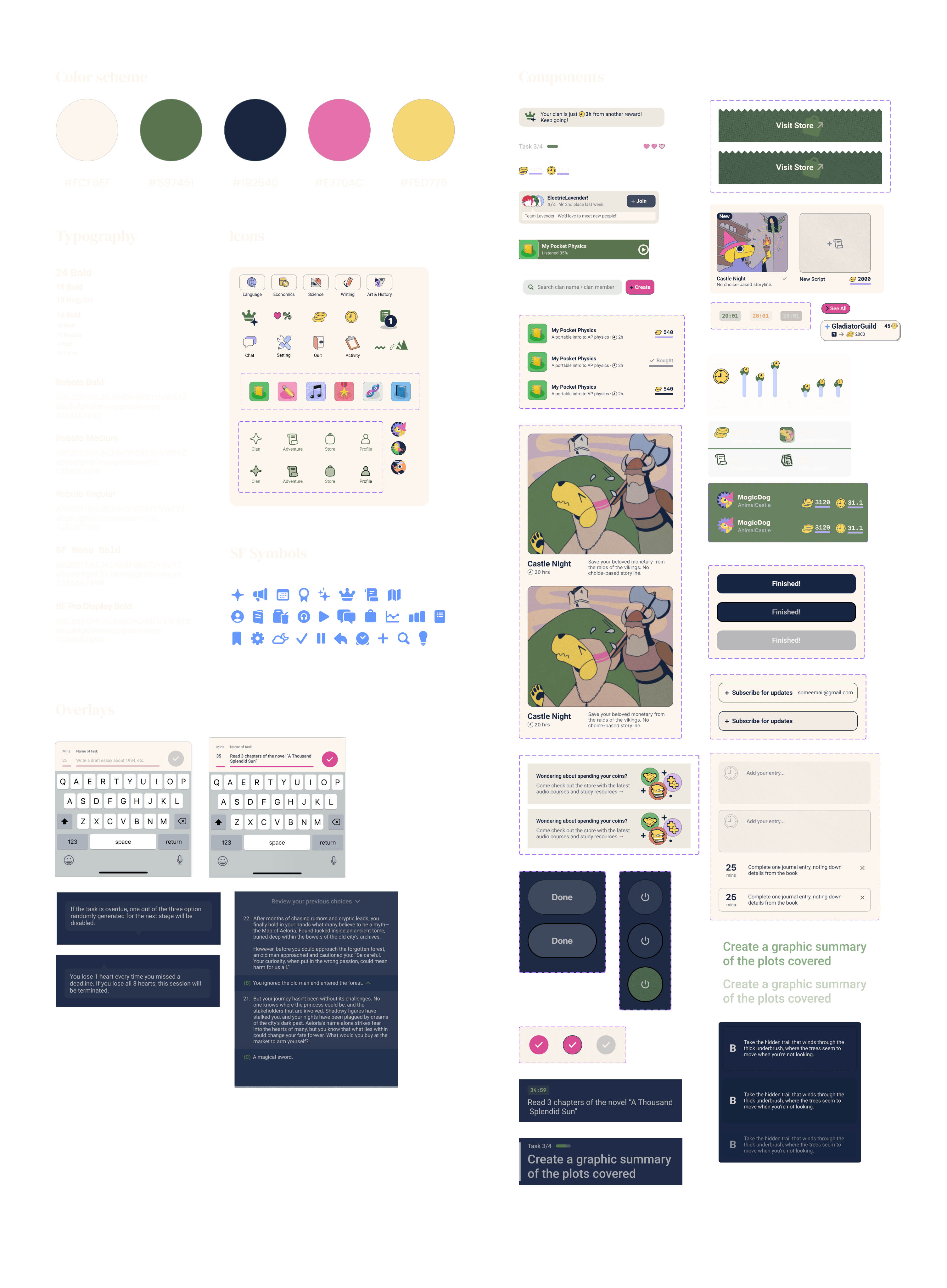
Design System
↓ Scroll down for more


Iterations 1-5
Sample Overview






Details
Iteration 1
September 13th, 2020
(Scroll to see full frame ➜)


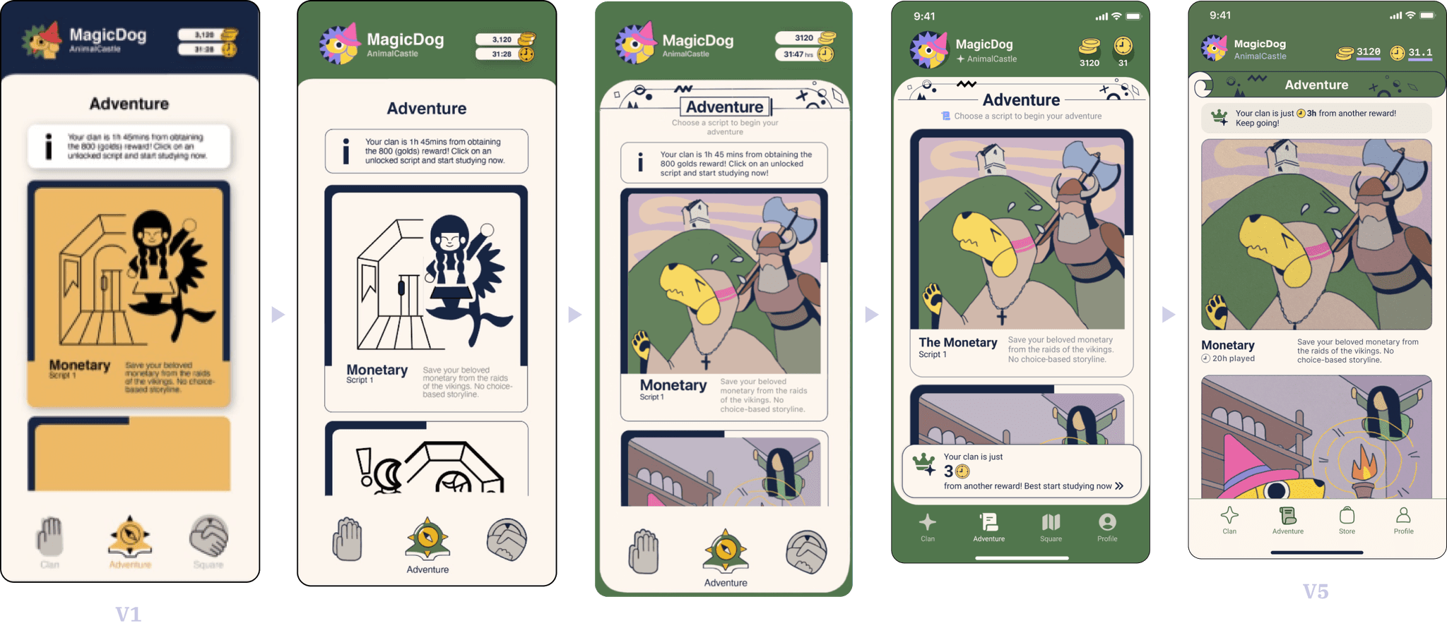
In my first iteration, I experimented with various color palettes, eventually settling on one featuring vibrant primary colors to suggest interactivity among design components.
In my first iteration, I experimented with various color palettes, eventually settling on one featuring vibrant primary colors to suggest interactivity among design components.
Iteration 2
November 7th, 2020
(Scroll to see full frame ➜)


Lack of color hierarchy
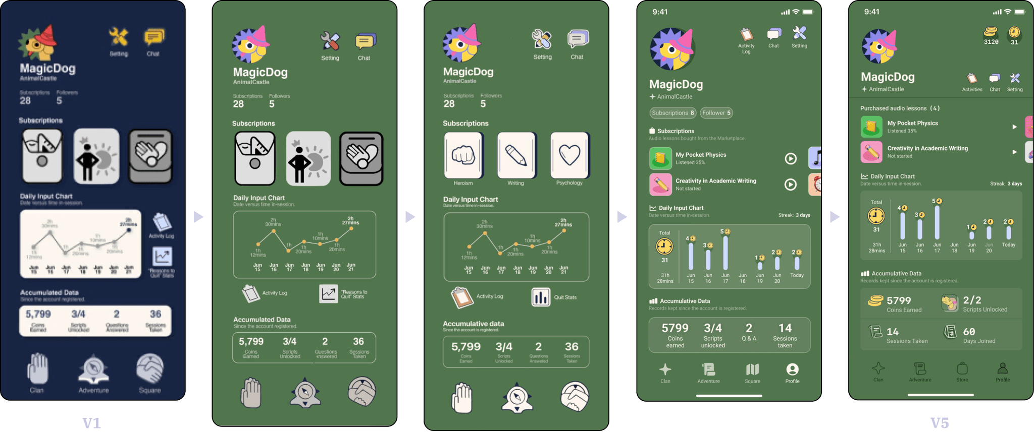
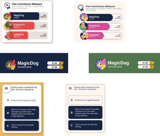
Upon reflection, I realized that the initial design's overuse of strong, vibrant colors and switch-up between light and dark texts reduced the app’s clarity and undermined longer texts’ readability. I transitioned to a more subdued, ivory-white-based palette to create a cleaner, more user-friendly interface.
In the first version, the same blue was used for both buttons and the background, blurring the distinction between interactive and non-interactive elements. In this iteration, I reserved blue strictly for interactive components.
Removed unnecessary spatial depth
Previously, I applied shadows to all panels and cards to differentiate them from the background, but this created an unnatural separation. In this iteration, I relied on the updated color scheme and added subtle strokes as borders to define these elements more naturally.

Iteration 3
July 9th, 2021
(Scroll to see full frame ➜)


New colors + incorporated emoji

Enhancing visual appeal and personality
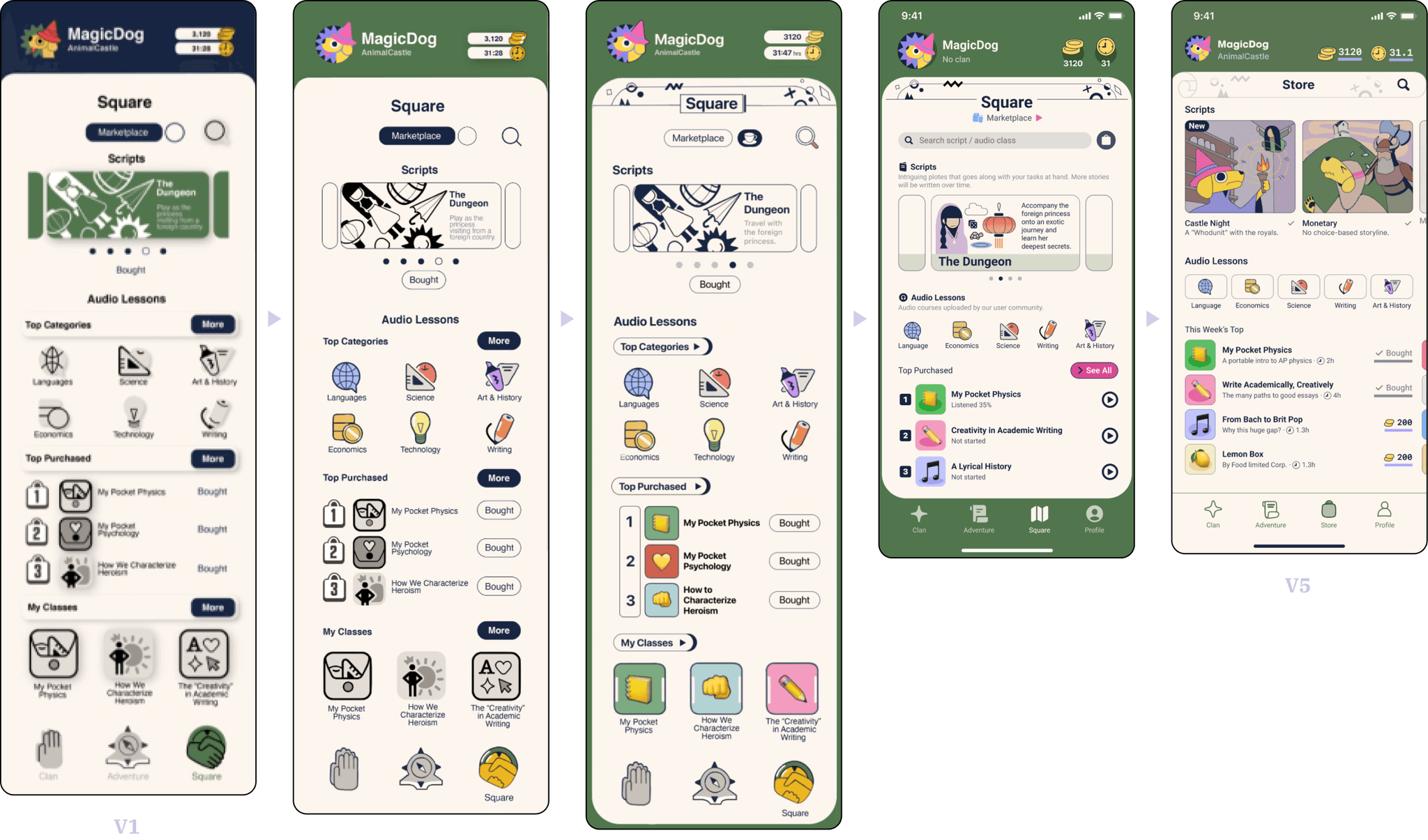
I added decorative patterns to the top of design frames to fill empty space and bring more personality to the interface.
I initially avoided using too many hues, but seeing how adding colors of the same value and saturation to the color scheme could improve the diversity, I reduced stroke weight and introduced fill colors to previously monochromatic graphics and illustrations to better align with the playful, polished nature of the app.
Iteration 4
Oct 30th, 2021


Adapting for mobile compatibility
Upon previewing the design in Figma, I realized the original version wasn’t phone-friendly. Icon clickable areas were too large, and I had to replace some icons with SF symbols due to their complexity when resized. Using the mobile version of Figma to test usability on the go was a helpful practice.
I also adjusted the layout to better fit the iPhone screen by integrating a status bar and home indicator for more seamless navigation.

Improving visual hierarchy and space efficiency
1) Upon realizing that adjusting opacity through my experimentations would strengthen structural hierarchy without compromising visual coherency, I applied reduced opacity to background panels, allowing them to blend in and not compete for attention.





2) Panels such as "Session Plan" is evidence of how I significantly improved space efficiency throughout my current prototype. Despite adding more information, the panel now occupies less space than previous versions.


V5: Scroll header design
V4: Header
V4: Bottom toaster


+

Reduced horizontal padding


4)Integrating AI-generated story scripts
With the inclusion of AI-generated story scripts, I removed the progress bar from the story card, as the story can now be continuously updated without a finite structure. Instead, the app now highlights the time invested and the choices made by the user.
Additionally, I integrated AI tools like Midjourney to generate thumbnail images for each story segment. I trained the AI using two existing illustrations I drew myself to maintain visual coherence as the story evolves.
5)Adding creative touches to graphic design
I added a notepaper texture overlay where users add task entries, giving the interface a more personal and homely feel.
The rigid SF symbols were replaced with hand-drawn, traced icons using the pencil tool in Figma, creating a softer, more organic aesthetic to align with the app’s creative and personalized vibe.
Statistical displays for time and coins were updated to prioritize the actual numbers over icons, ensuring users focus on key information.
3)Reducing on-screen distractions in focus mode
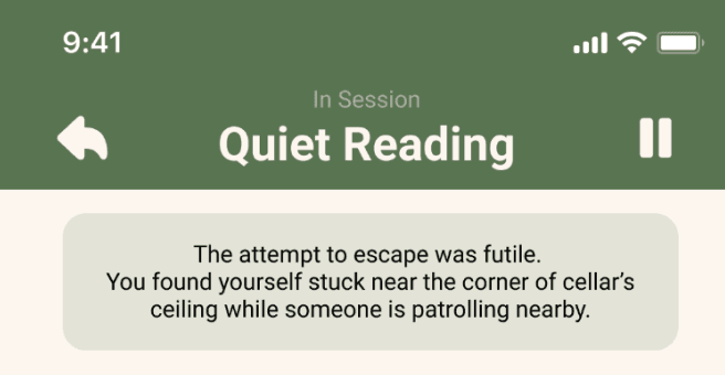
To reduce distraction, I redesigned the focus mode screen into a dashboard. I prioritized interactive elements like buttons by arranging them in a single row instead of scattering them across the screen.
The animated timer was also given priority, and I moved content related to the ongoing story to a separate interface, preserving the story’s role as a relaxing intermission between tasks.
Iteration 5
Sep 5th, 2024
New
1)In this iteration, I focused on balancing modernity and airiness with bold, expressive design elements.
Expanding viewport and enhancing storytelling
Expanding viewport and enhancing storytelling
To accommodate more scrollable content, I reduced the size of the page header. I replaced the poker card motif with a parchment scroll design, which echoes the app’s story-writing mechanism during focus sessions. I also removed the rounded corners at the bottom of the page to alleviate a sense of confinement, giving the design a more open feel.
Simplifying usability
Simplifying usability
I replaced the bottom toaster notification on the homepage. As users only need to see the message once, the floating property becomes redundant.
Optimizing visual emphasis
Optimizing visual emphasis
I decreased the horizontal padding between the thumbnail posters and the screen margin, putting more emphasis on the graphics and creating a more immersive visual experience.


x 3
x 3
2)Light & dark mode switch-up
Instead of sticking solely to a light mode (ivory color palette), I realized that users may keep their devices open during study sessions to monitor tasks and time. In darker environments, the light mode could become a distraction. To resolve this, I redesigned all focus session screens with a dark blue background and ivory-colored text, minimizing visual distractions and improving usability in low-light settings.


Wishes
Benefits of prototyping
I regret not creating an animated prototype or play-testing UI screenshots on my phone earlier in the process. Doing so would have helped me catch usability issues like button placement and responsiveness much sooner. By waiting until the final iteration to test, I missed chances for earlier refinements that could have led to a smoother user experience from the start.
In addition, the “variable” function from Figma really helped me with prototyping animated features such as the stretching progress bar and the changing timer digits. They perfectly illustrated the visualization I would like to achieve with the final product.


Adapting text-generation to comic generation
After discussing with my friend Jane, I realized that the text-generating feature could be adapted into comic generation. Middle school students, especially those looking to improve their learning skills, might find it difficult to engage with long paragraphs of text after focusing on their tasks. While reading serves as a form of relaxation between task intermissions, a comic format could be more visually engaging and memorable. By allowing users to choose character appearances, dialogs, and movements, the narrative experience could become more interactive and appealing.
Expanding story customization beyond the protagonist
Jane also inspired me to rethink how plot decisions are presented. Up until now, I assumed the focus would always be on what the protagonist does next. But what if users could become the designers of the story itself, choosing which parts of the comic they want to change? For example, by clicking on a specific area of the comic strip, they could select from a list of options for different plot elements. This approach would offer users greater creative freedom, letting them influence various aspects of the story beyond just the protagonist’s actions. These are options worth exploring in future product development stages.

Nicole Wei
Please check out the laptop / tablet version for the full case study
The Adventurer’s Scroll
The
Adventurer’s
Scroll


