


Timeline
Timeline
MVP development: Feb - Aug 2023
Prototype updated Sep 2024
MVP development:
Feb - Aug 2023
Prototype updated Sep 2024
Results
Results
5000+ visits
1000+ new user registrations
Collaborators
Collaborators
Dino.labs (Product manager, engineers, marketing)
My role
My role
Sole designer for landing page & web app MVP UI, graphic design
Tool
Tool
Figma
dino.live
dino.live
Onboarding Attendees for Networking Events in Web3
Onboarding Attendees for Networking Events in Web3


Dino.labs (Product manager, engineers, marketing)
Collaborators
MVP development: Feb - Aug 2023
Prototype updated Sep 2024
Timeline
Sole designer for landing page & web app MVP UI, graphic design
My role
Tool
Figma
Nicole Wei
Please check out the laptop / tablet version for the full case study
Summary
Dino.live is an innovative online event platform designed to elevate engagement for both event hosts and attendees in the Web3 career space. Utilizing cutting-edge, crypto-backed technologies like token-gating and E-Token rewards, Dino empowers event managers to deliver branded, high-quality experiences that promote meaningful connections among participants.
I led the end-to-end UI design for Dino’s landing page and web app interface, marking my first significant role in a commercial, cross-functional project. In collaboration with the product and engineering teams, I iterated on high-fidelity prototypes and managed a comprehensive design system that balanced user needs with technical requirements. This resulted in the successful deployment of Dino’s MVP in August 2023, which was immediately applied during Dino's own sponsorship events.
As the sole designer in a fast-paced startup environment, I was also responsible for shaping the brand’s aesthetic across marketing materials, ultimately defining Dino’s playful, techno-inspired visual identity.
Problem
In the Web3 space, there was no efficient platform for aggregating major event series. Event organizers and participants relied on fragmented spreadsheets that were neither comprehensive nor user-friendly. Additionally, event hosts were missing opportunities to leverage crypto technologies, such as using NFTs for community building and identity verification. This highlighted a need for a streamlined solution to increase event visibility and incorporate Web3 tools for better engagement.
Prototype Overview (v4)


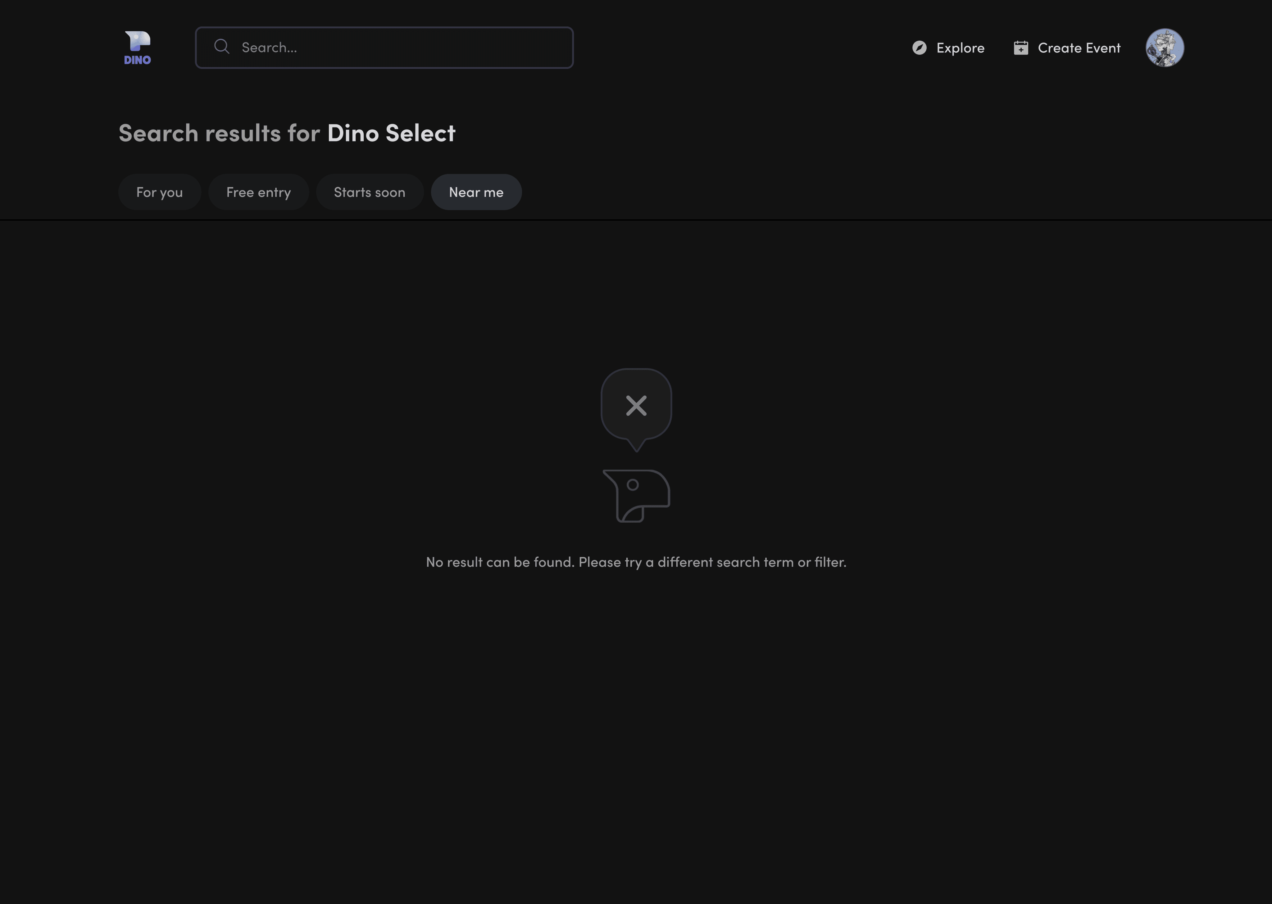
Event Browsing
Event Browsing
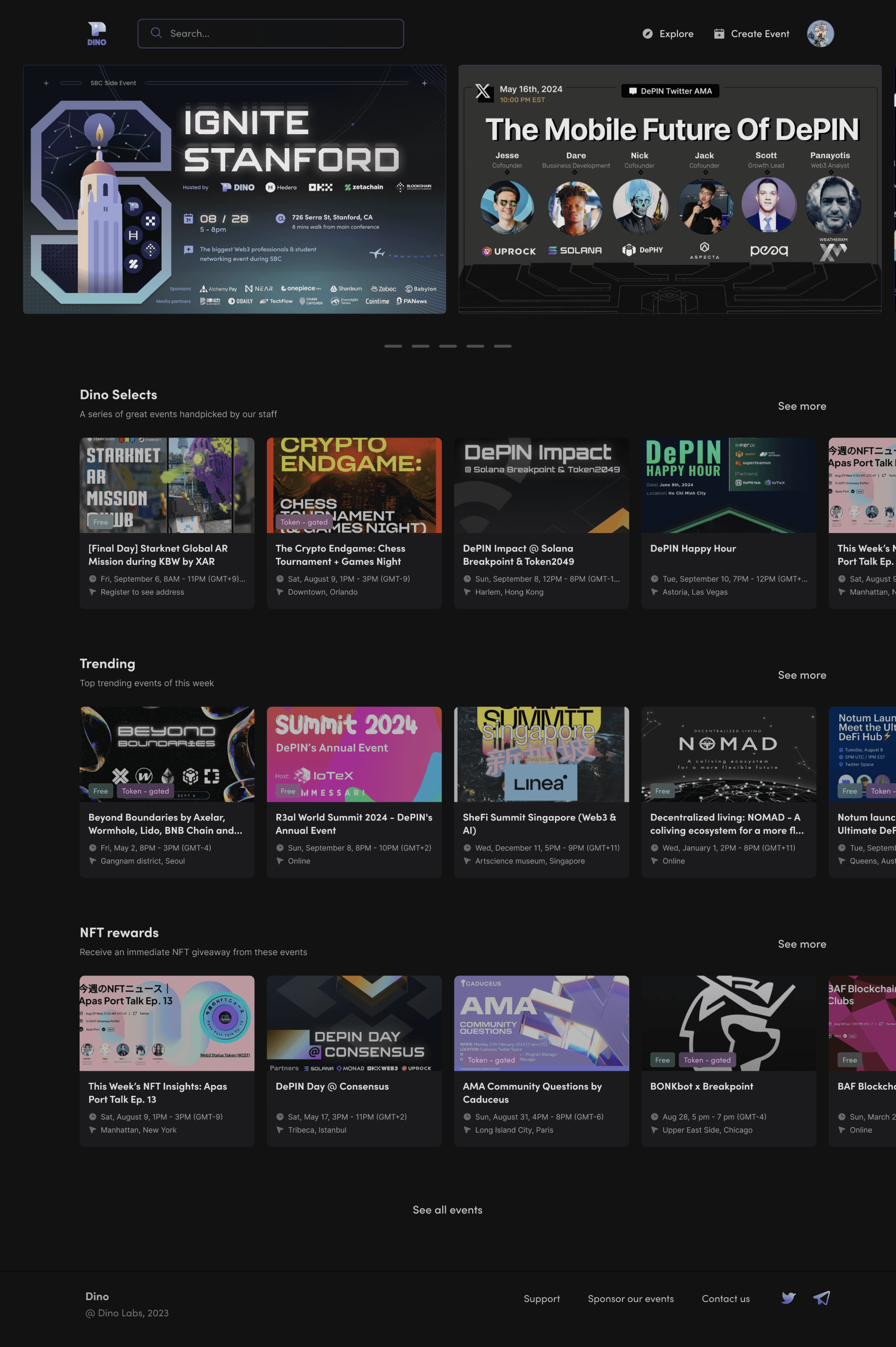
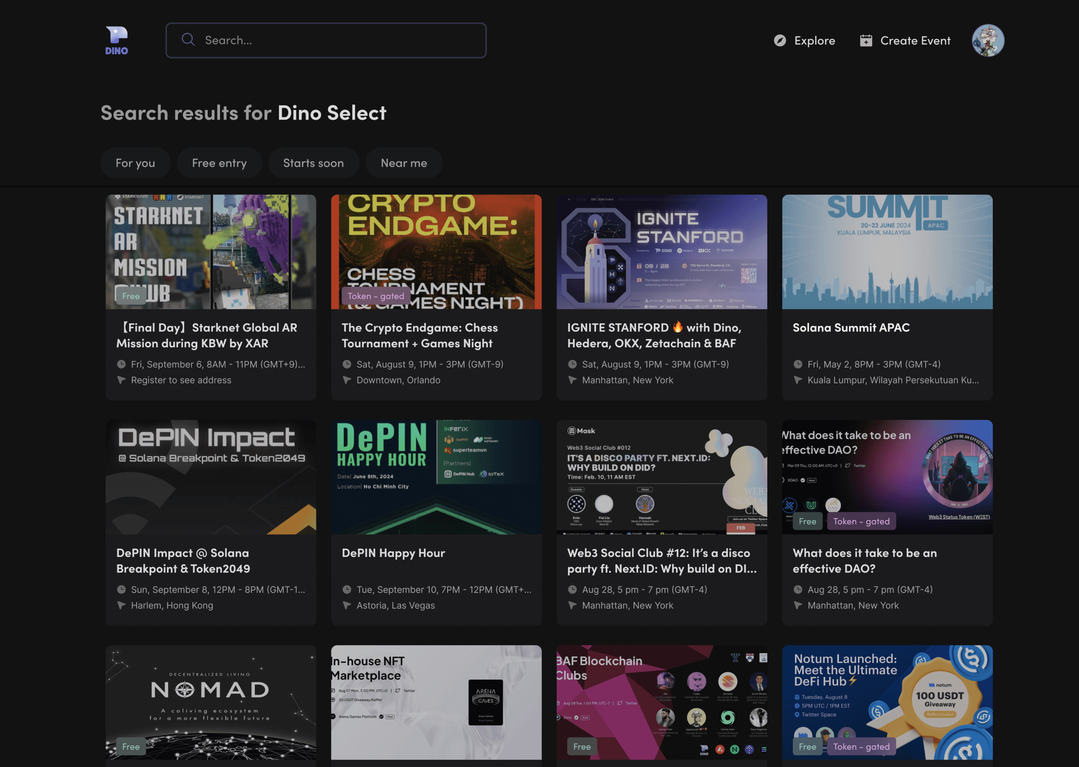
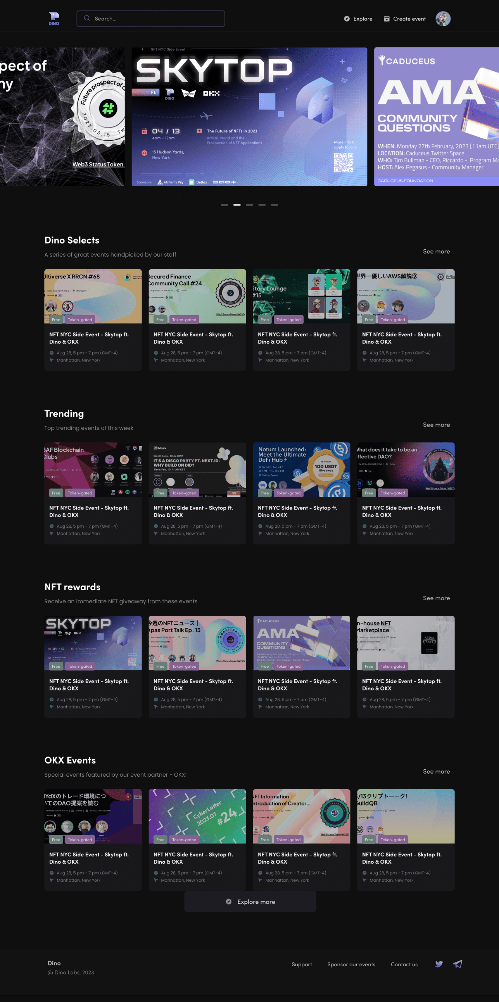
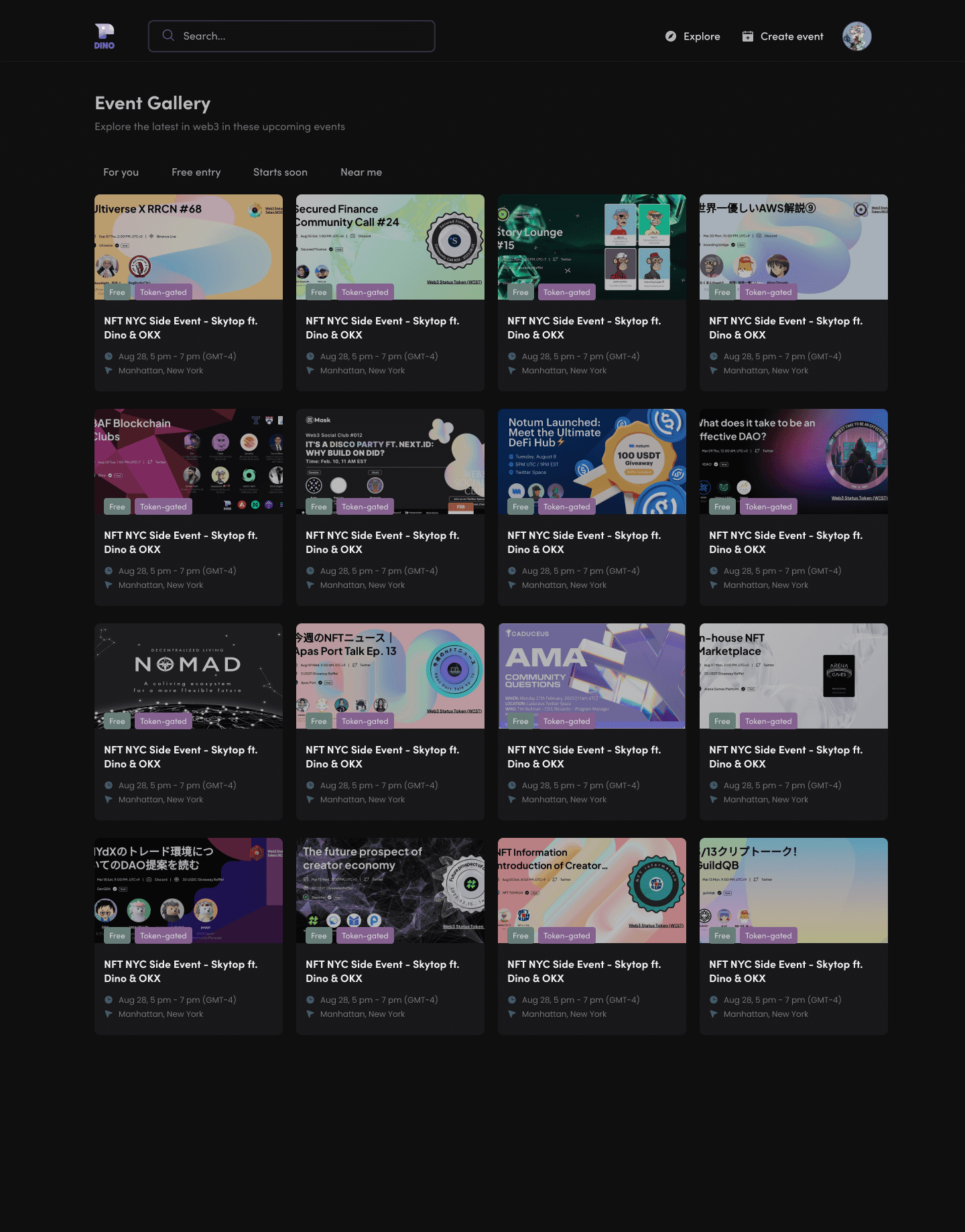
Browse upcoming events based on homepage categories & tags.
Browse upcoming events based on homepage categories & tags.

(↓ Scroll to preview full frame)


Event Sign-up
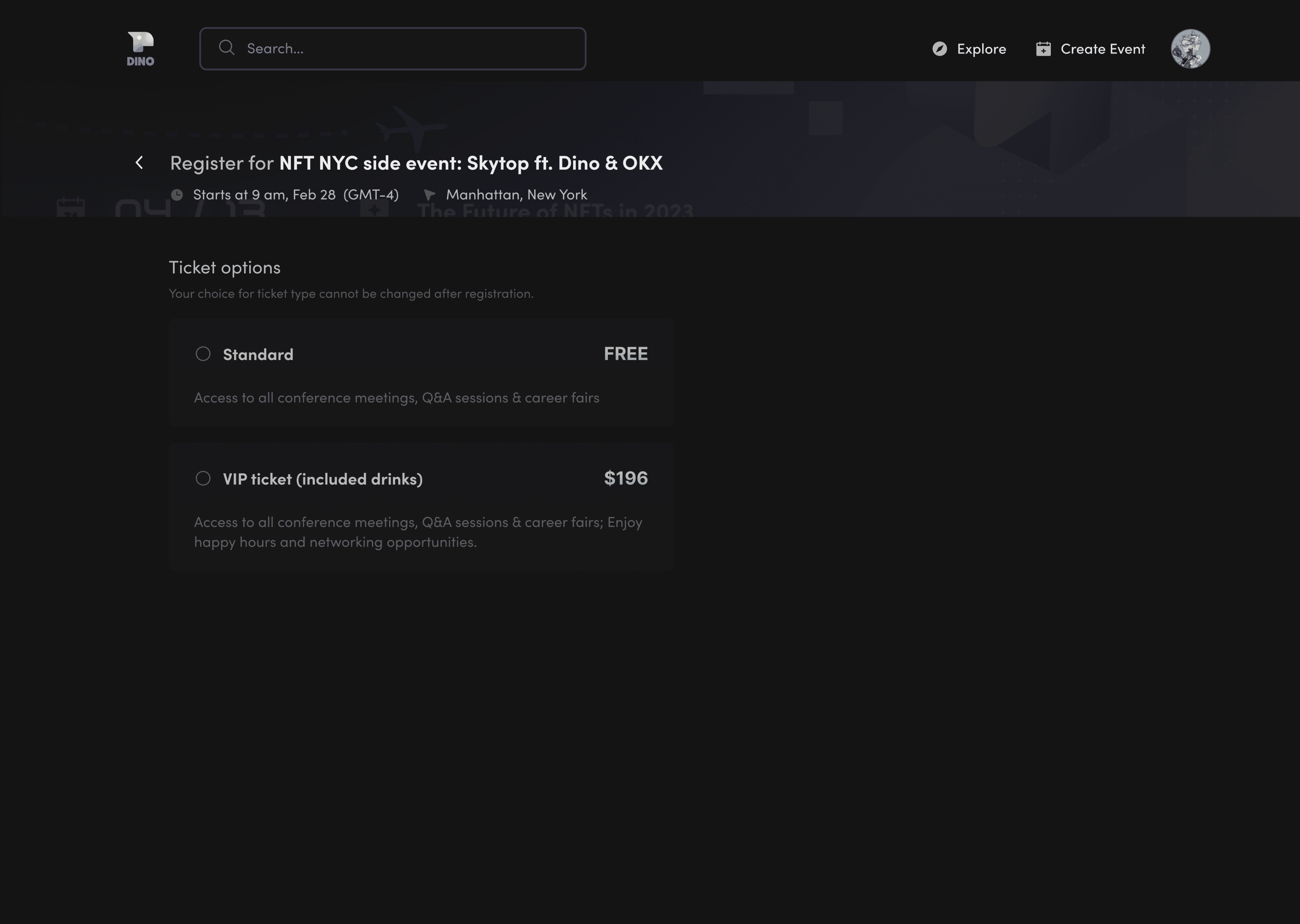
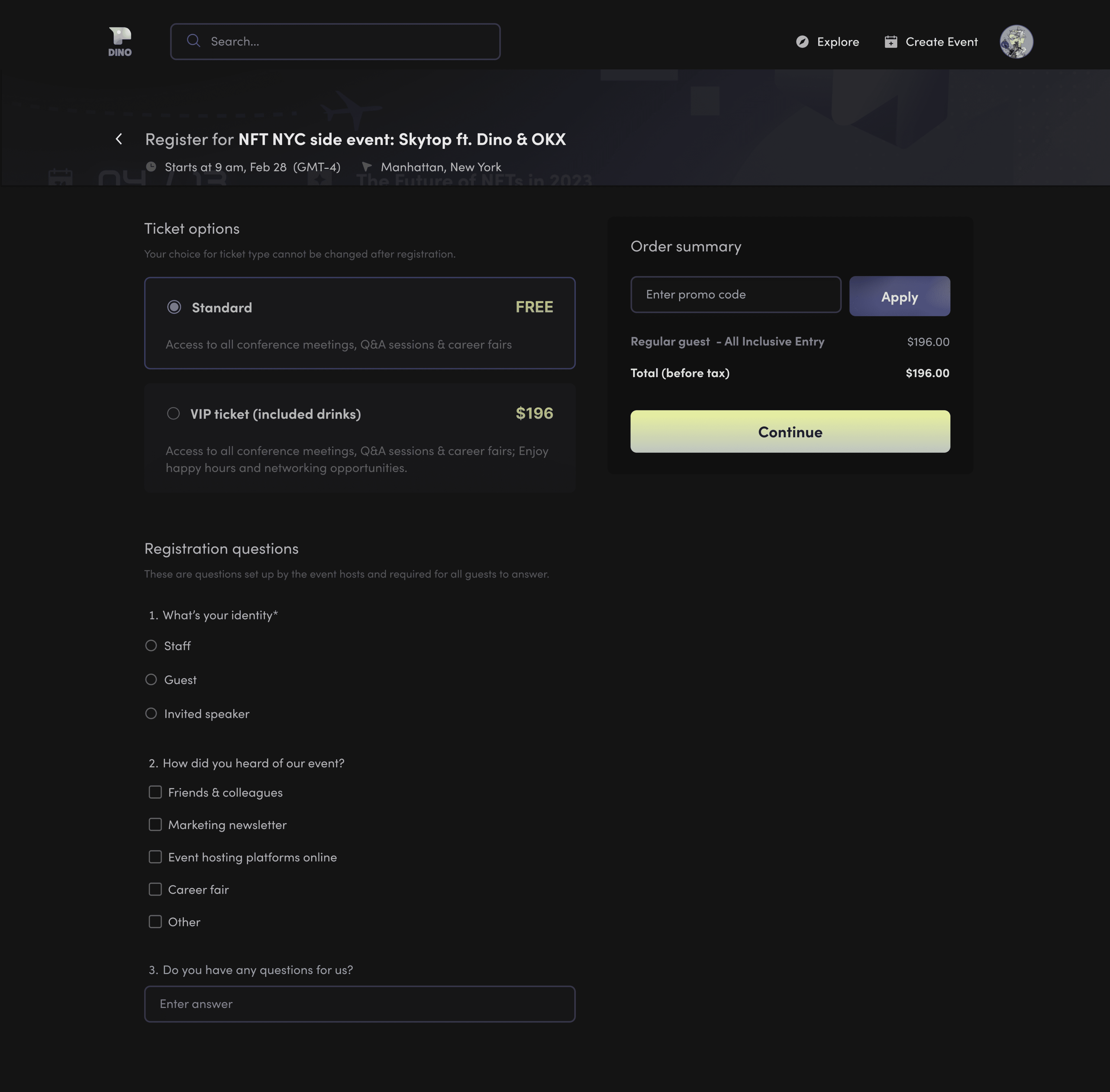
Event Sign-up
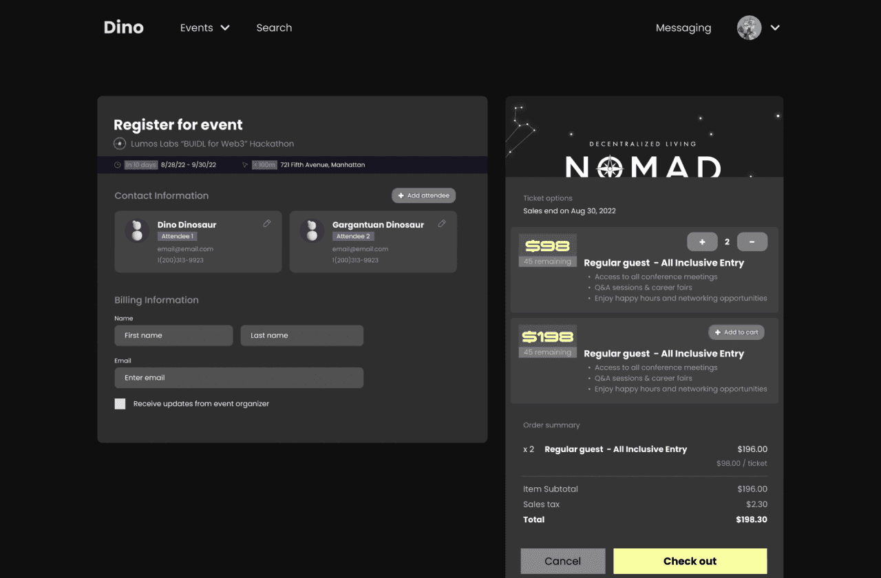
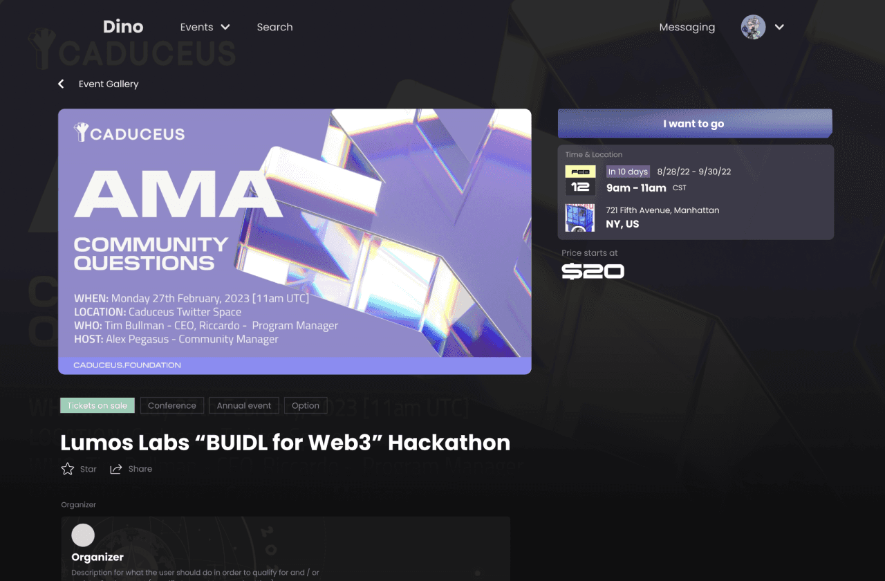
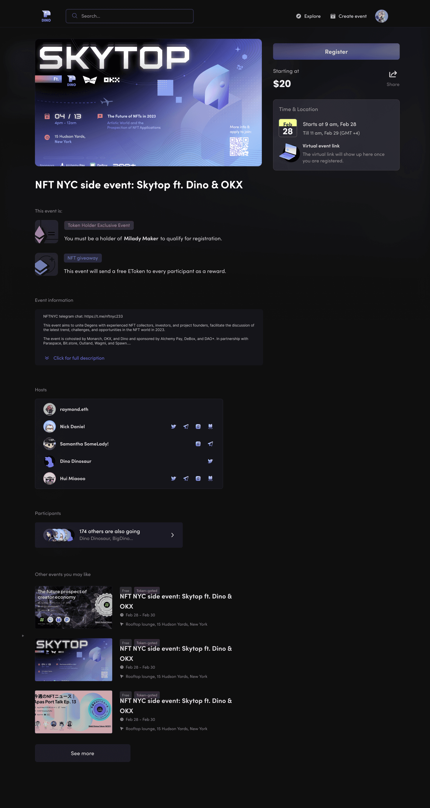
Check event details and current attendees. Sign up for attendance.


(↓ Scroll to preview full frame)



(↓ Scroll to preview full frame)
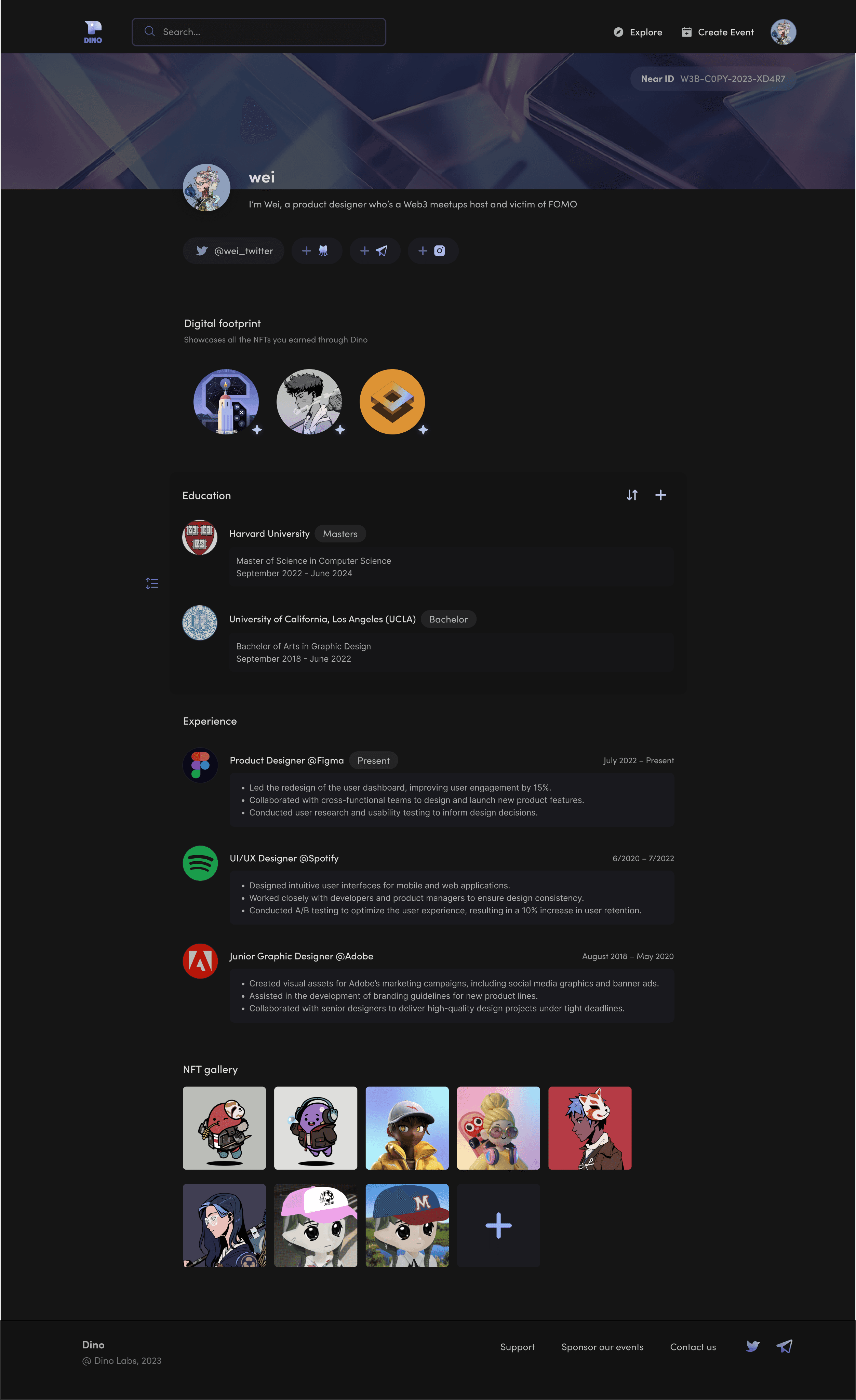
Profile
Profile
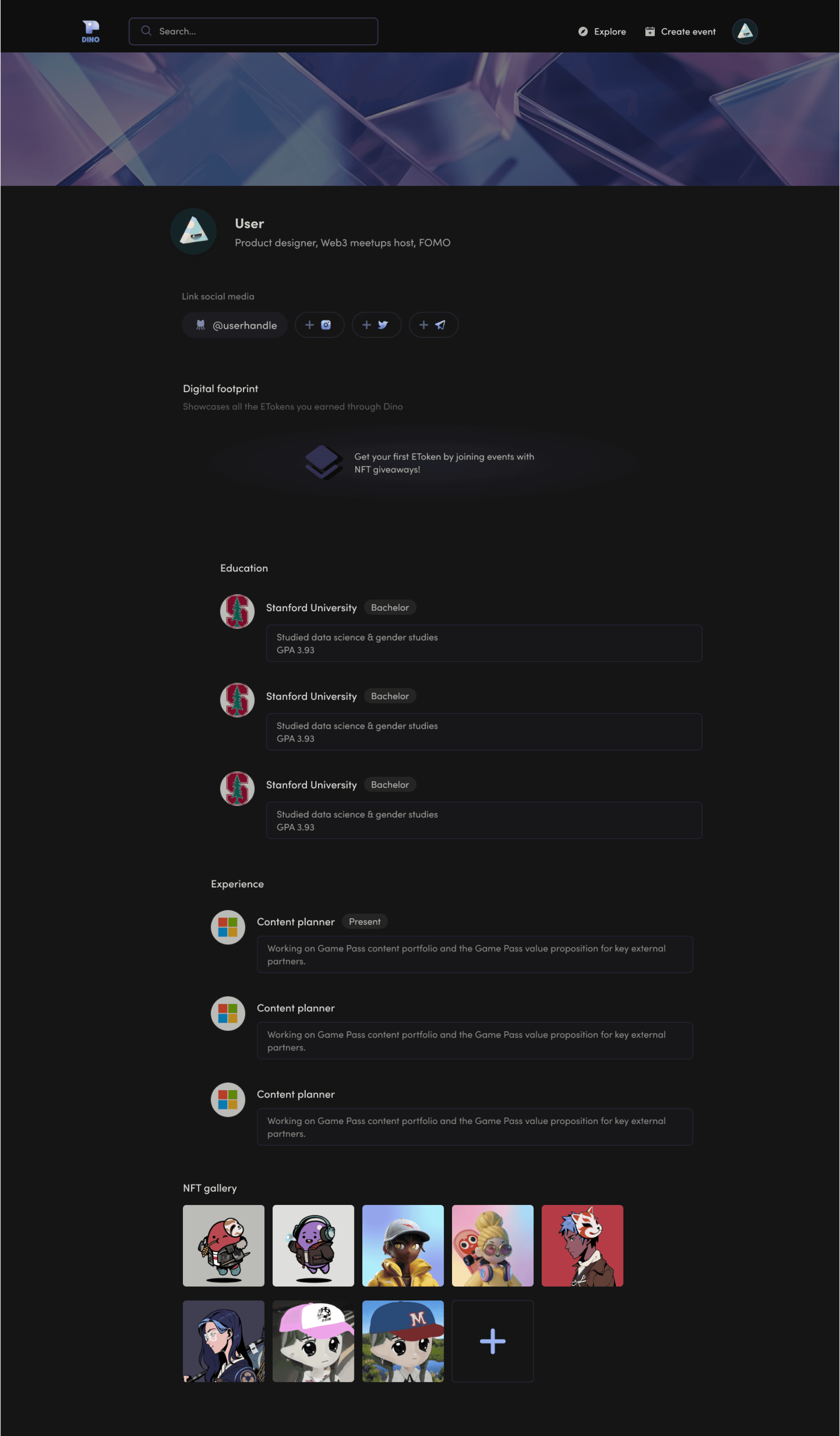
Personal profile setup: social media accounts, education / experience entries, NFT showcase

(↓ Scroll to preview full frame)
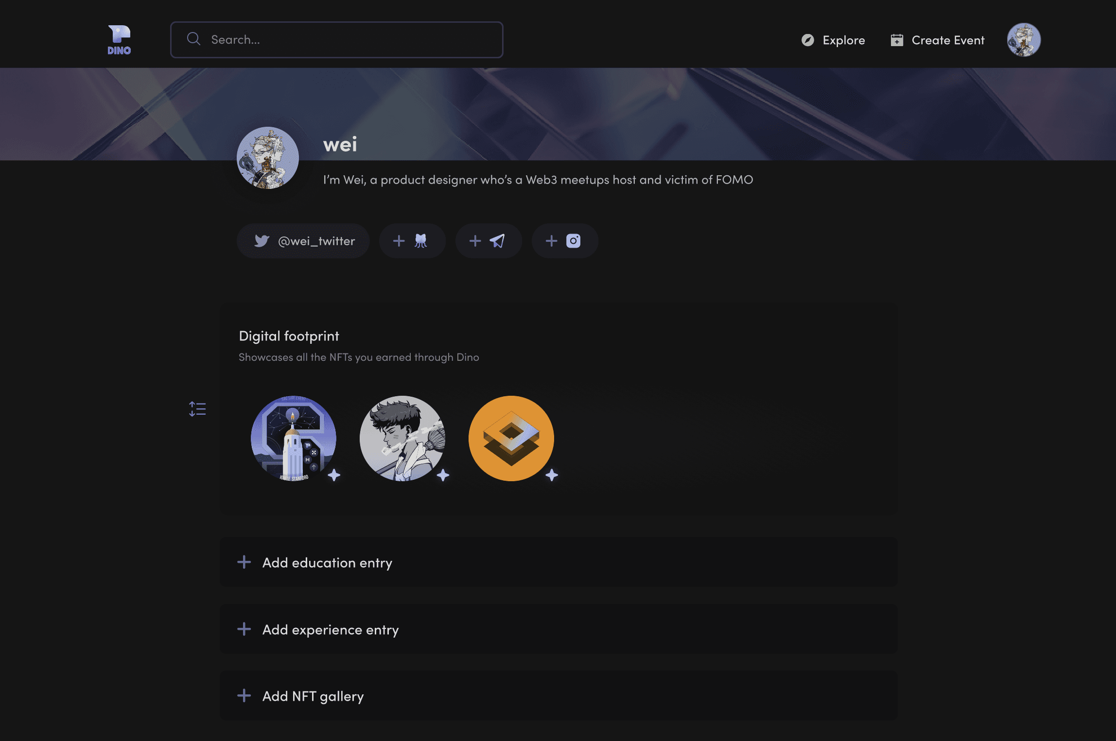

Empty state
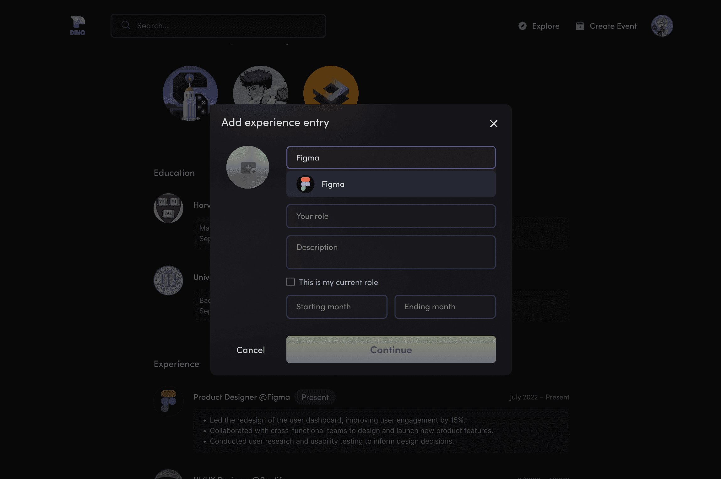

Profile (Display Mode)
Profile (Display Mode)
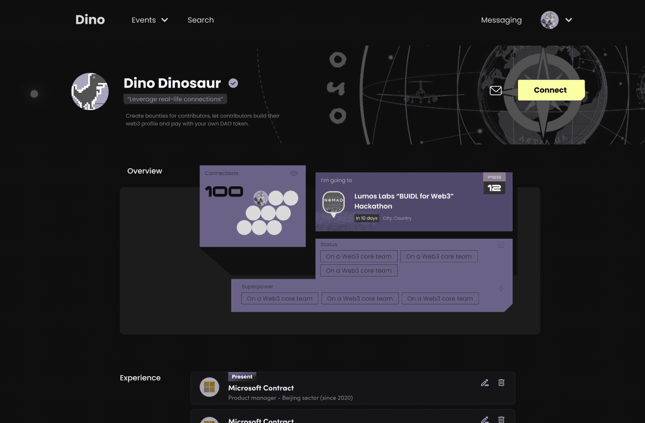
Check other people’s social media & content entries, including events they have attended / hosted
Check other people’s social media & content entries, including events they have attended / hosted
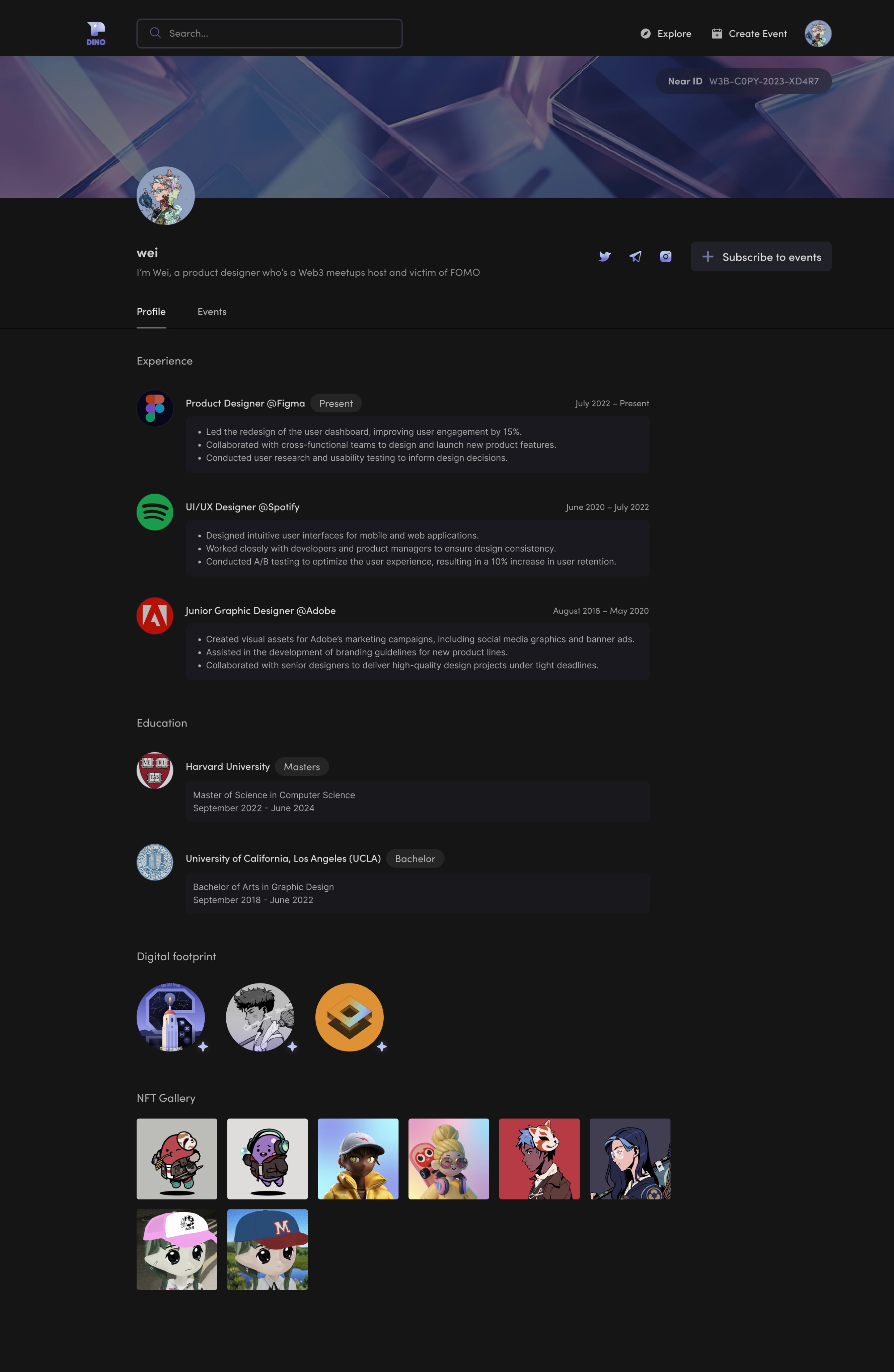

(↓ Scroll to preview full frame)
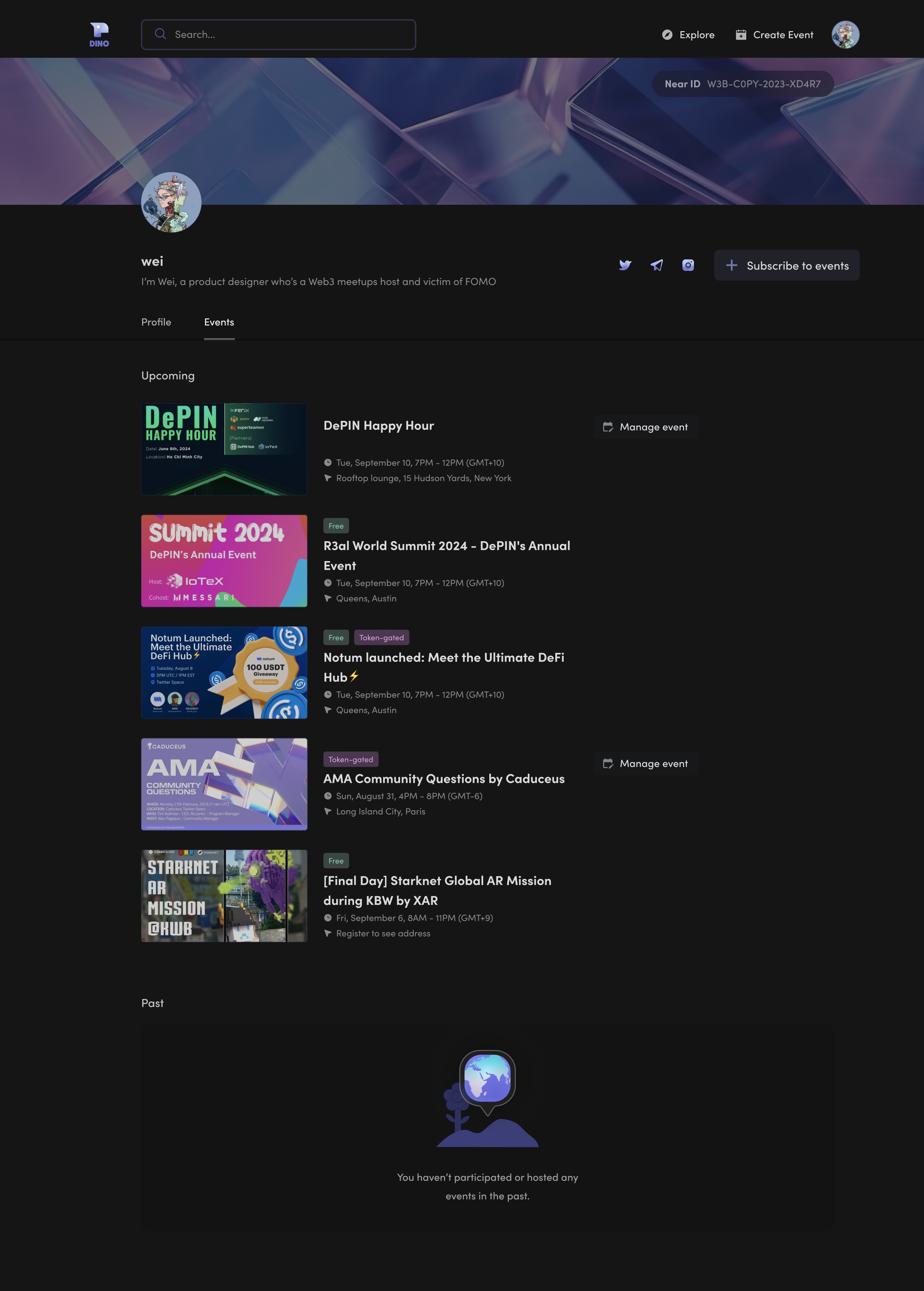

(↓ Scrollable preview)
(↓ Scroll to preview full frame)
Full Prototype
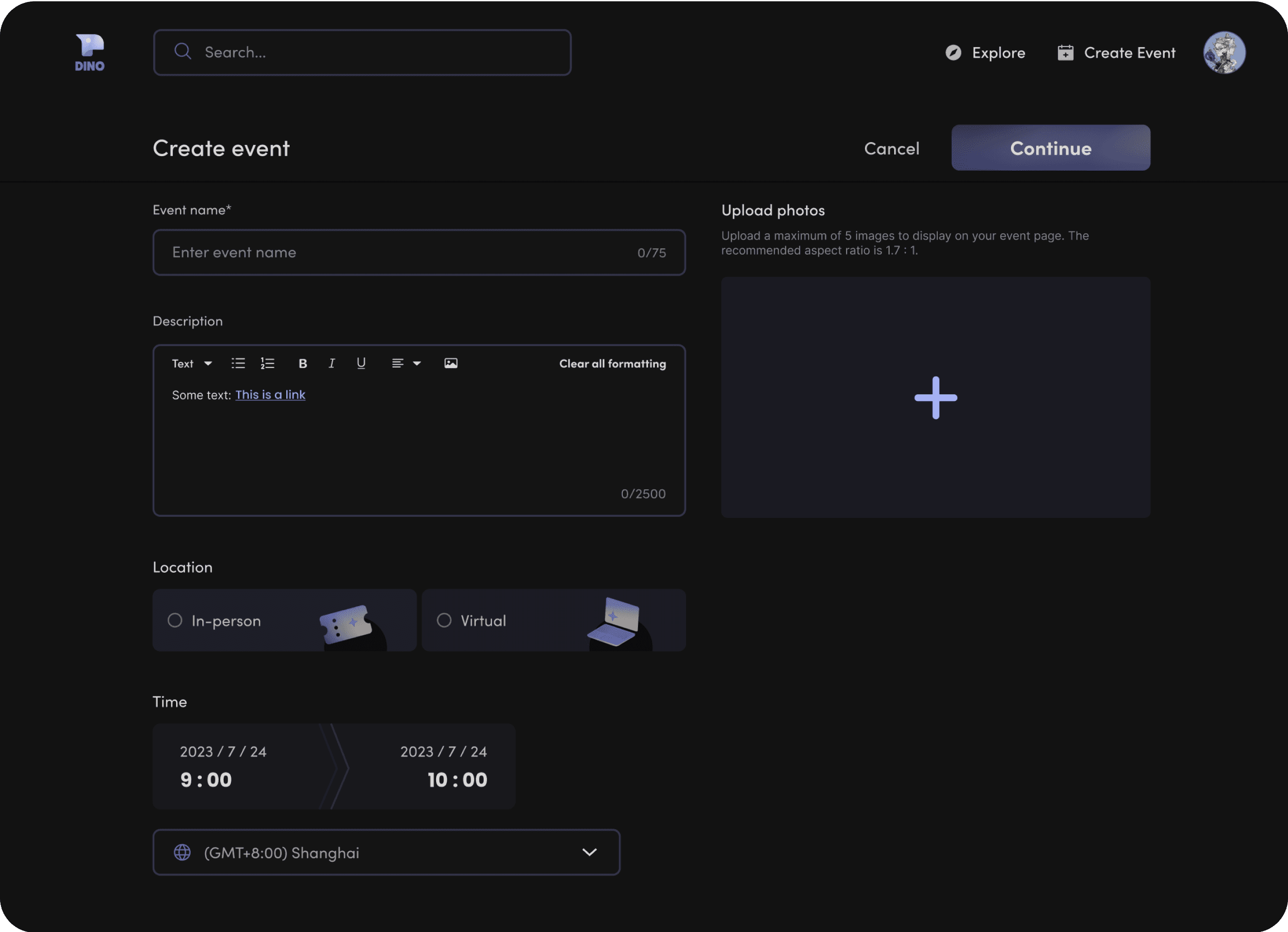
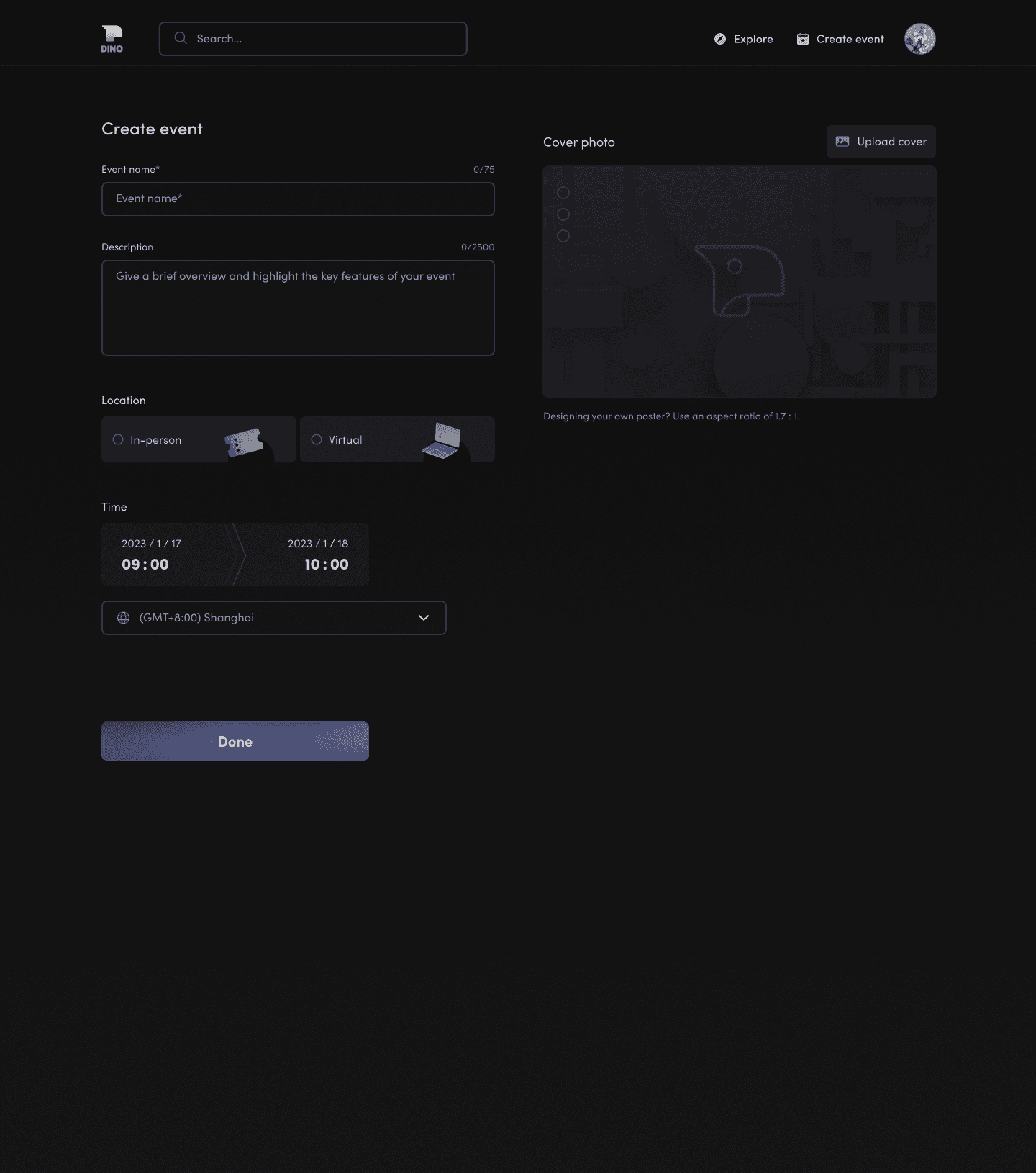
Create Event
Create and save a new event to draft
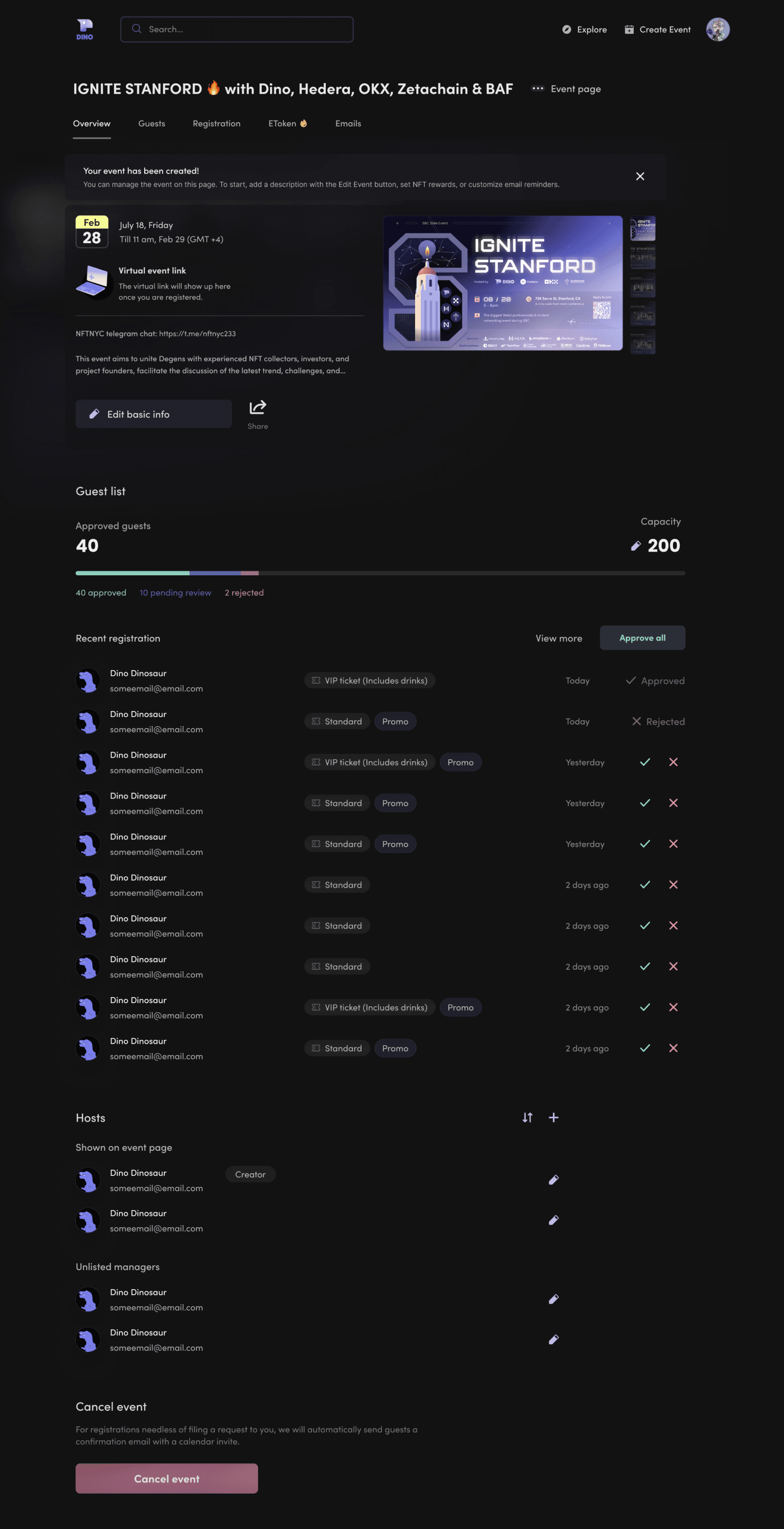
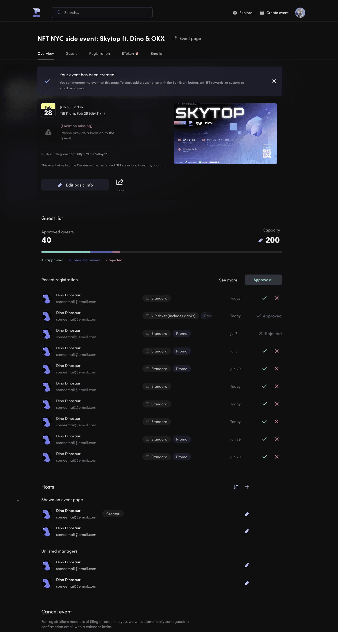
Event Overview (Host View)
Create Event
Edit event information and manage guest attendance
Create and save a new event to draft
(↓ Scrollable preview)

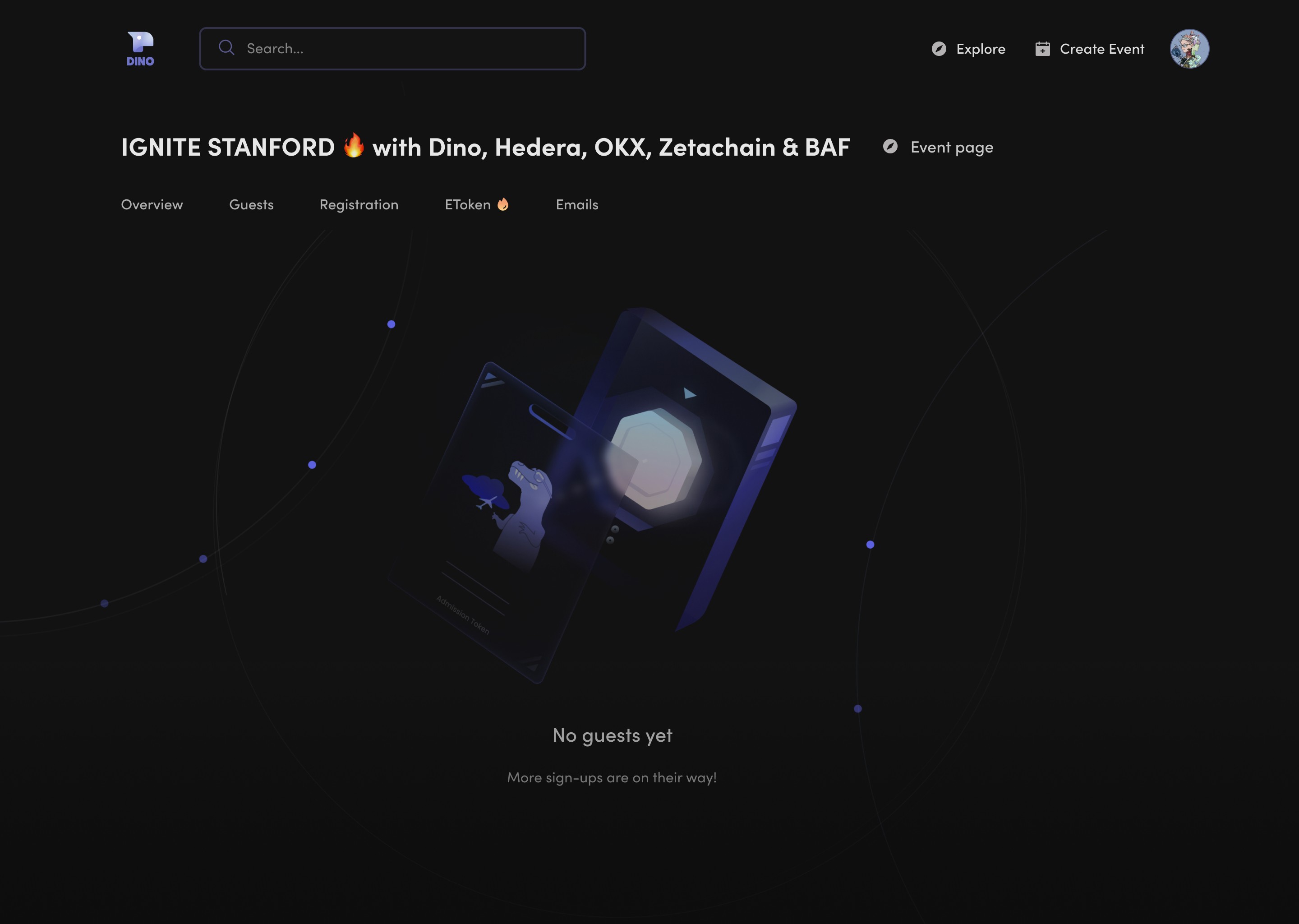
Empty state


Event Overview (Host View)
Edit event information and manage guest attendance


(↓ Scroll to preview full frame)


Empty state
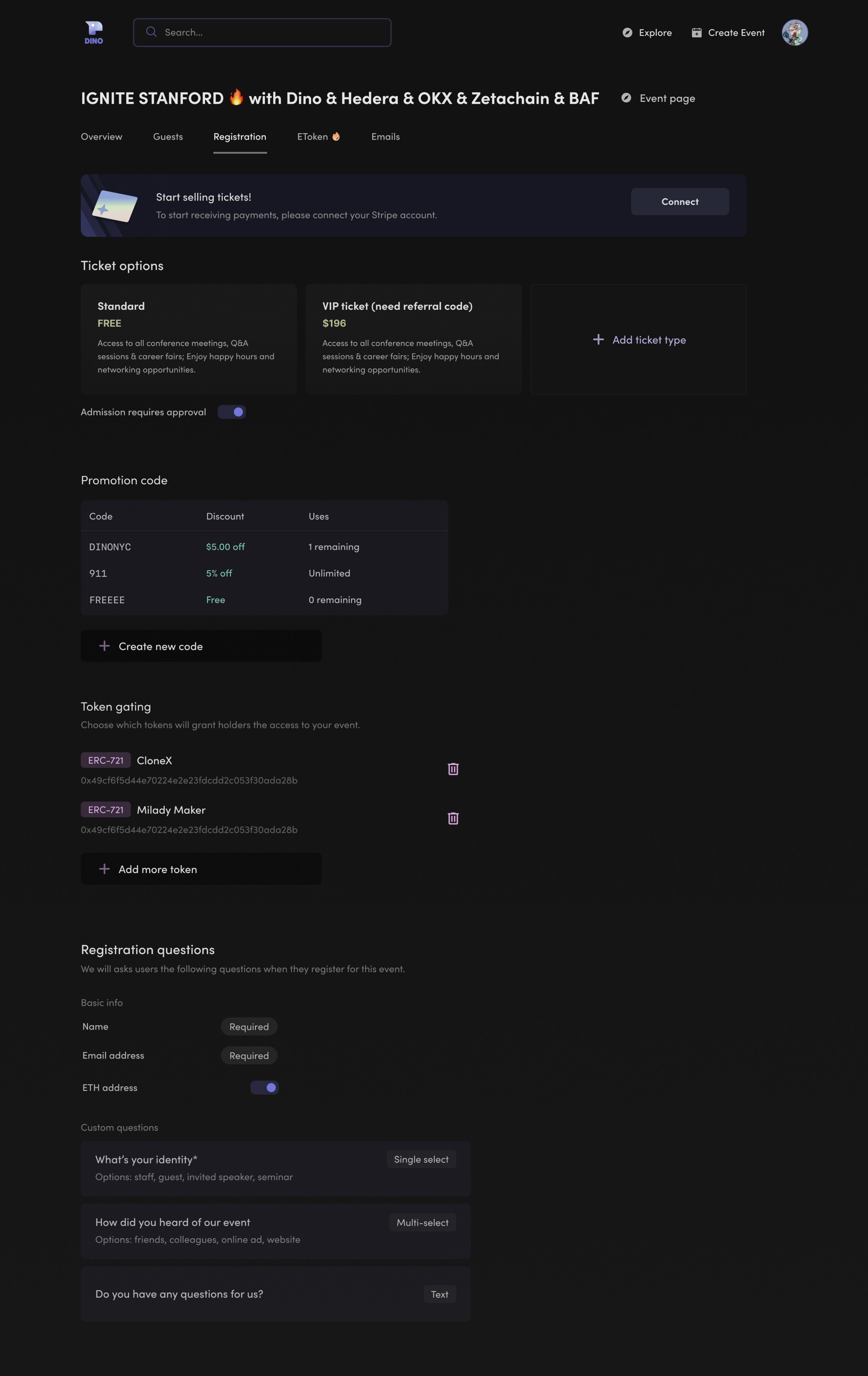
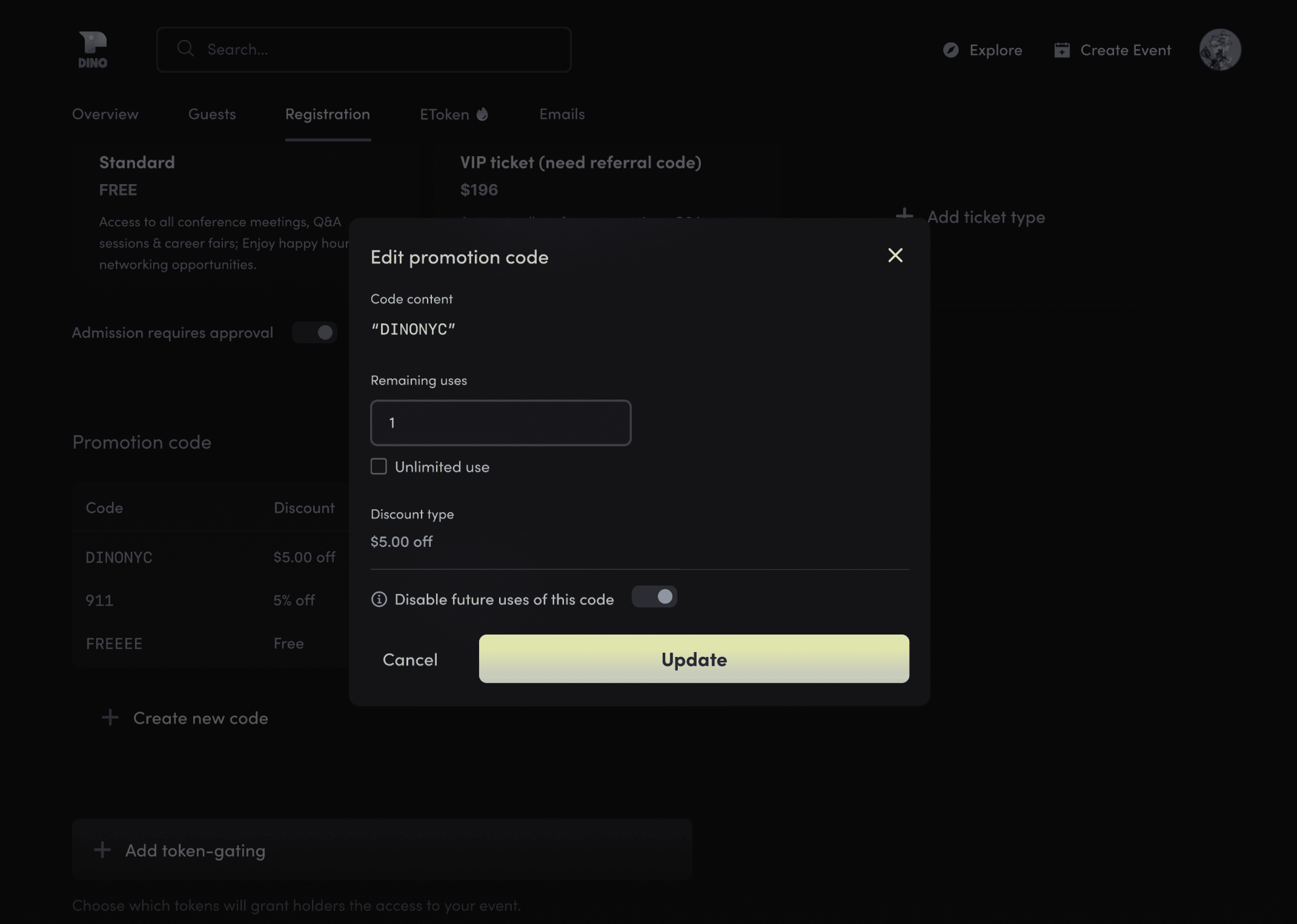
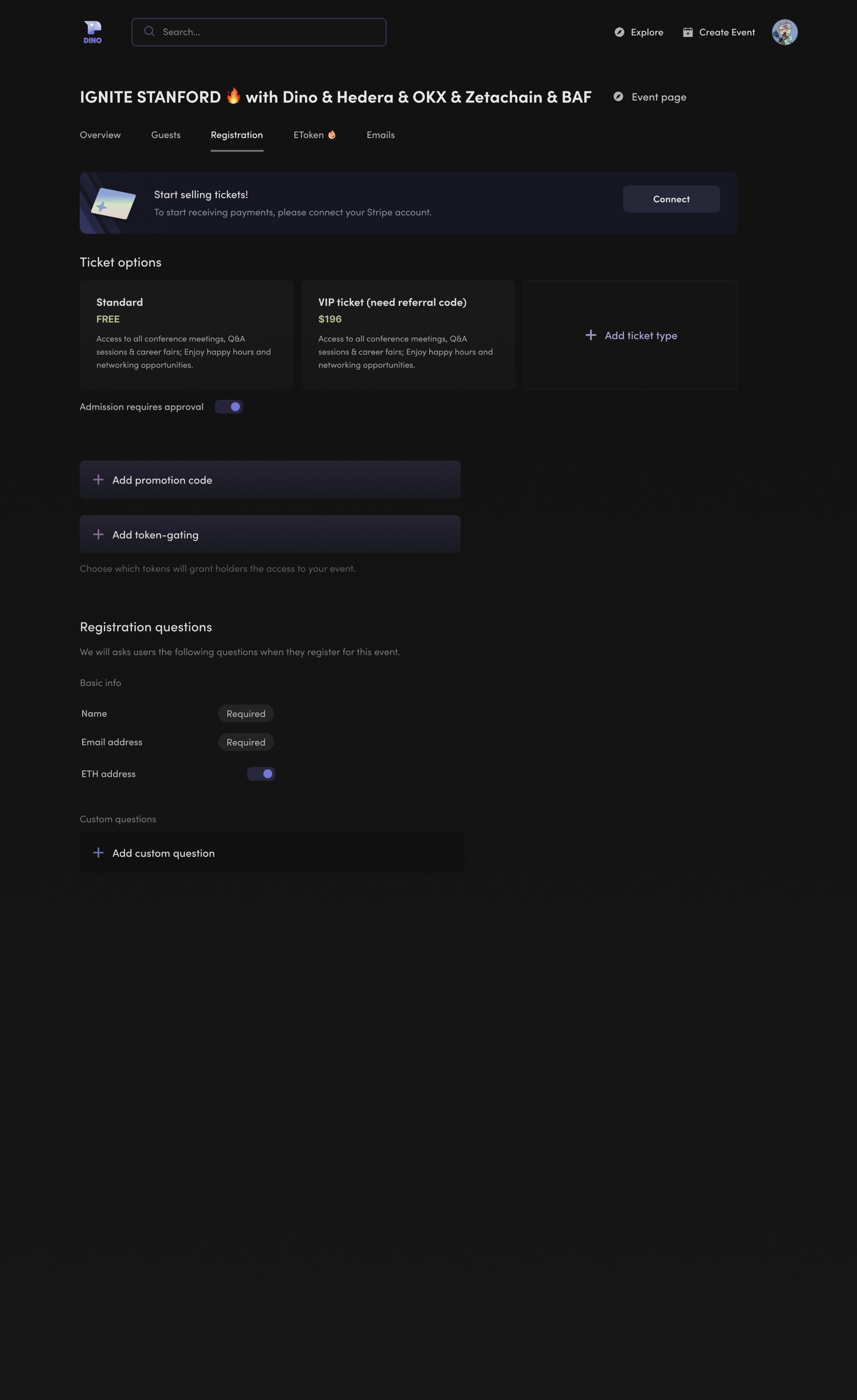
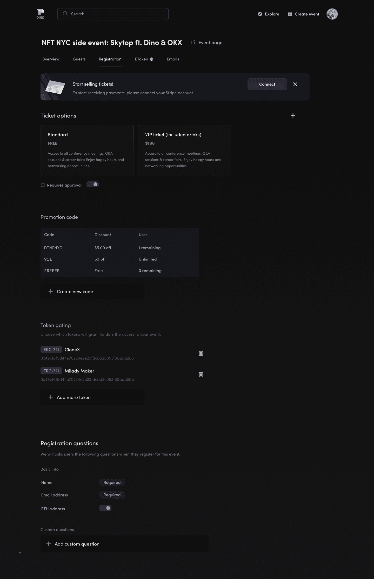
Event Registration Setup
Event Registration Setup
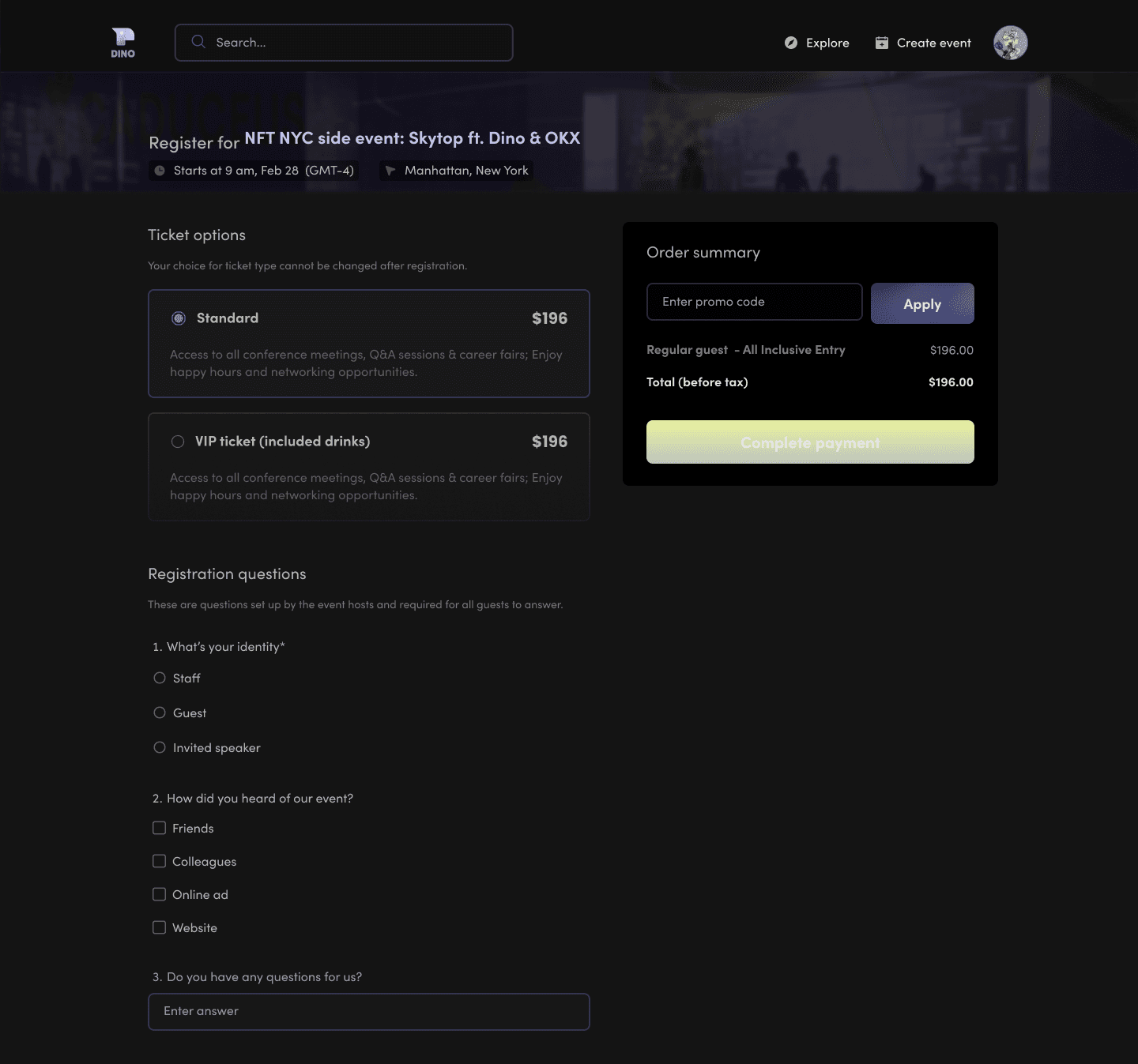
Set up ticket options, promotion codes, token-gating restrictions, and custom questions
Set up ticket options, promotion codes, token-gating restrictions, and custom questions

(↓ Scroll to preview)
Filled state


(↓ Scroll to preview)
Empty state
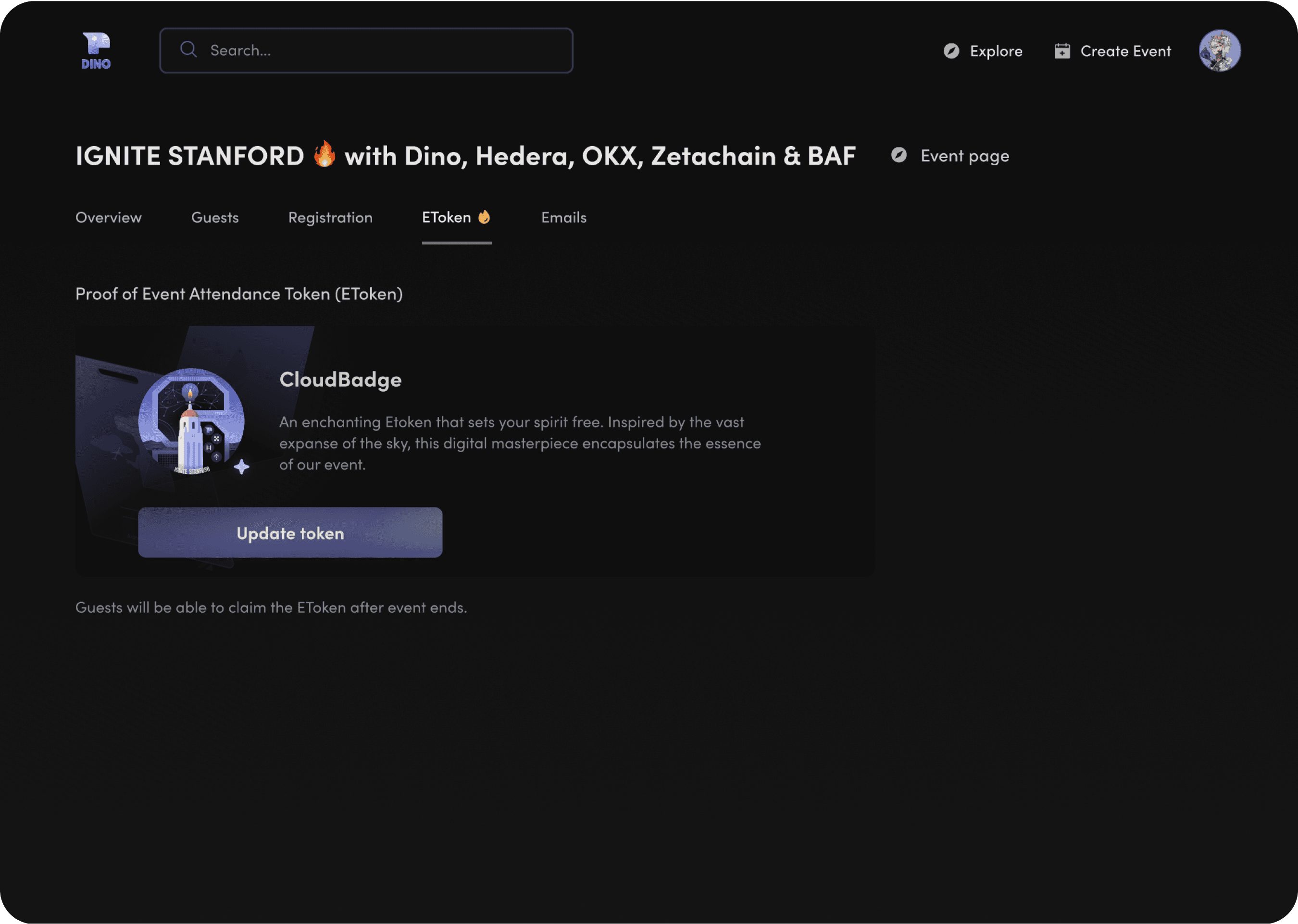
“EToken”
“EToken”
Add a Proof of Attendance Token to reward event attendees
Add a Proof of Attendance Token to reward event attendees


Email Reminder Setup
Schedule email reminders and confirmations for event guests
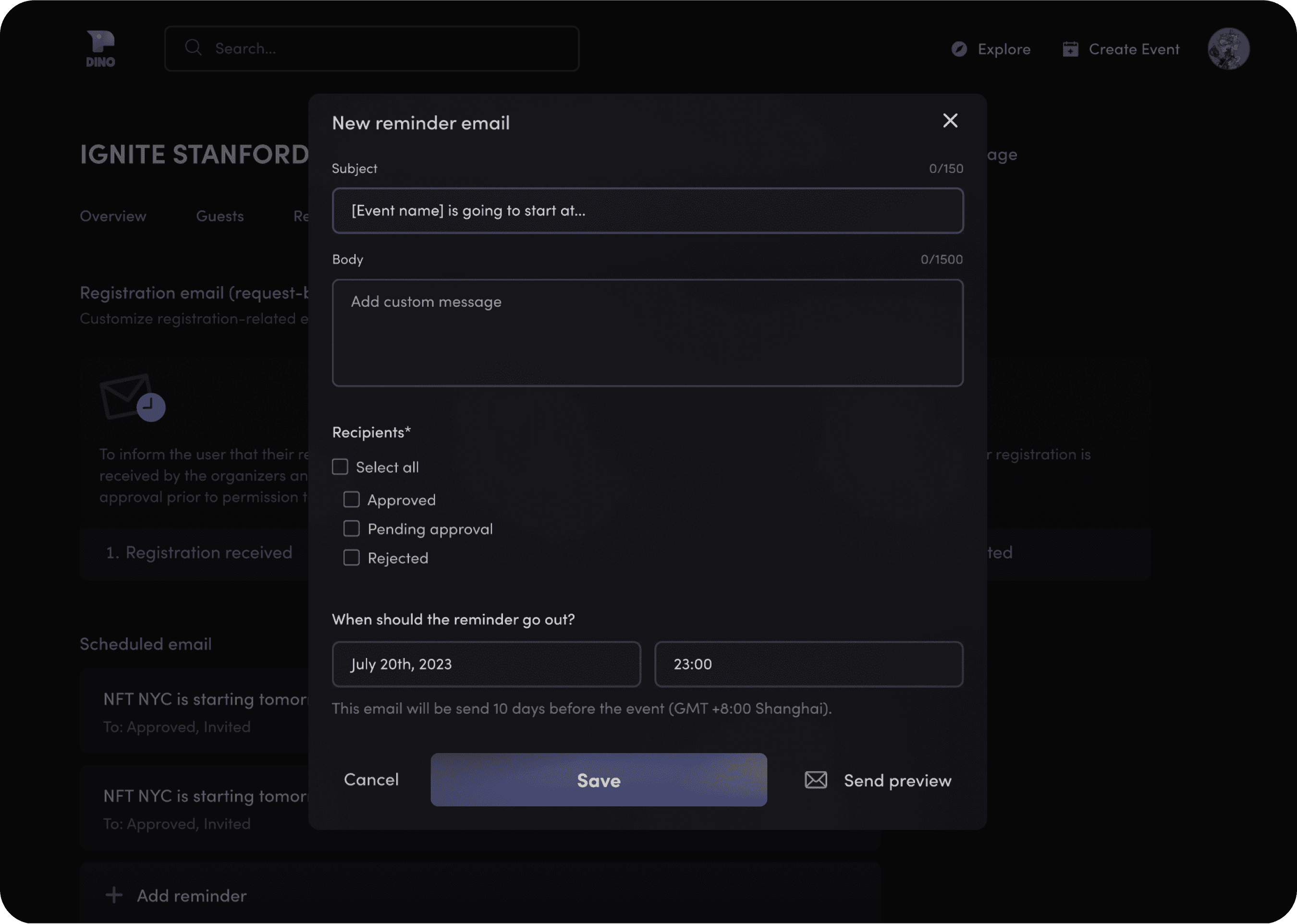
Email Reminder Setup
Schedule email reminders and confirmations for event guests


Full Prototype
Screen recording of current iteration (taken Jan 30, 2024)
Landing Page
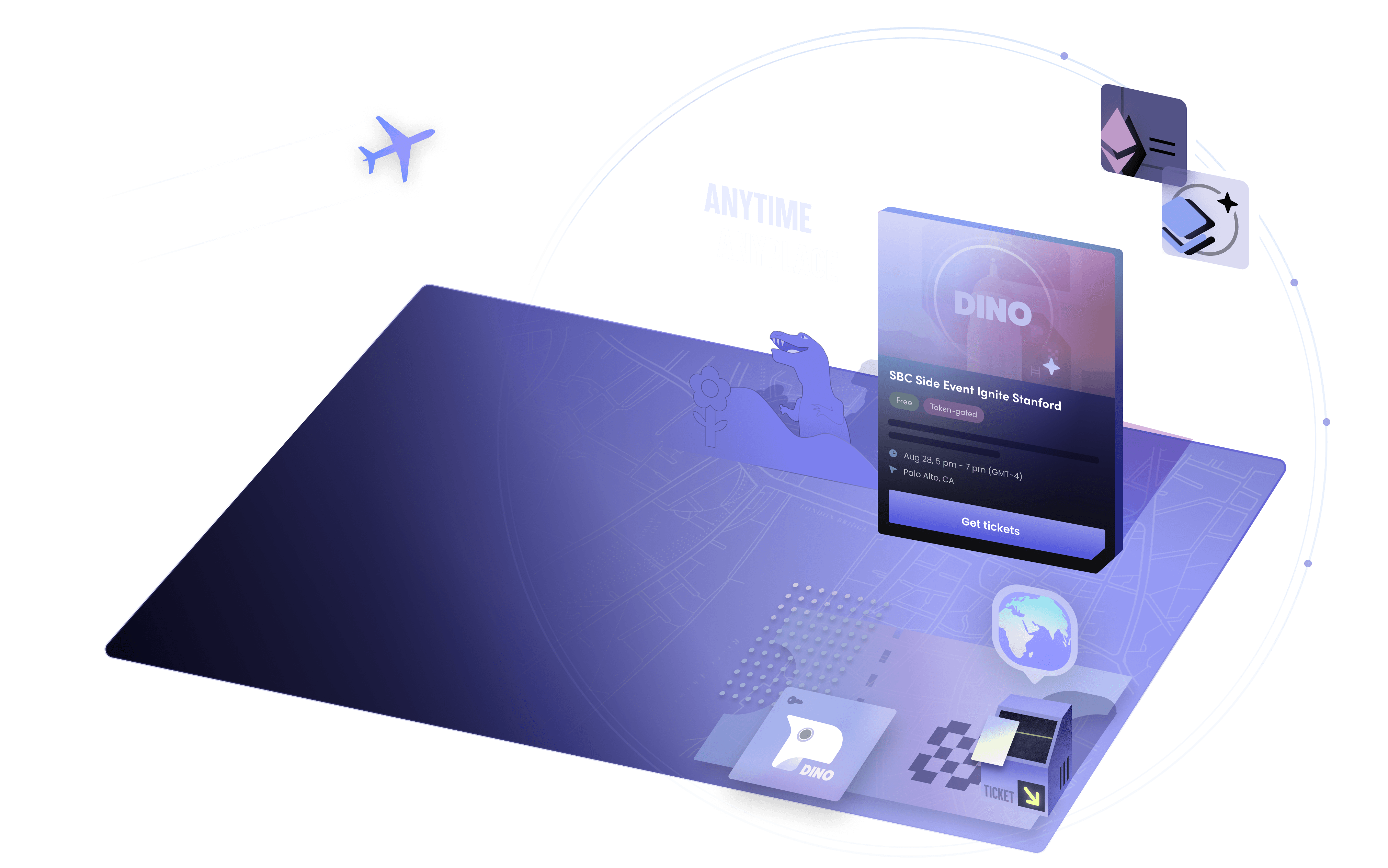
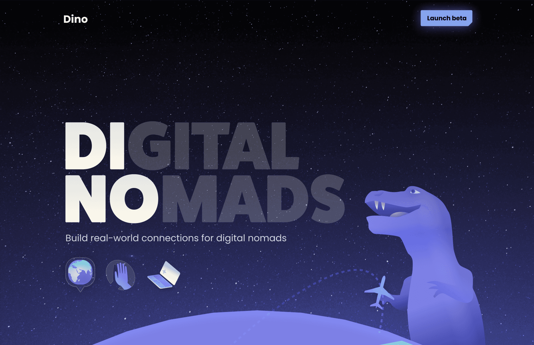
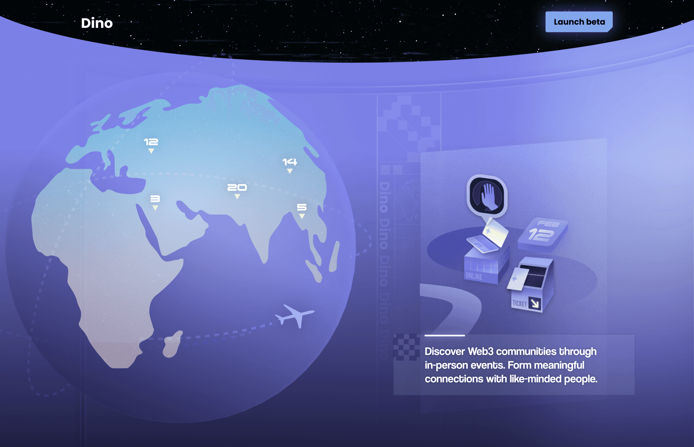
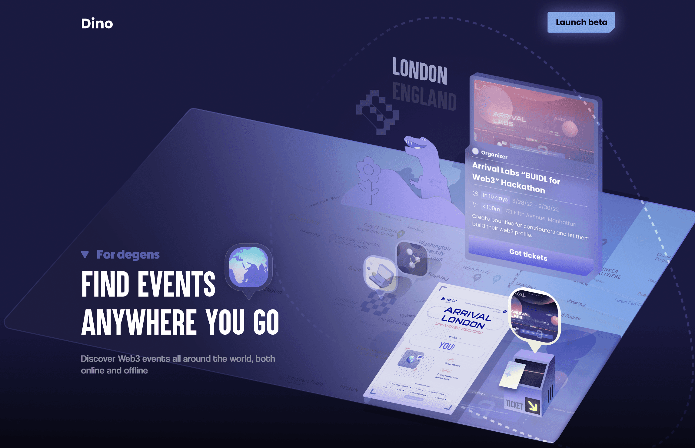
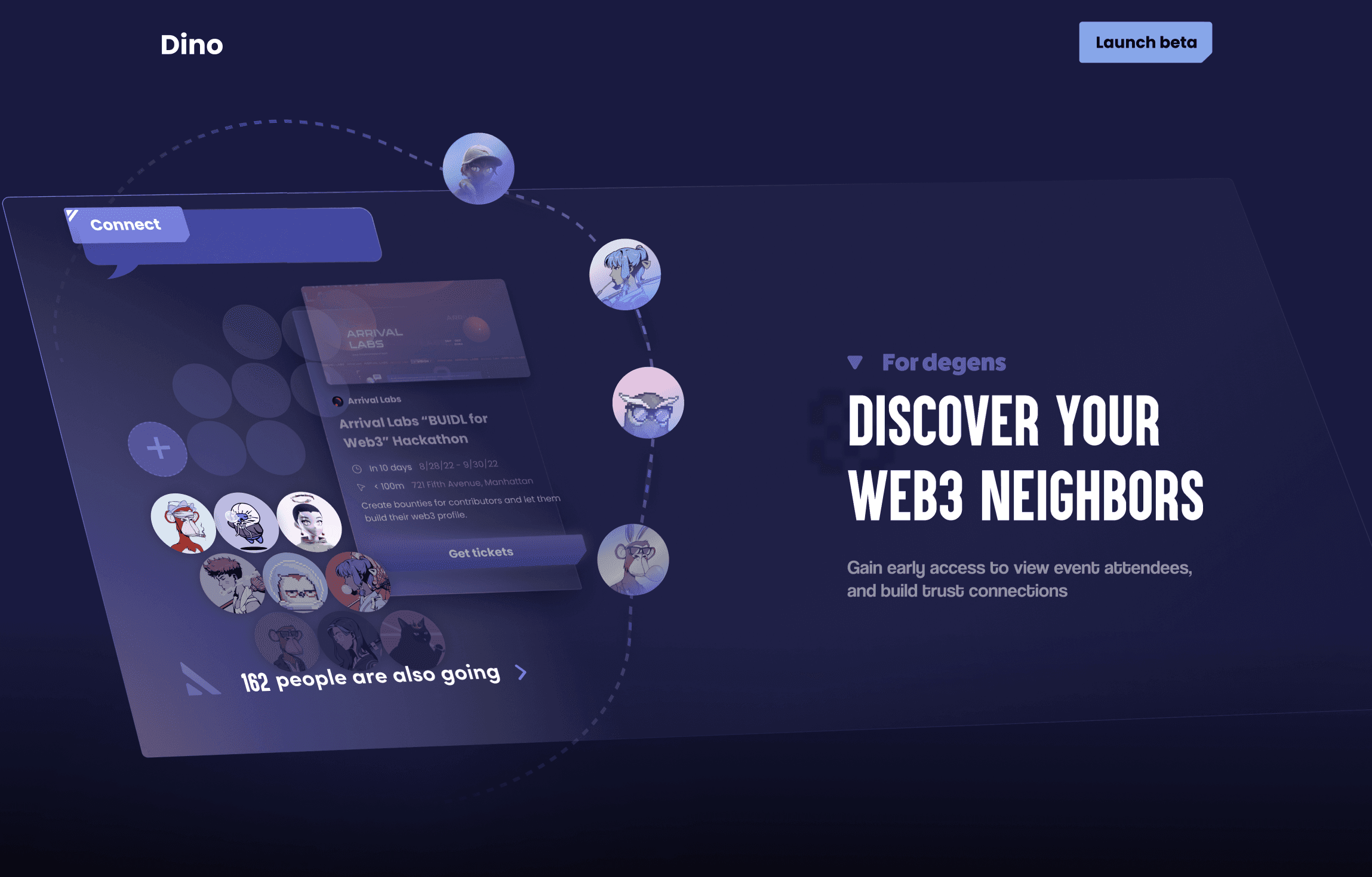
I designed the landing page to highlight Dino's brand identity. In the first iteration, the product manager and I created over six screens with unique illustrations to showcase product features. However, we realized this much content was unnecessary for a straightforward product. We simplified the design to a single screen with parallax-effect, guiding users directly to the main app.
Screen recording of current iteration (taken Jan 30, 2024)


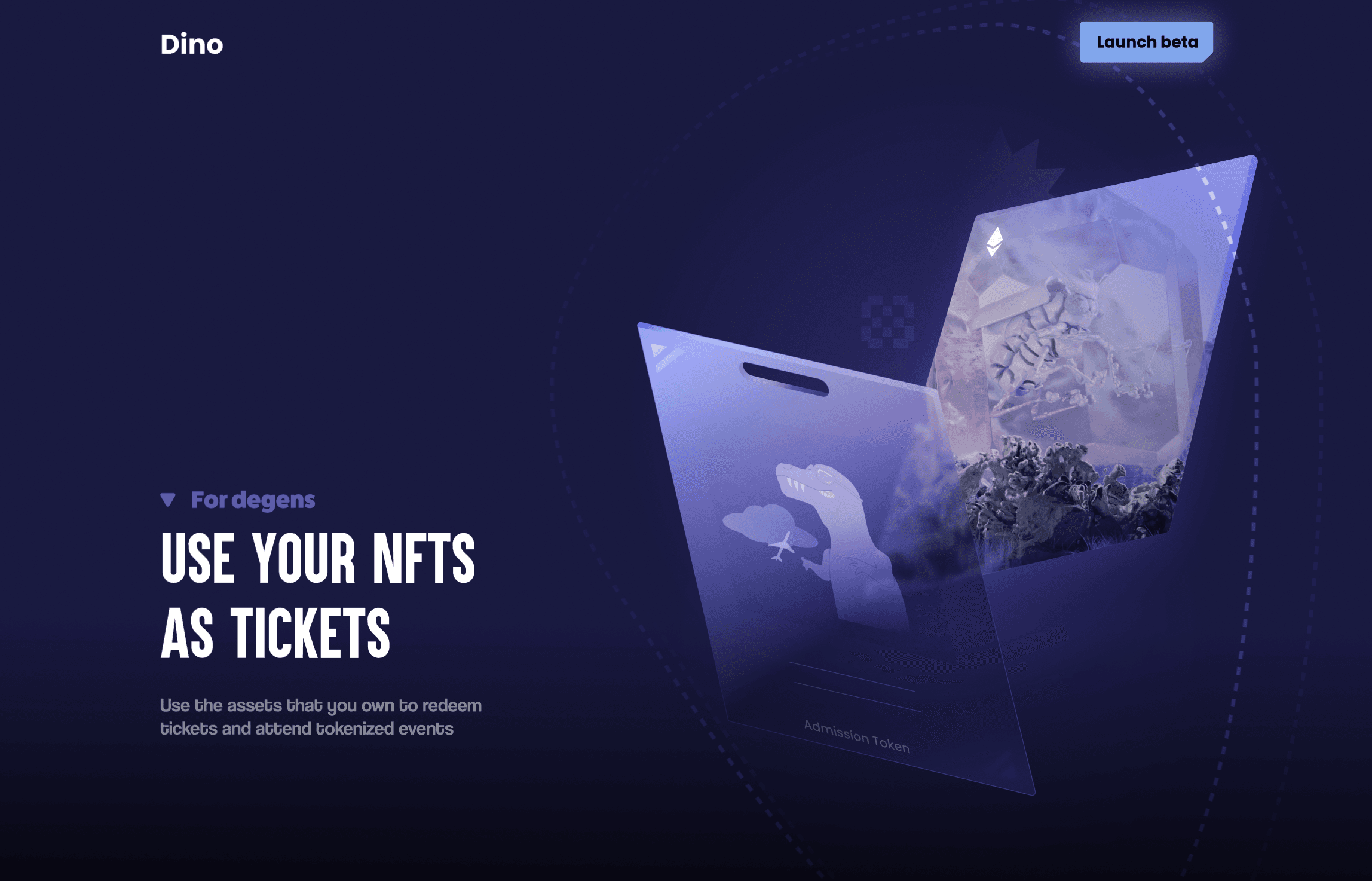
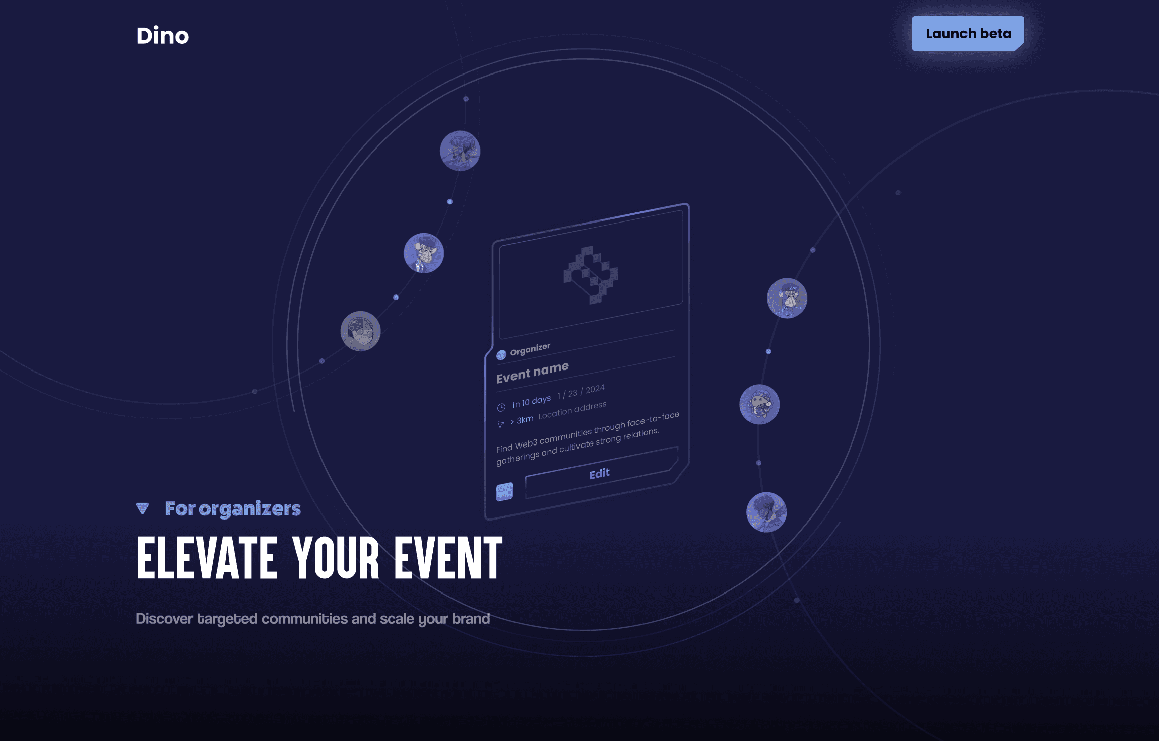
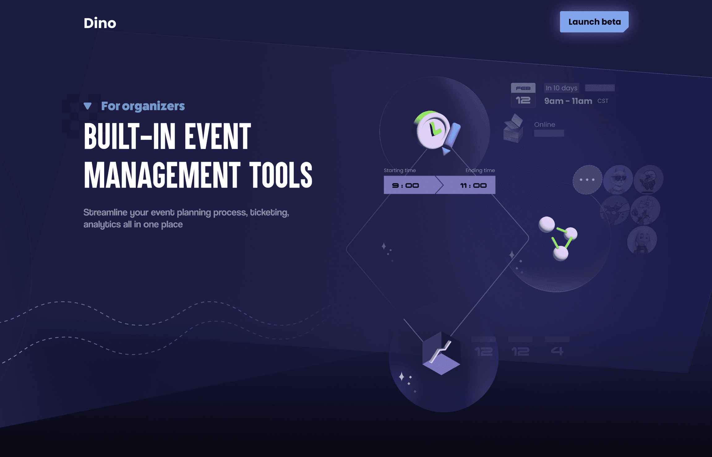
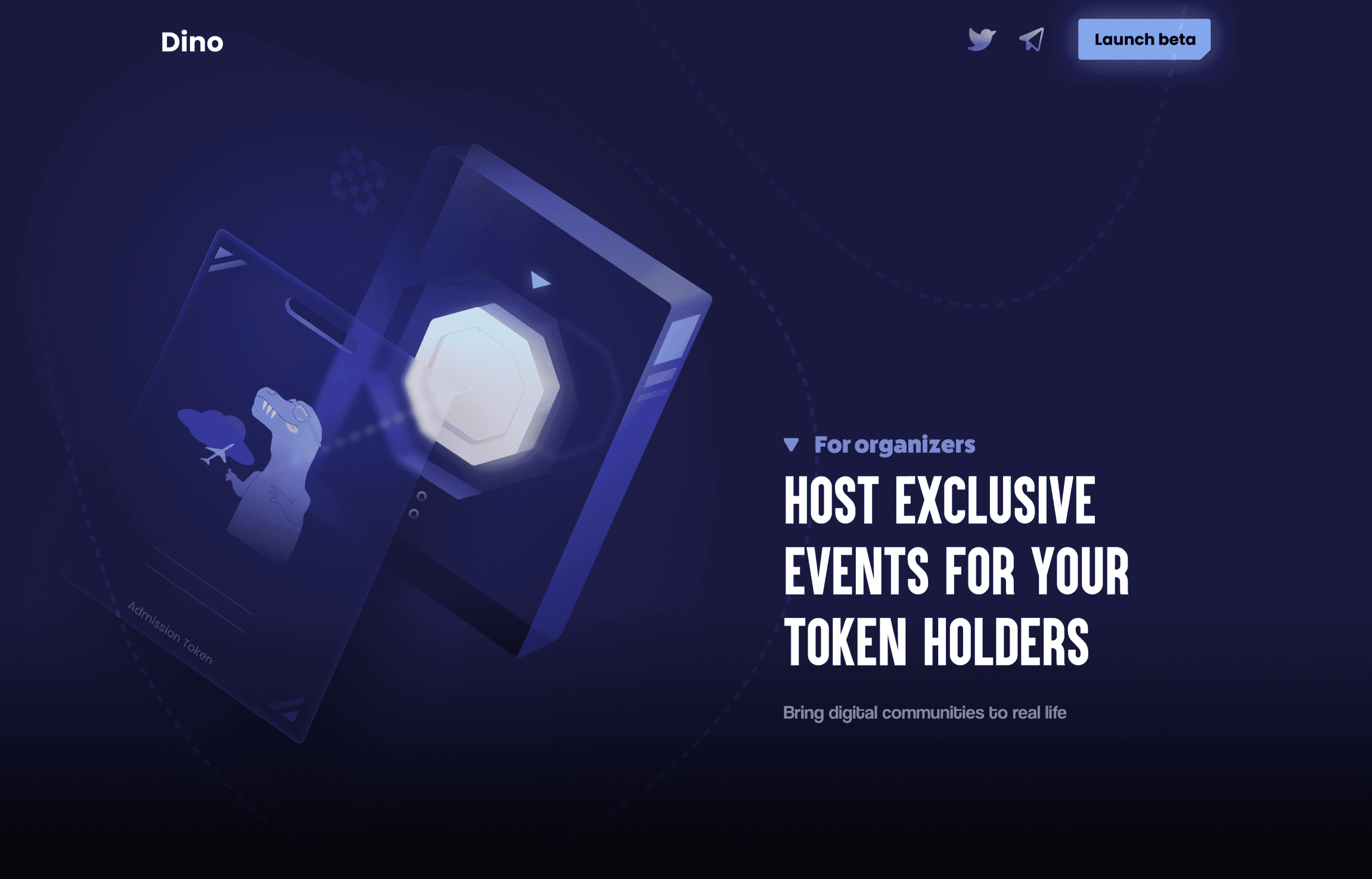
Previous iteration
(→ scroll to view more)
Landing Page
I designed the landing page to highlight Dino's brand identity. In the first iteration, the product manager and I created over six screens with unique illustrations to showcase product features. However, we realized this much content was unnecessary for a straightforward product. We simplified the design to a single screen with parallax-effect, guiding users directly to the main app.
Iteration
Iteration
Iteration 1
Mar 5th, 2023
I explored with a variety of bold design elements during the lo-fi stage, e.g. a 3D spaceship backdrop with UI elements floating above, and interactive moments like a spaceship wall revealing NFT rewards for event attendance. However, after discussions with the engineering team, it became clear that the complexity of 3D development exceeded the team's expertise and didn’t align with our tight launch timeline. I shifted to a more standard design but retained some techno-inspired elements, like unevenly cut geometrically shaped buttons and cards, to preserve the futuristic feel.
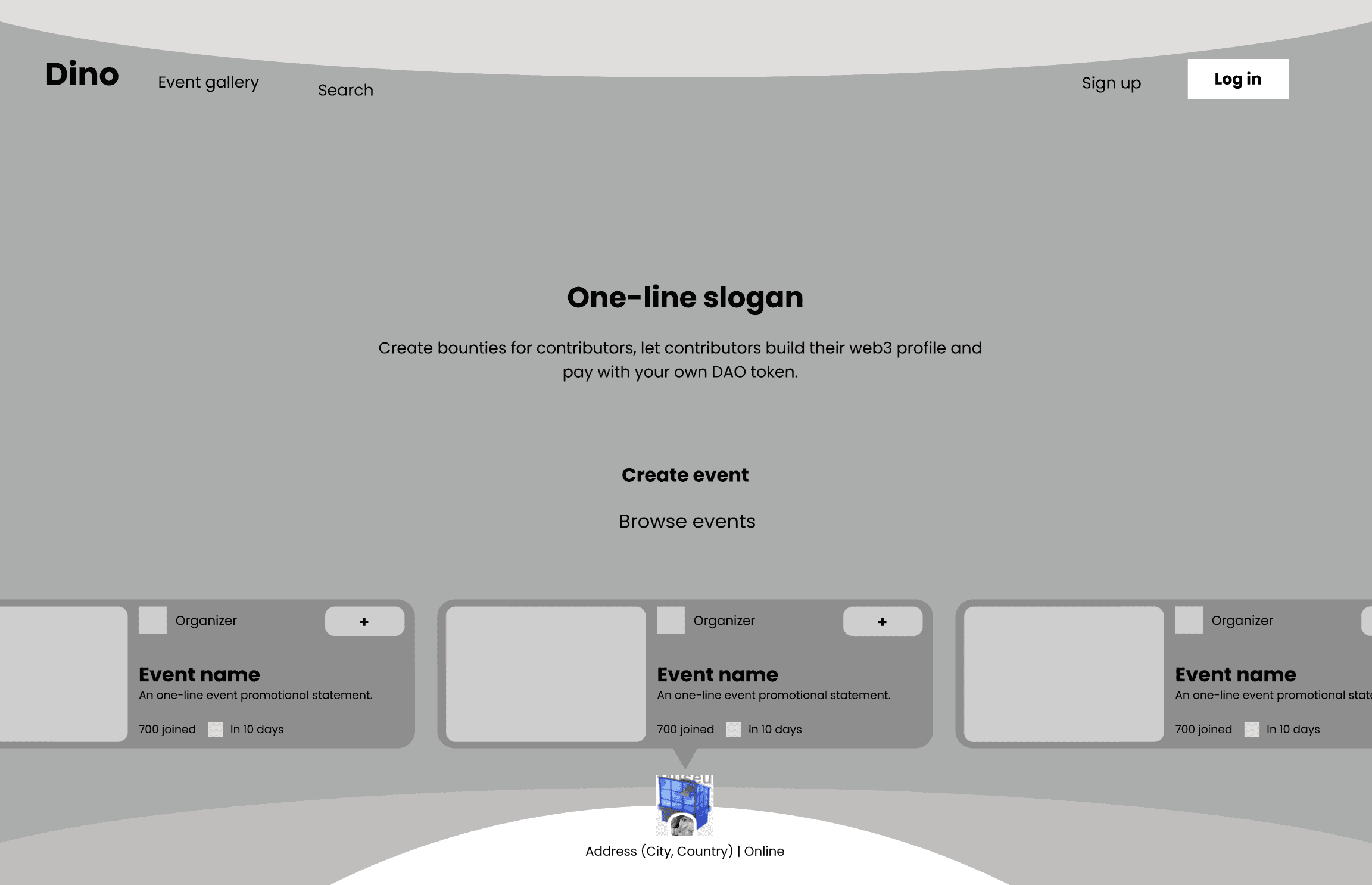

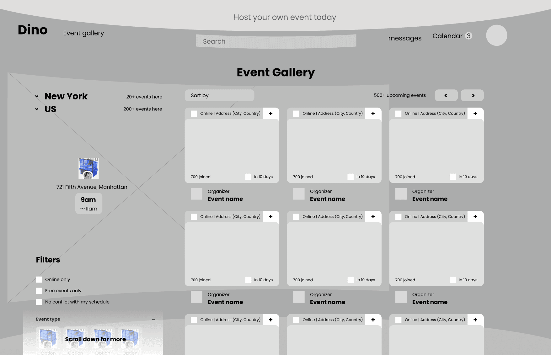

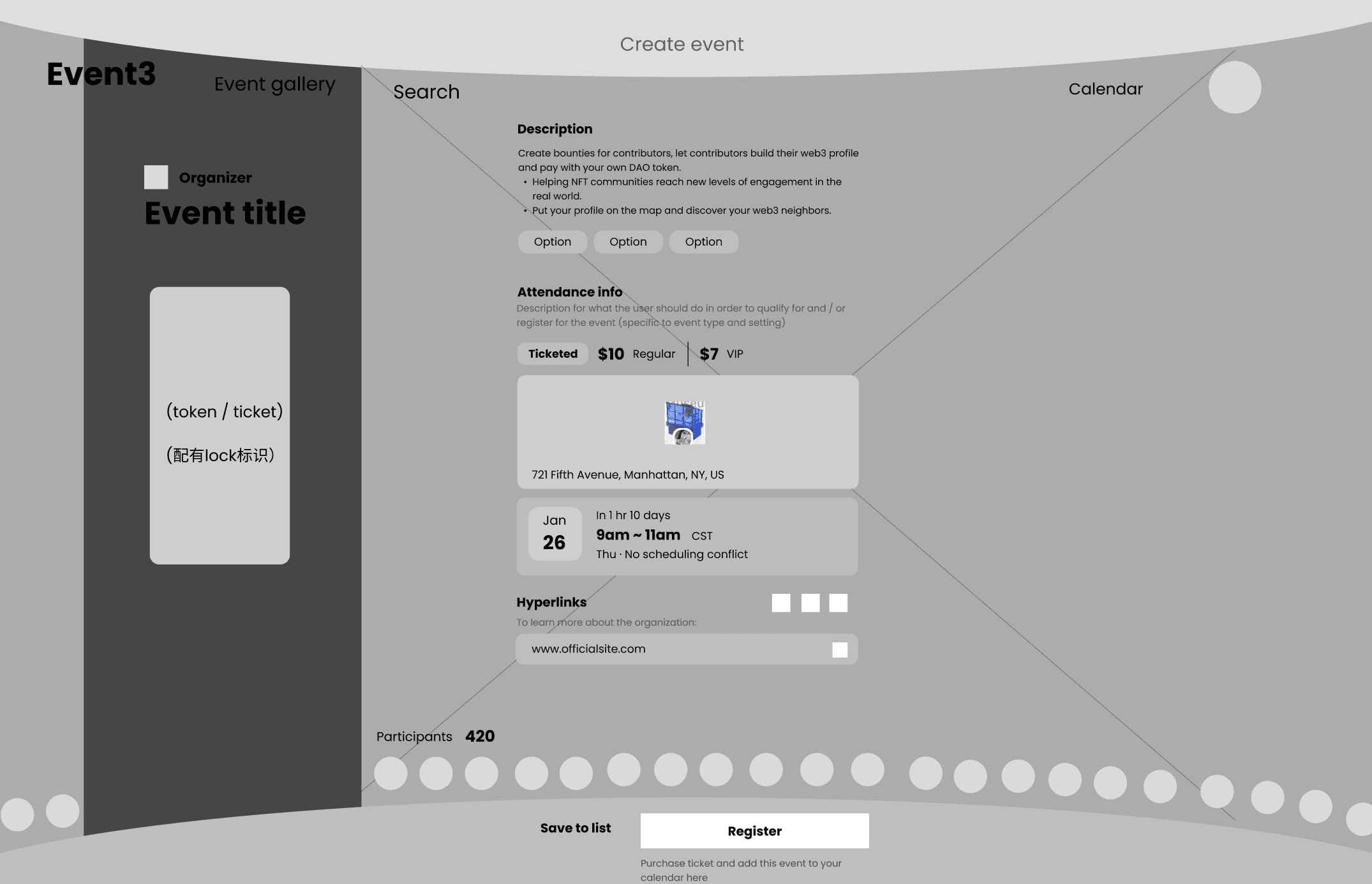

Low-fi exploration: spaceship motif
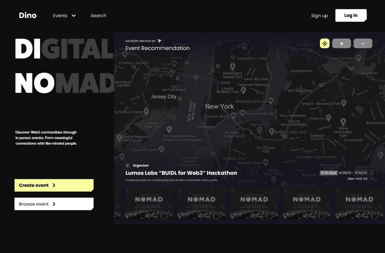





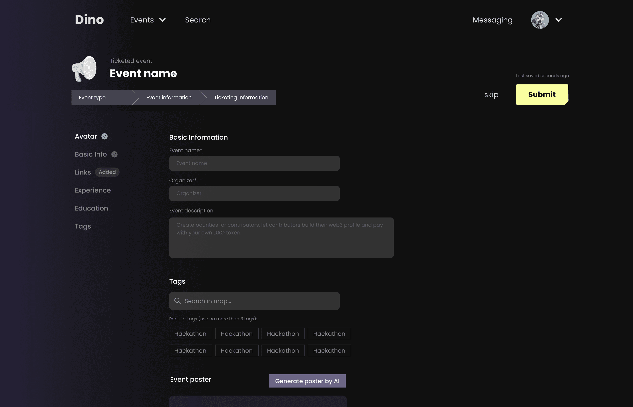

Mid-fi V1
Iteration 1
Mar 5th, 2023
I explored with a variety of bold design elements during the lo-fi stage, e.g. a 3D spaceship backdrop with UI elements floating above, and interactive moments like a spaceship wall revealing NFT rewards for event attendance. However, after discussions with the engineering team, it became clear that the complexity of 3D development exceeded the team's expertise and didn’t align with our tight launch timeline. I shifted to a more standard design but retained some techno-inspired elements, like unevenly cut geometrically shaped buttons and cards, to preserve the futuristic feel.
Iteration 2
Apr 8th, 2023
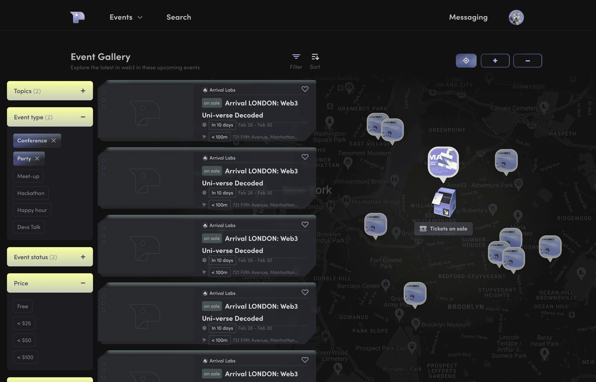
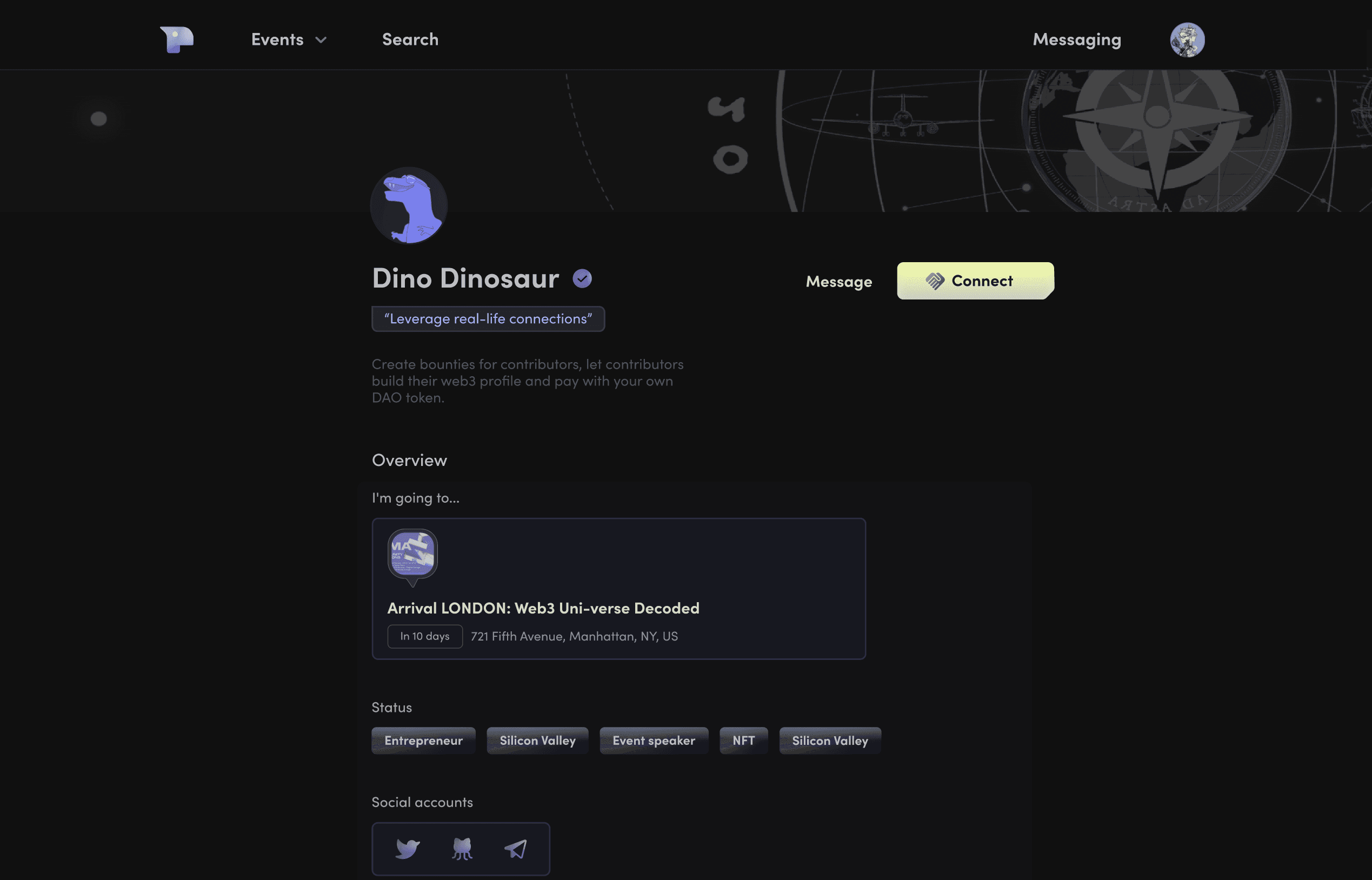
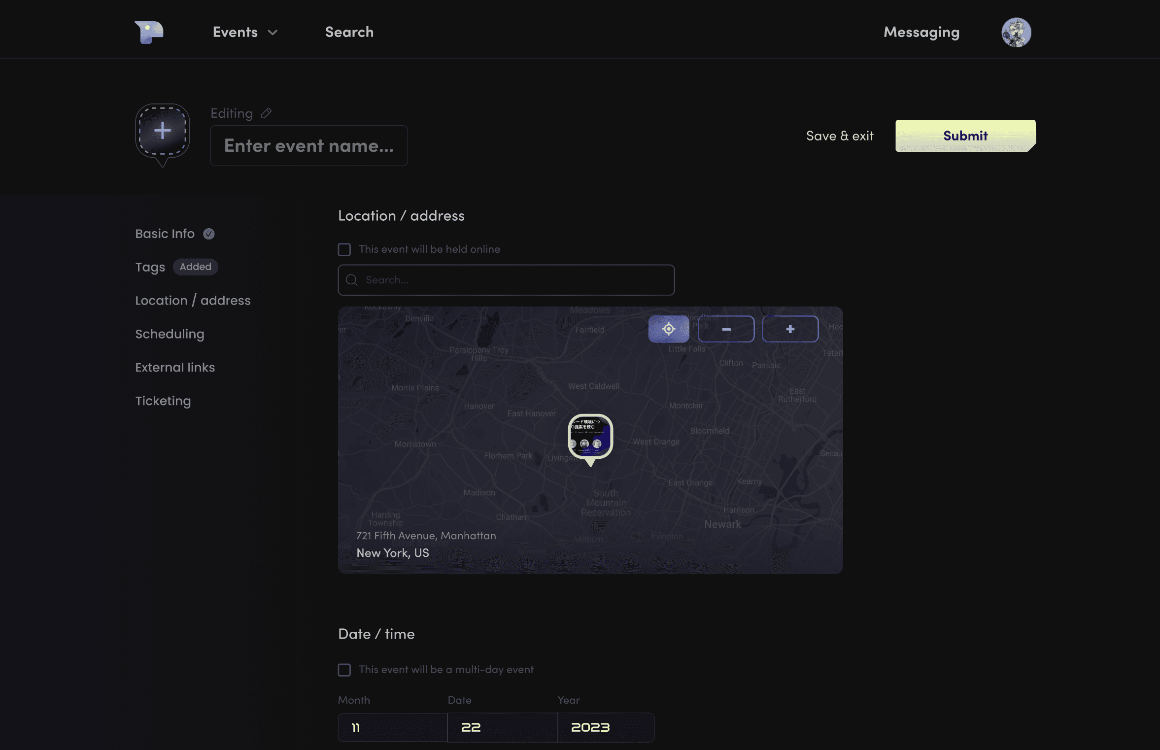
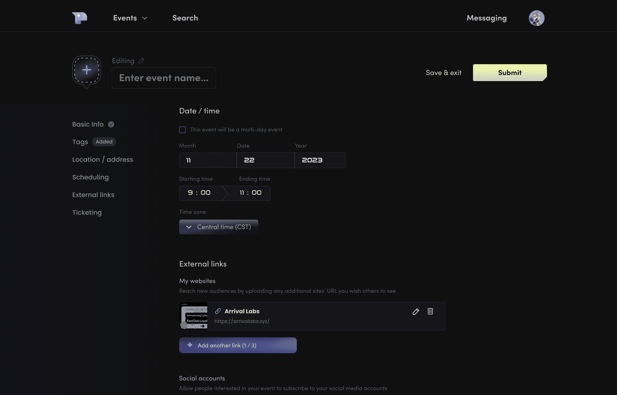
In V2, I refined several design elements from the mid-fi V1. I experimented further with gradient fill colors for buttons and icons, using dimensionality to emphasize interactivity. Additionally, I introduced a background blurring effect to create a glassy, modern feel for cards and backdrop panels.
In V2, I refined several design elements from the mid-fi V1. I experimented further with gradient fill colors for buttons and icons, using dimensionality to emphasize interactivity. Additionally, I introduced a background blurring effect to create a glassy, modern feel for cards and backdrop panels.

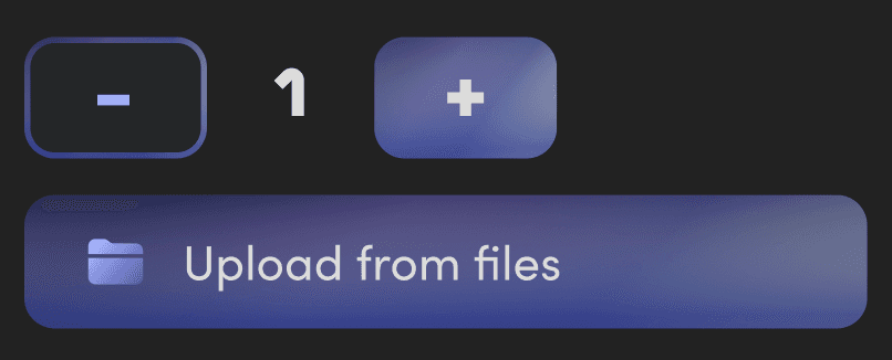
Gradient color experimentation
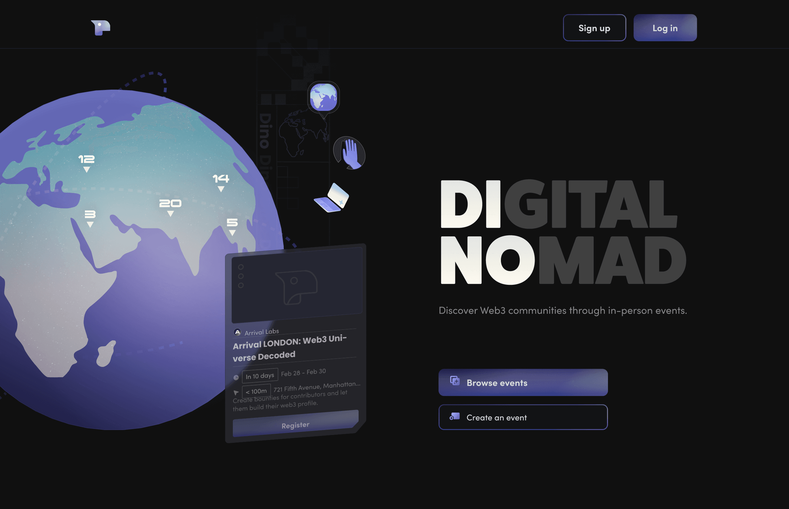


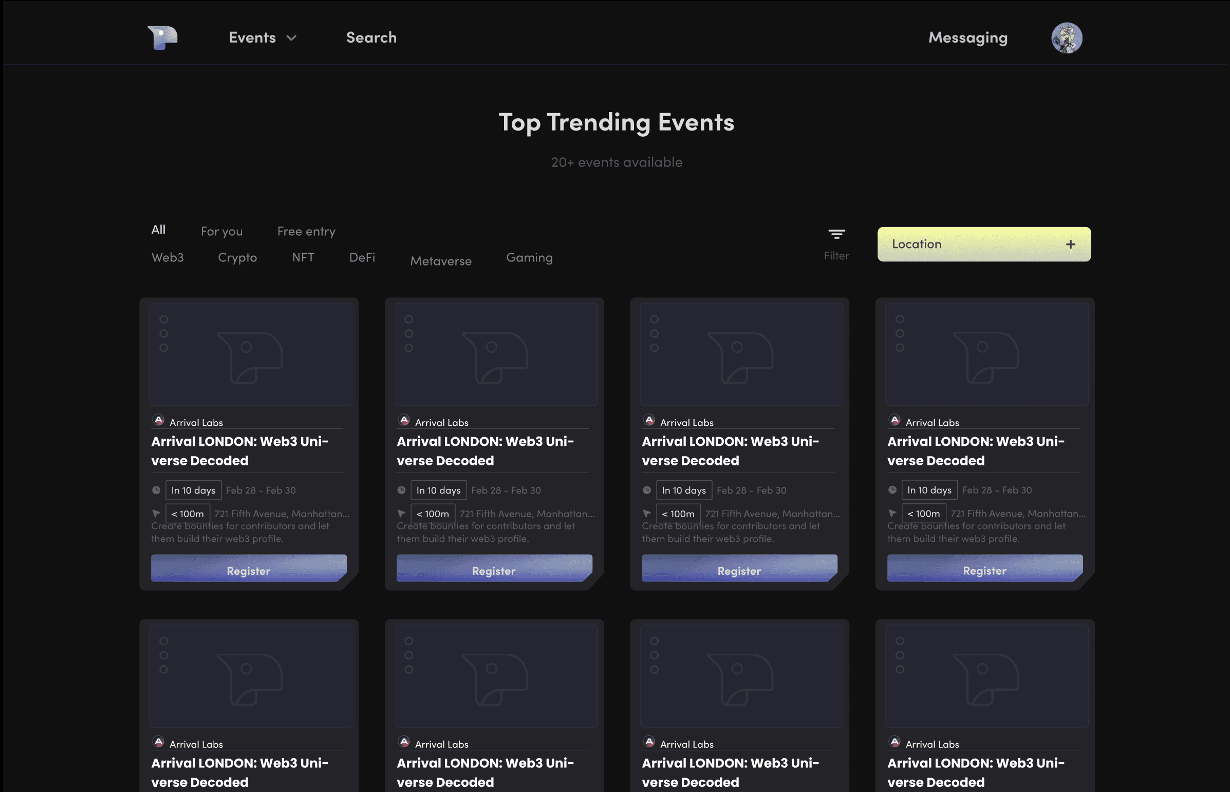










Mid-fi V2
Iteration 3
Aug 30th, 2023
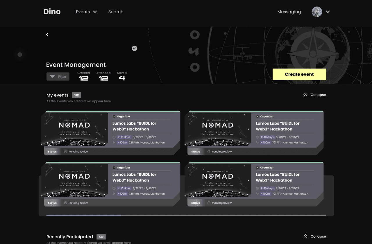
In V3, which was deployed as the MVP, we abandoned the map-based event display, realizing geographic location wasn’t a priority for our highly decentralized, “digital nomad” user base and that mapping service subscription costed extravagantly. Instead, we introduced a carousel on the homepage to highlight event recommendations. Additionally, we expanded the event management section to help hosts track their guests more effectively, and removed the in-app messaging feature, as users preferred connecting through social media. I also began implementing a design system to ensure better communication and consistency with the engineering team during development.
In V3, which was deployed as the MVP, we abandoned the map-based event display, realizing geographic location wasn’t a priority for our highly decentralized, “digital nomad” user base and that mapping service subscription costed extravagantly. Instead, we introduced a carousel on the homepage to highlight event recommendations. Additionally, we expanded the event management section to help hosts track their guests more effectively, and removed the in-app messaging feature, as users preferred connecting through social media. I also began implementing a design system to ensure better communication and consistency with the engineering team during development.





Event browsing
(Scroll to preview full frame)



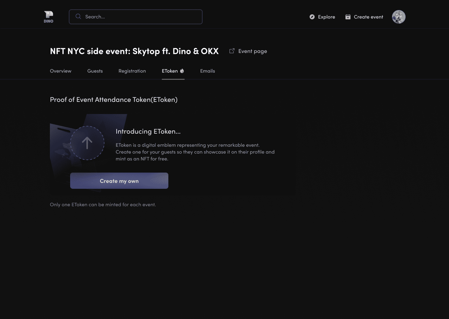

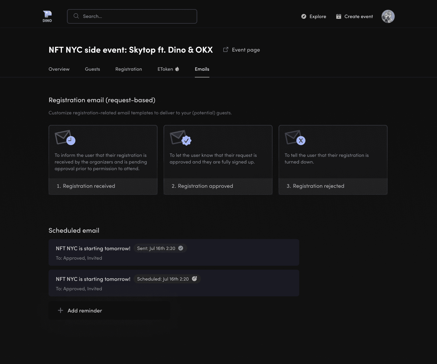

Event management
(Scroll to preview full frame)
Iteration 4
Sep 7th, 2024
New
Sep 7th, 2024
Reflecting on my work in 2023, I focused on improving layout efficiency, visual accessibility, and refining minor features while fixing issues from the previous prototype.
Accessibility
I discovered that lowering text-to-background contrast improved readability, and I replaced "Sofia Pro" as it wasn’t suitable for long text. I also removed stroke borders and increased the fill opacity on card backdrops, as the strokes hindered quick scanning.
Layout efficiency
I wanted to reduce the frame height for certain screens to minimize unnecessary scrolling. Iaddressed spacing between components and sections to enhance content grouping and compactness. By adjusting spacing, font size, and horizontal space usage, I ensured more content could fit on a single screen without sacrificing readability.
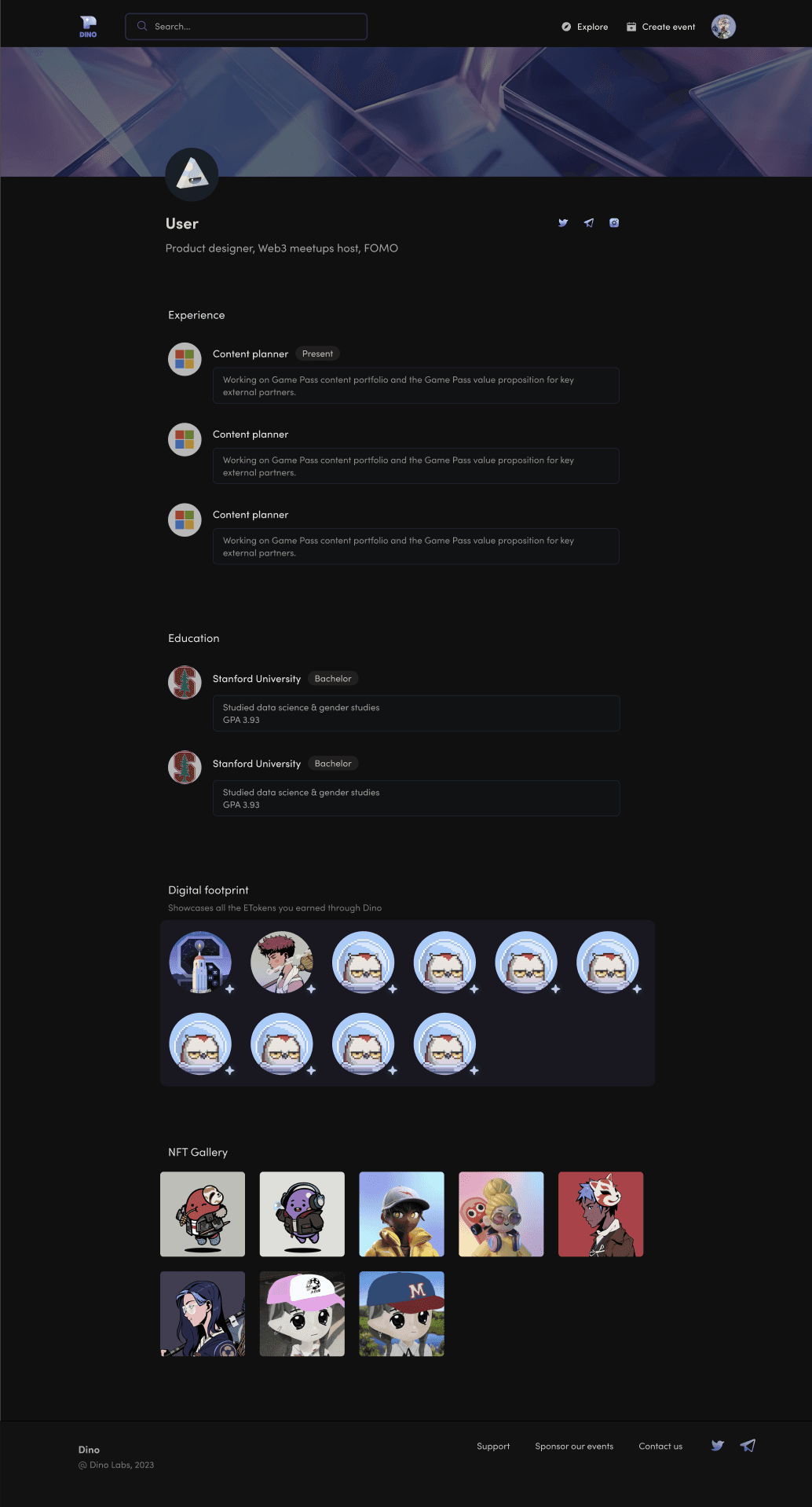


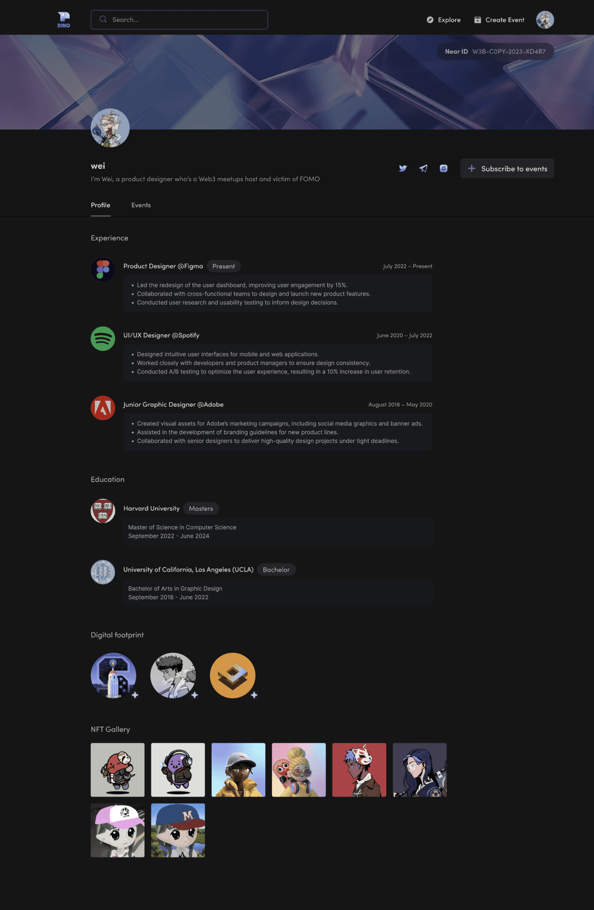


+
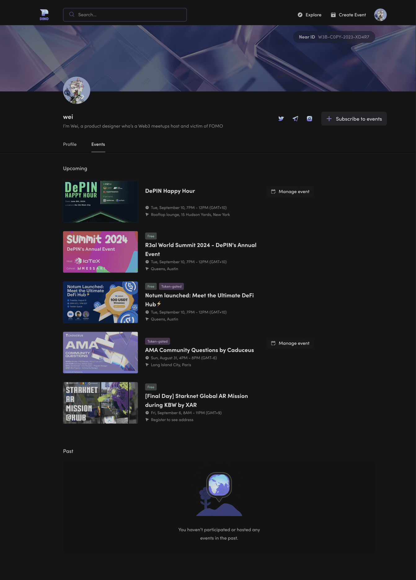


Personal Profile (Display Mode): I reduced vertical spacing, expanded the viewport horizontally, and added a tab for events users had attended.
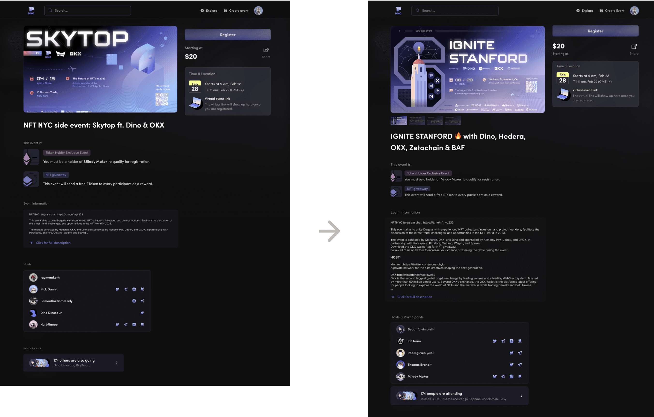

Event Details: I combined the hosts and participants sections for efficiency, reduced the size of event tags (“token holder” and “NFT giveaway”), and expanded the event description section to accommodate more detailed content.
Design Components Iteration
V2

V3


V4

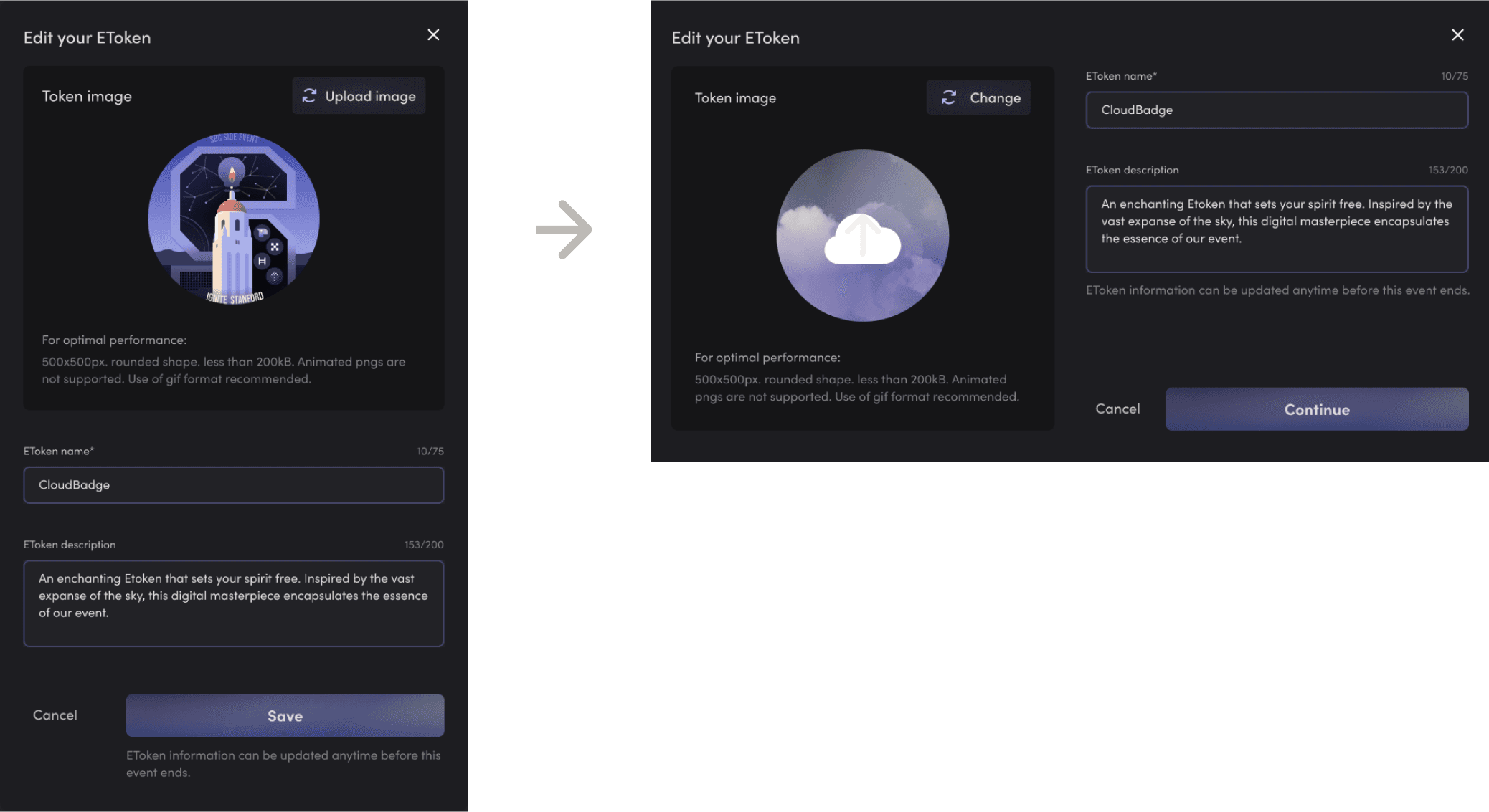
“Edit your EToken” window

“Edit your EToken” window
V2

V3
V4
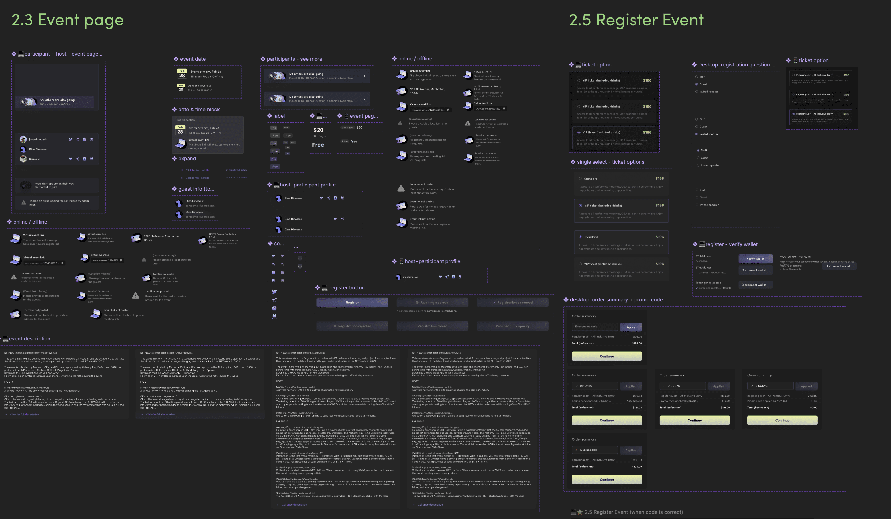
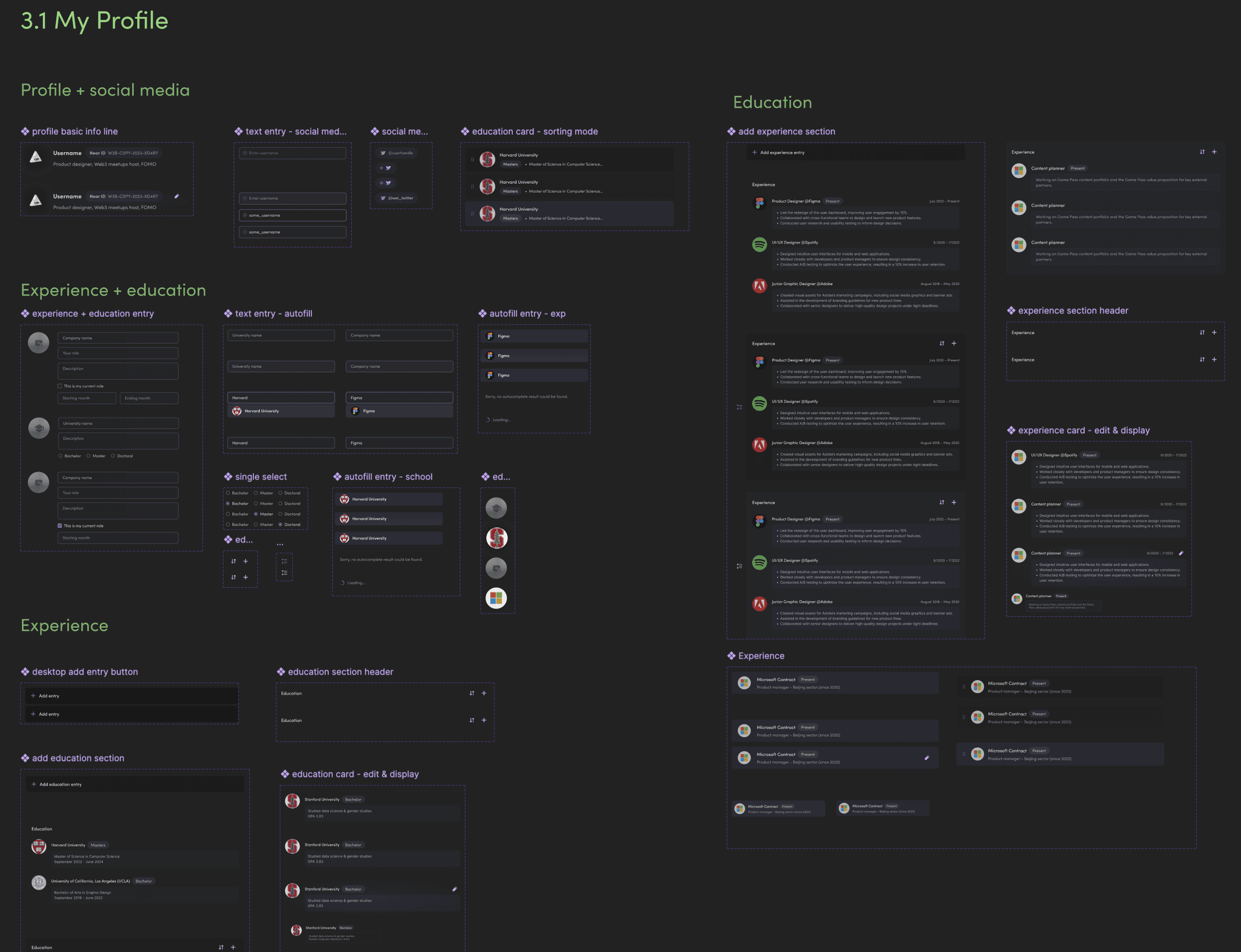
Design System
(partial snapshots)


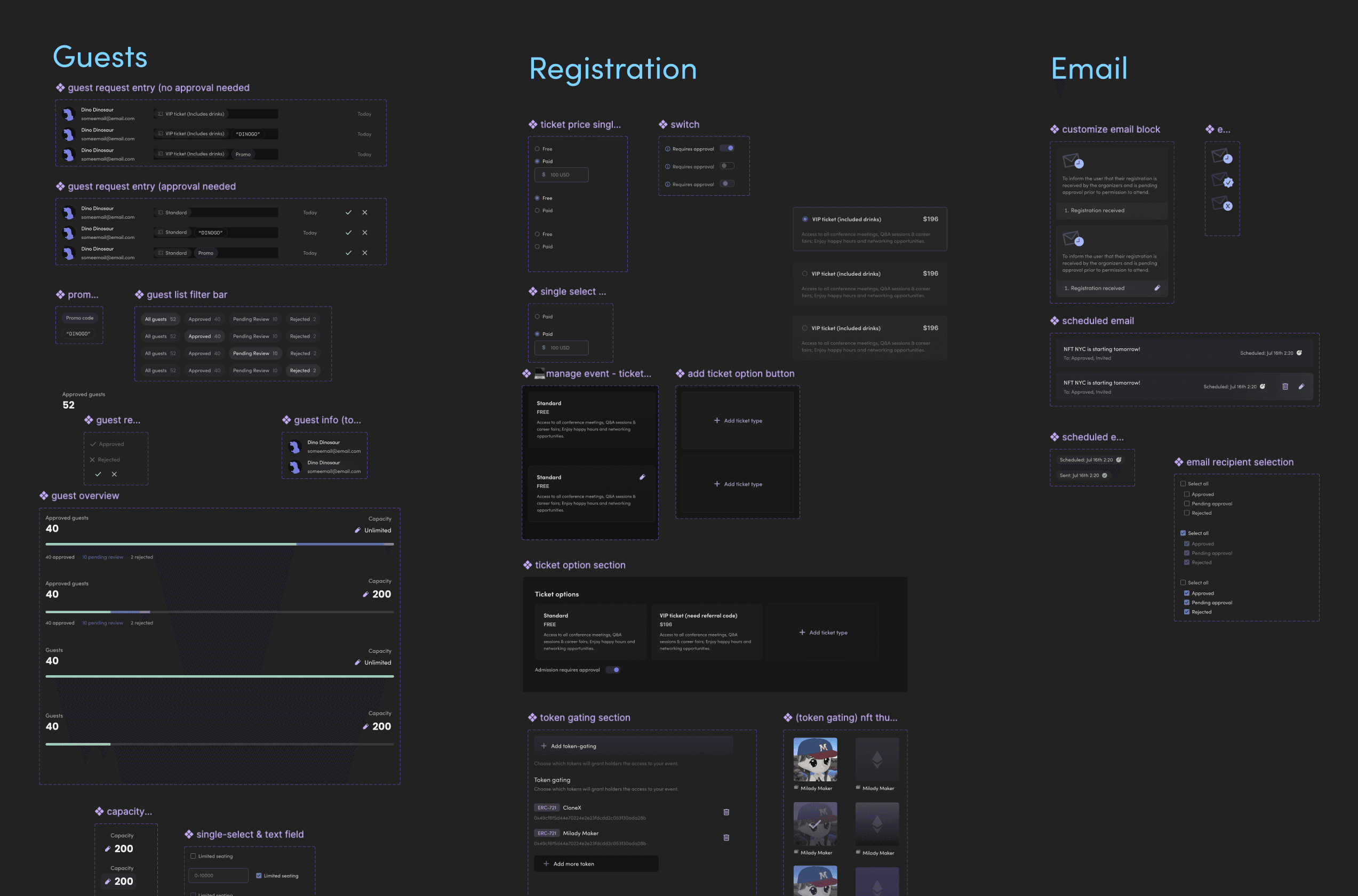

(→ Scroll left for more)
Results
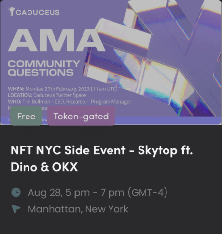
The MVP website was successfully deployed in August 2023, six months after I joined Dino and began the design process. Close collaboration between the design, product, and engineering teams ensured seamless integration of design features, which allowed us to deploy on schedule.The key features I implemented helped boost platform traffic to over 5,000 visits, with more than 1,000 registered users in the first year. The site was actively maintained until the end of 2023, when the team pivoted to a new direction and shut down the platform.
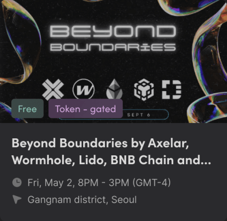
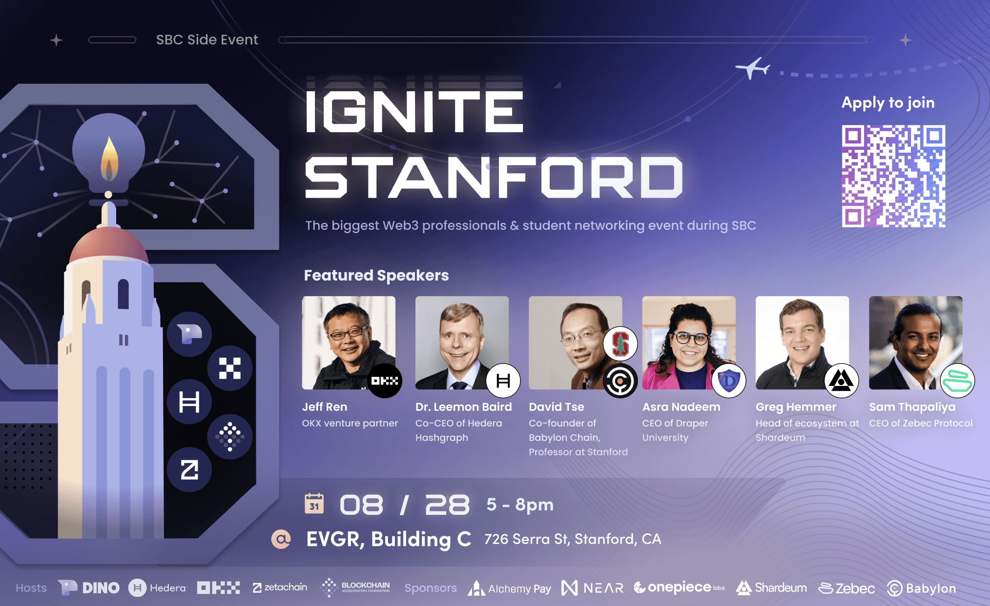
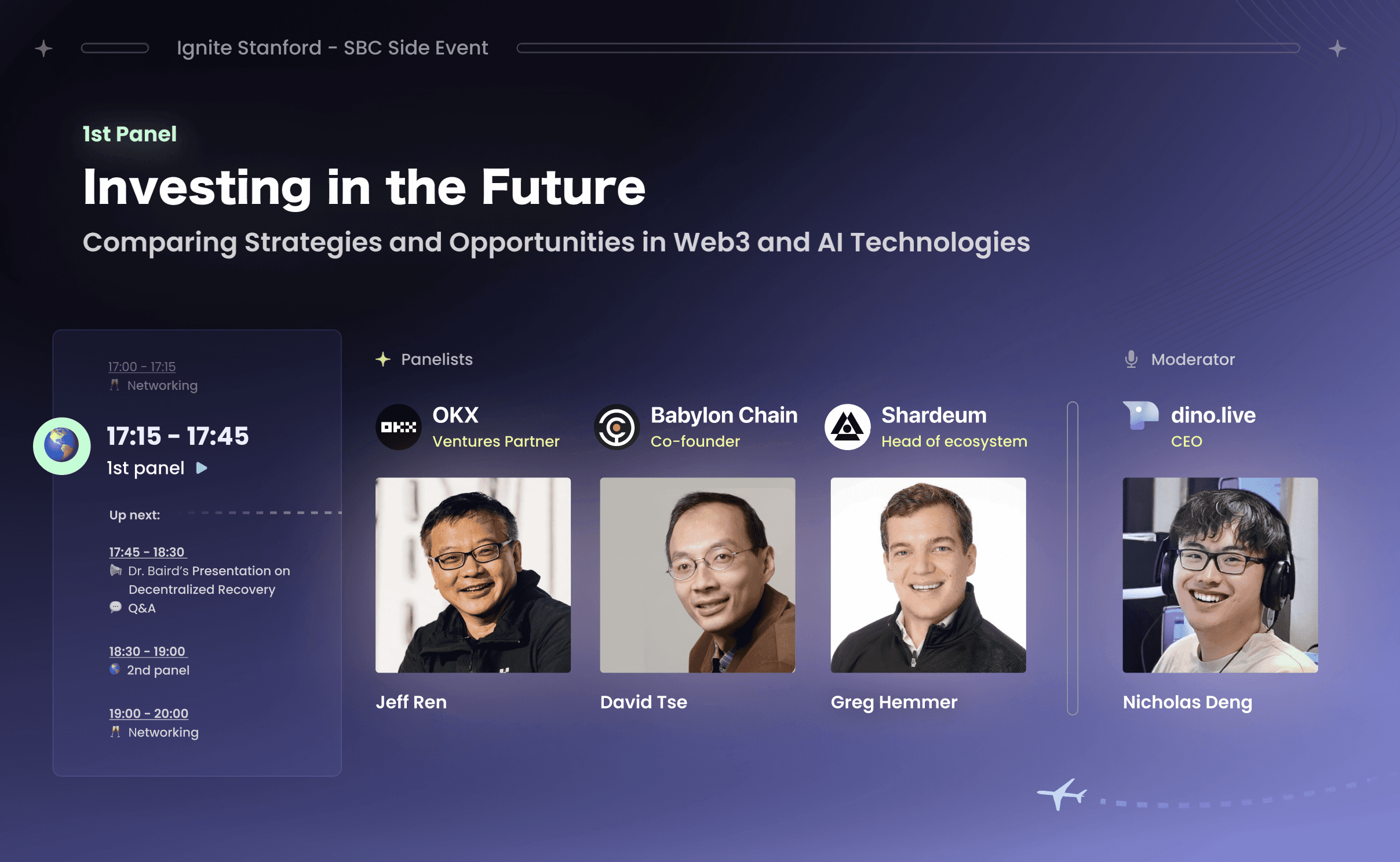
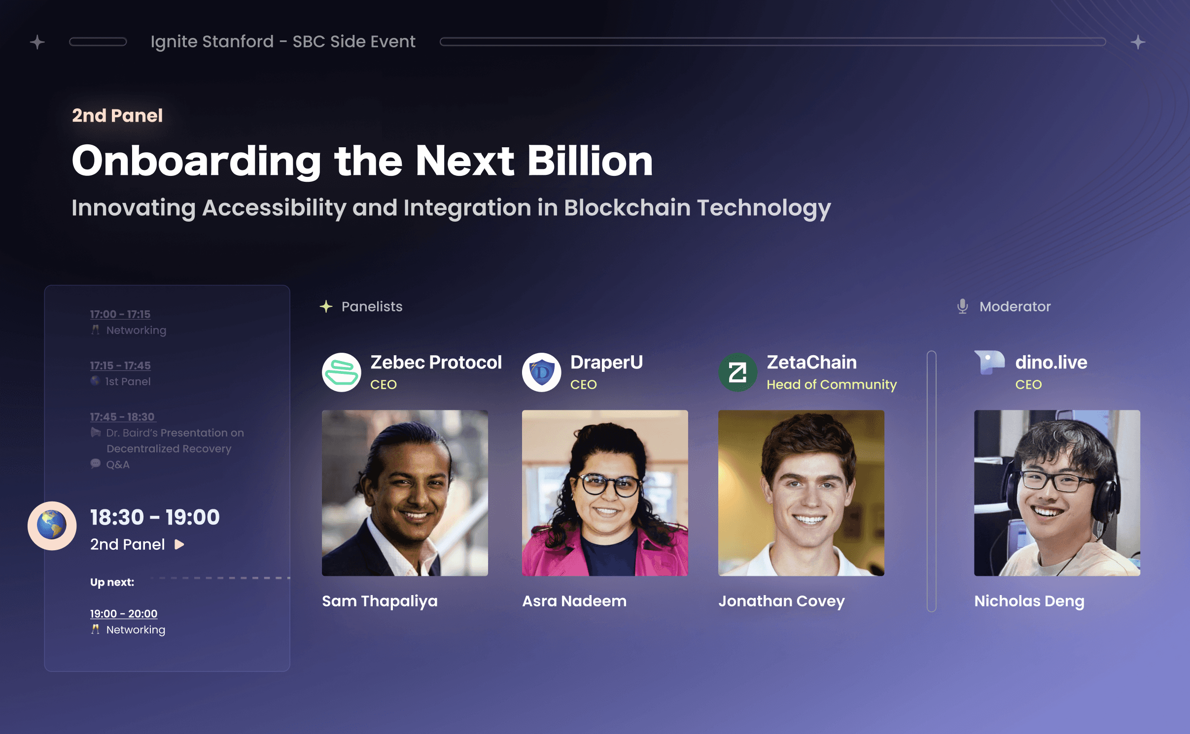
Additionally, I created graphics and illustrations for promotional materials used at major events, including the Stanford Blockchain Conference (“Ignite Stanford”) and the NFT NYC gathering {“Skytop”). These materials, such as social media thumbnails, event posters, and panel discussion backdrops, contributed to strong brand presence and successful event engagement, with around 800 guests registering for events through Dino.
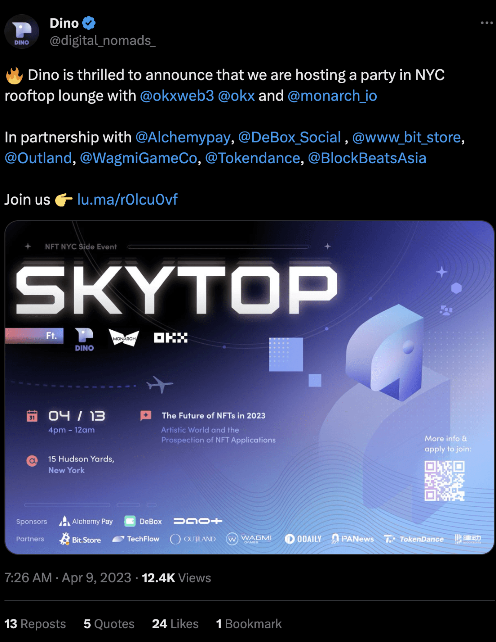
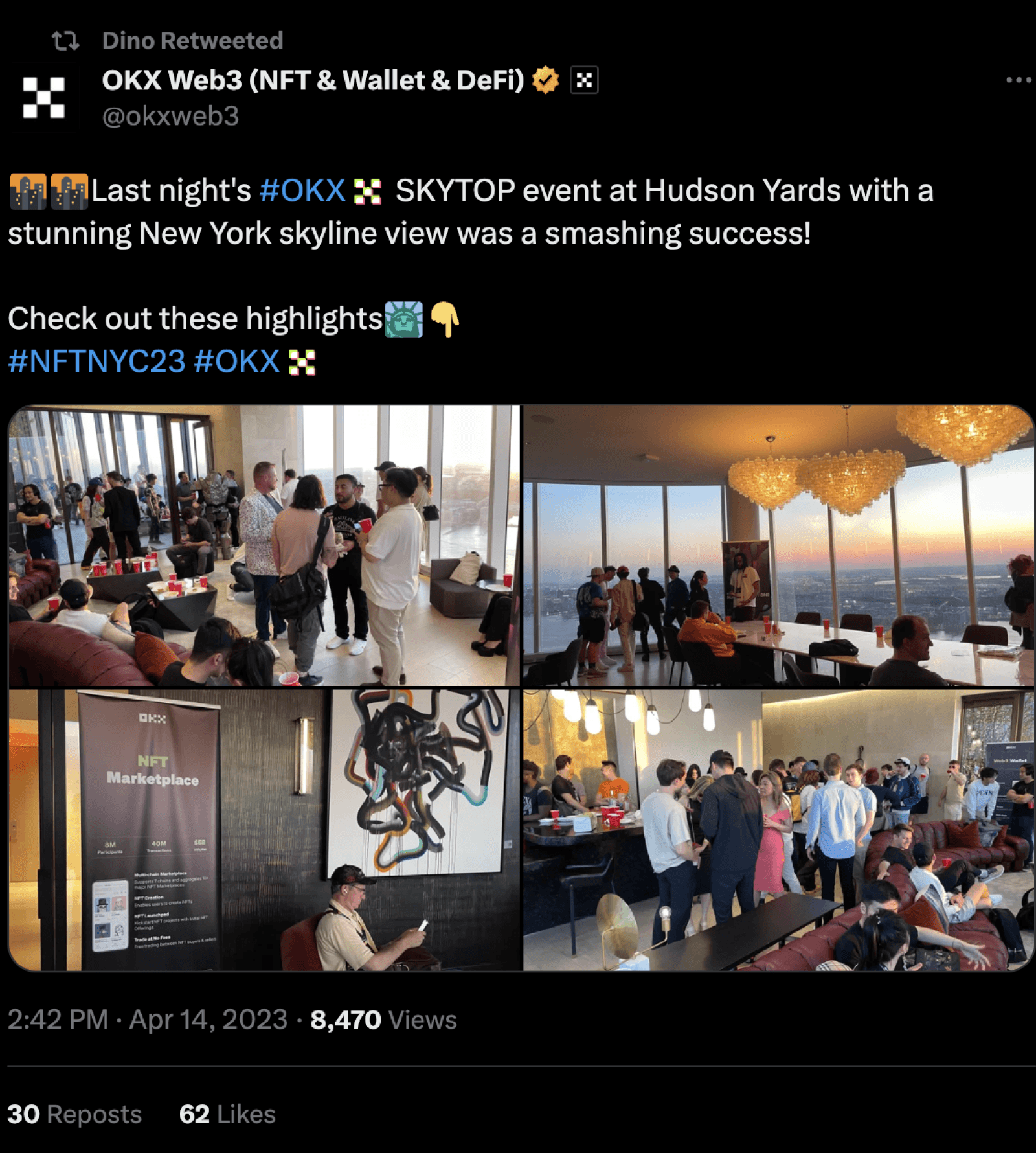
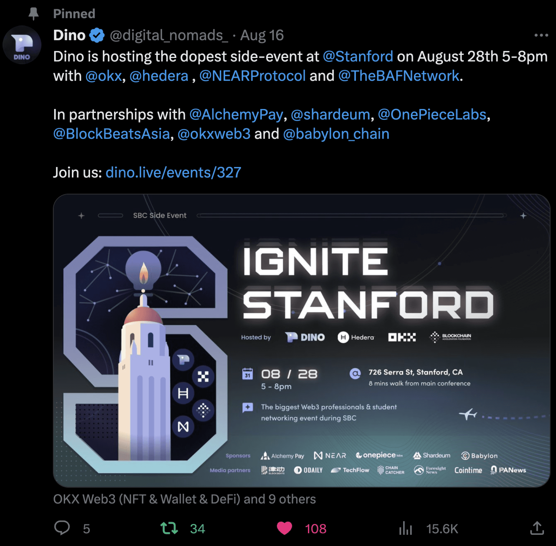
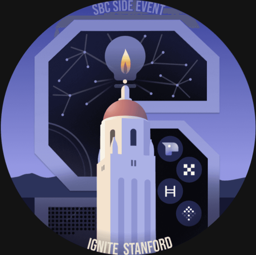
Event Etoken for “Ignite Stanford”



Takeaways
Communication methods in remote coworking
Communication methods in remote coworking
While larger companies often rely on rigid product specifications to facilitate collaboration, our startup's evolving nature allowed us to adopt more flexible communication methods, as long as ideas were effectively conveyed. During my collaboration with engineers, I often found it challenging when discrepancies between the visual design and the final implementation weren’t immediately recognized. To address this, I focused on improving the prototype and maintaining the design system.
Additionally, I created supplemental resources, such as spreadsheets and diagrams, to outline necessary updates in the Vercel app code. For instance, I provided a diagram detailing how to implement token-gating in event registration, which also contained component instances that allowed engineers to easily trace each element’s main component via the right-click menu in Figma.
When design changes conflicted with engineering feasibility or marketing goals, we scheduled meetings to resolve these differences. These discussions helped me better understand the technical constraints and which parts of the design were more difficult to implement. This project taught me to balance creativity with practical technical constraints, and it was a valuable experience in fast-paced product development.
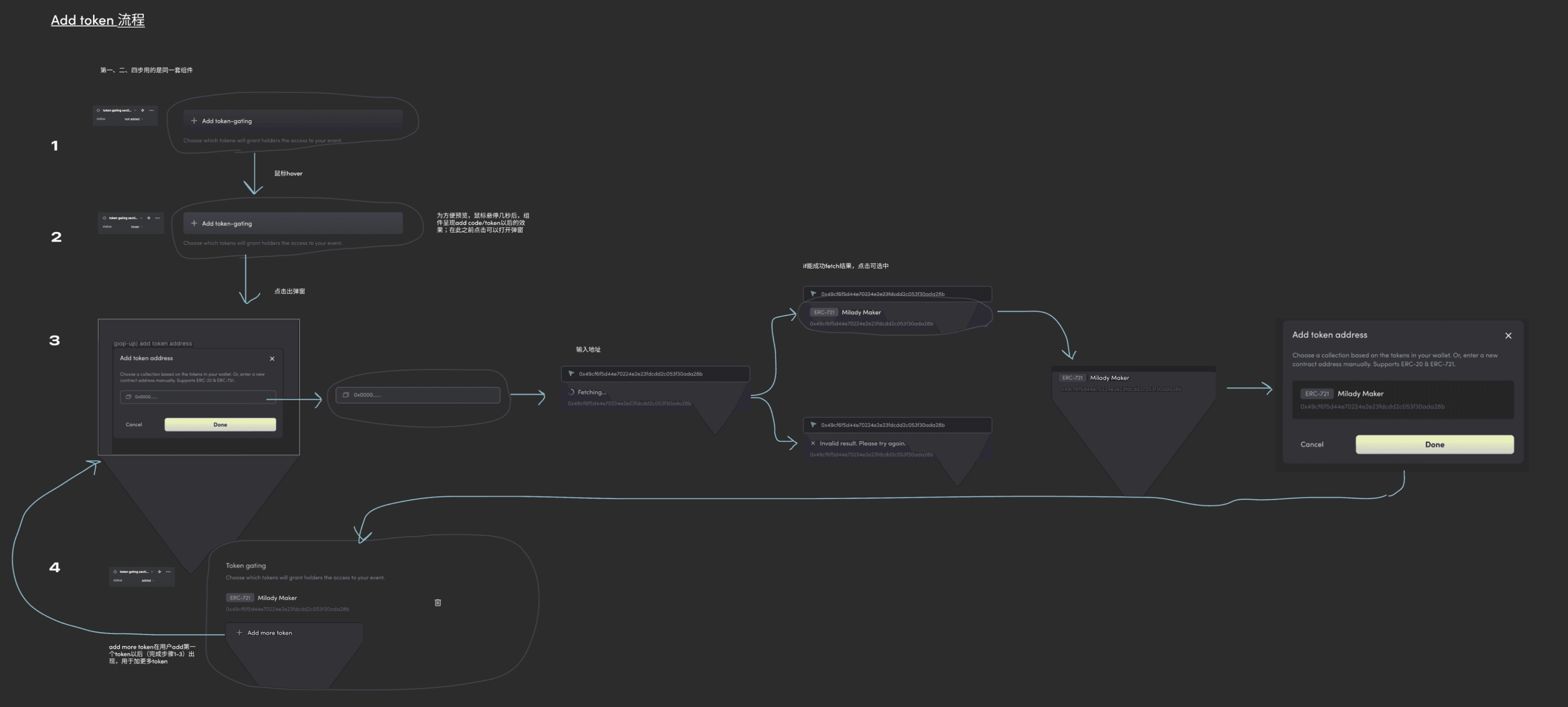

“Add token” logic diagram
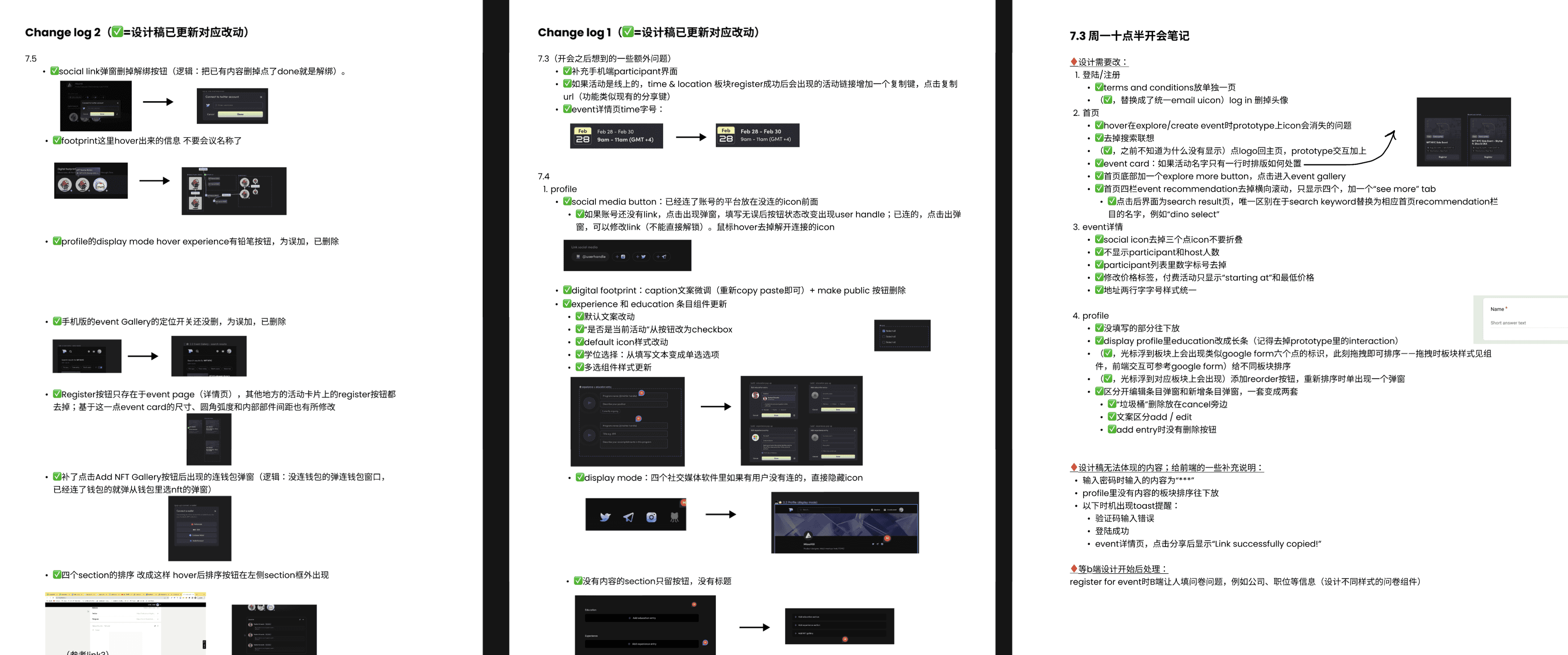

Modification revolving deployed front-end changes
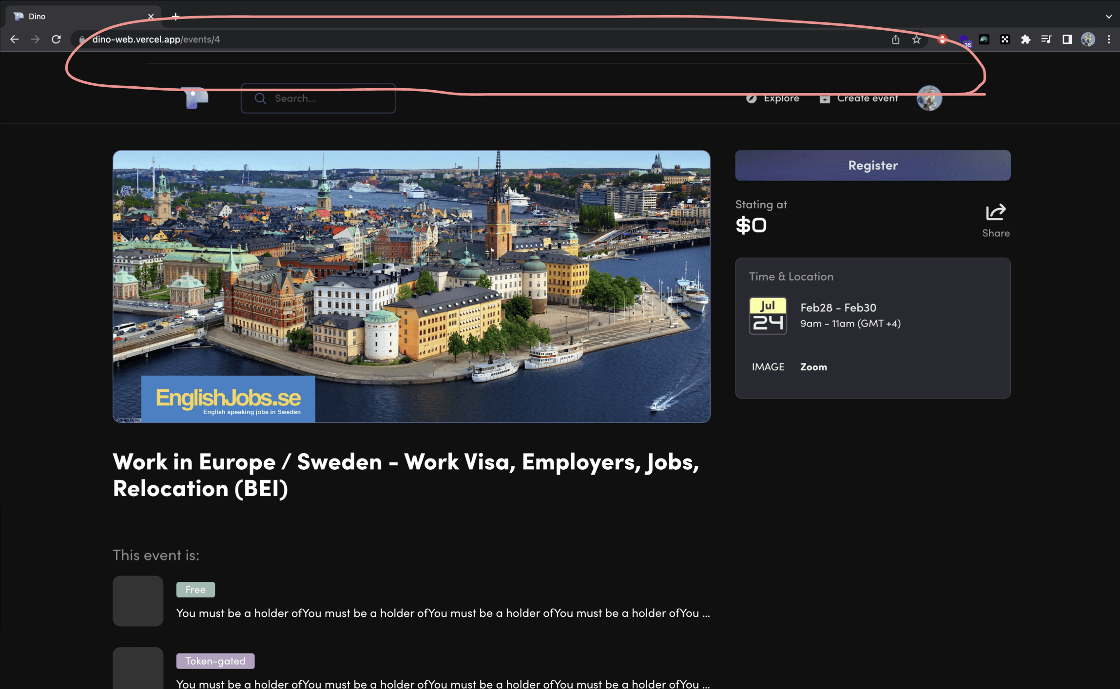
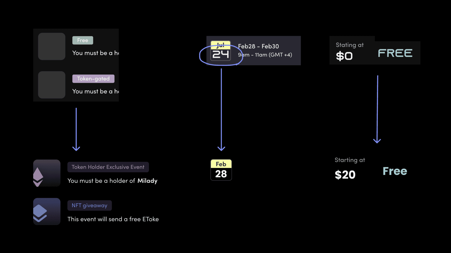
Detail adjustments
Meeting w/ WWT team
Meeting w/ WWT team
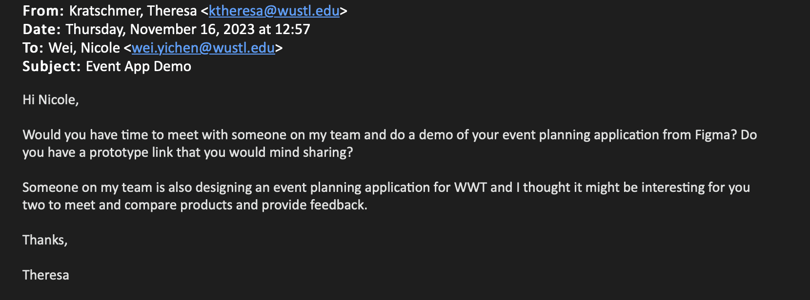
While attending the course "Visual Principles for the Screen," I shared my outside projects with my instructor, Thereasa, who introduced me to a team at Worldwide Tech (WWT). The team was developing an internal platform for employees to create and promote events within the company. We scheduled an online meeting where we exchanged and discussed our respective products.
One key takeaway from this meeting was recognizing the stark difference in audience needs. Despite both being event management platforms, Dino, as a B2C platform, prioritized simplicity and a clean, modern design to avoid overwhelming users with too many features on-screen. In contrast, WWT’s internal tool catered to a B2B audience, responding directly to the marketing department and requiring a feature-rich interface to accommodate complex workflows. This contrast highlighted the importance of tailoring design to the specific needs of the target audience.
Onboarding Attendees for Networking Events in Web3
dino.live
